July 17, 2020

Lettering Crit. Take Aways.

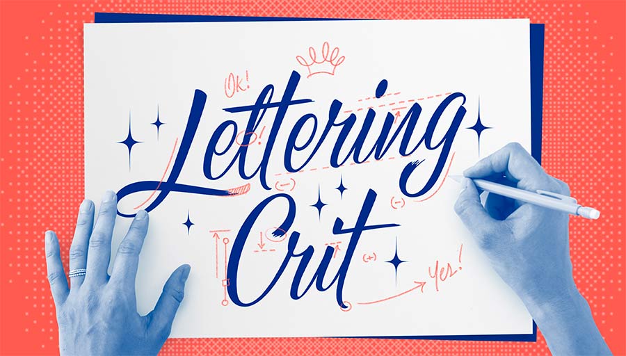
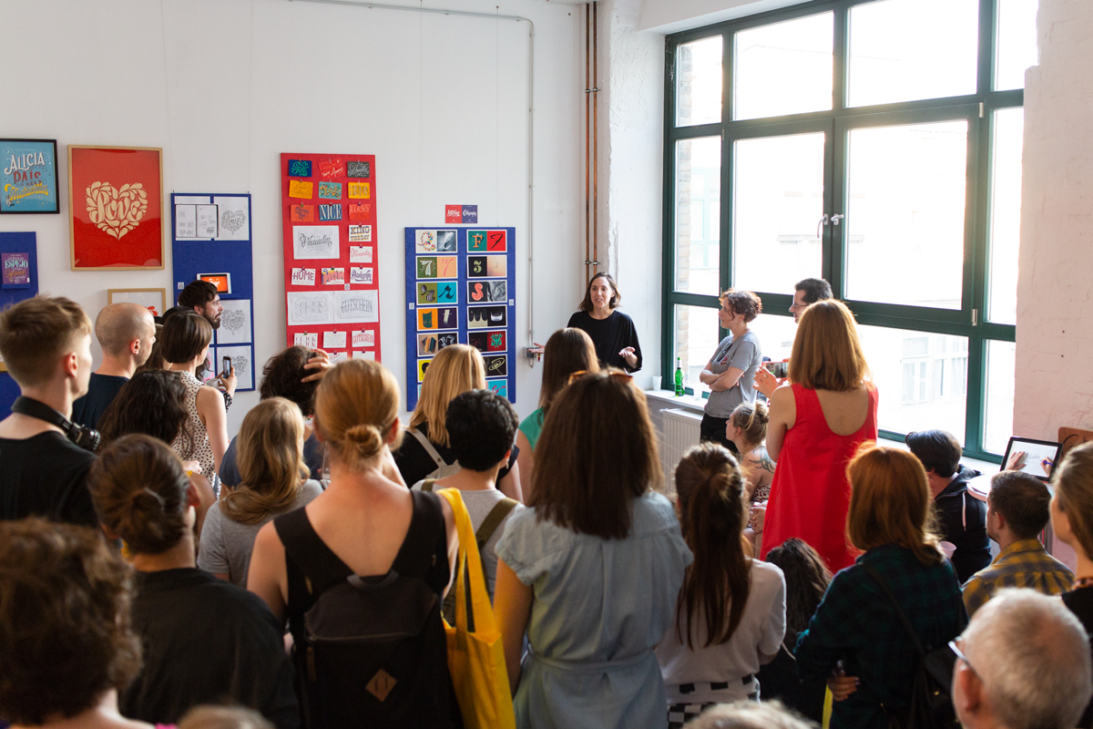
The first Lettering Crit session was just over-the-top amazing. I enjoyed it so much that I just want to do this exclusively from now on! Just kidding #notkidding. If you missed it, here's a replay.

​This was a collective work. In the session, it was not only me giving comments and feedback on the work, but all attendees participated (that chat was on fire!). I have to say that it wasn't easy to select among hundreds of submissions and so many great pieces of work, but finally, the projects of Ailen Kenny, Caroline Esteves, Darshita Agarwal, Jenn Rothschild, Irene Clua, and Jenny Mercer were selected. They were the lucky ones to receive valuable feedback for their next iterations.

These are some of the main take-aways of the session, good lettering tips: 

1. Composition hints: To get your composition right use the North (N), South (S), West (W), East (E) principle. So if the north of your composition is very busy (with swashes or flourishes), find ways to compensate that in the south portion of your composition.

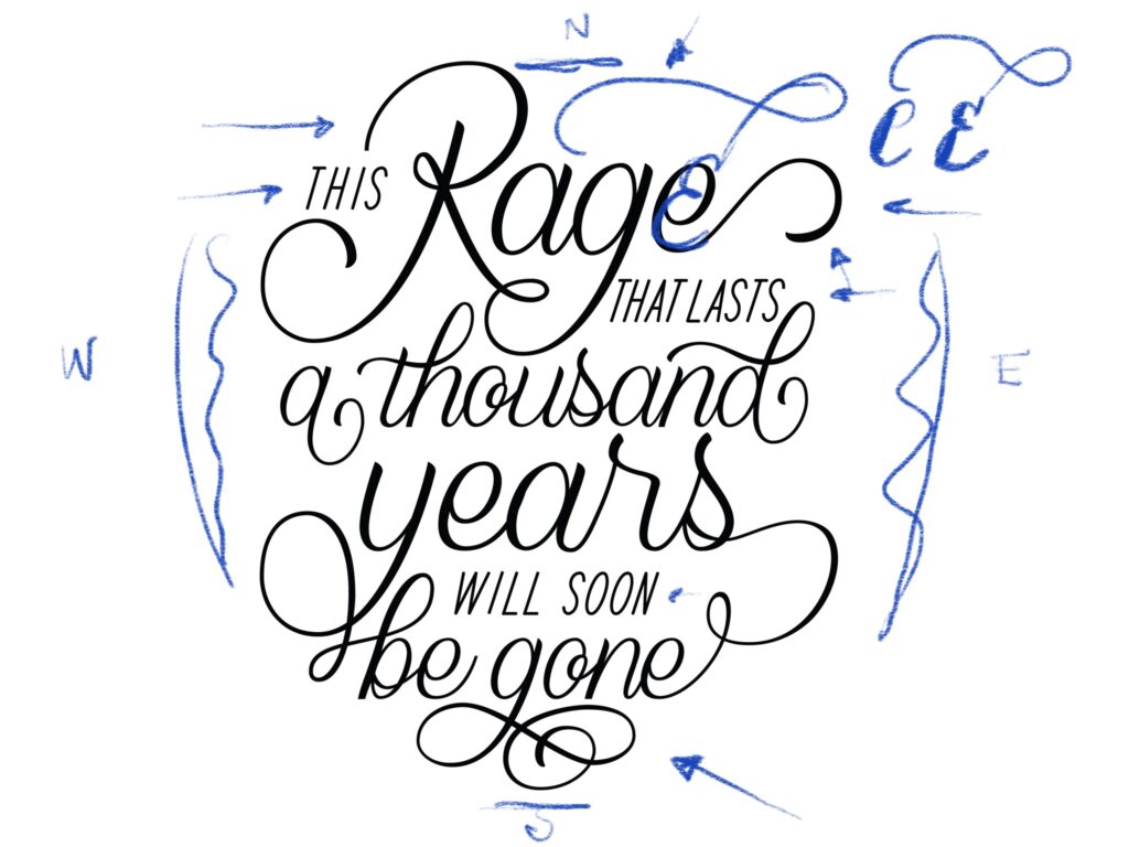
Beautiful script lettering by Ailen Kenny. We suggested a change of shape for letter e.

2. Decorative elements to the rescue: if you happen to have negative spaces (white spaces) within your composition, decorative elements may come handy. Use lines, swirls and flourishes to "cover" those up.

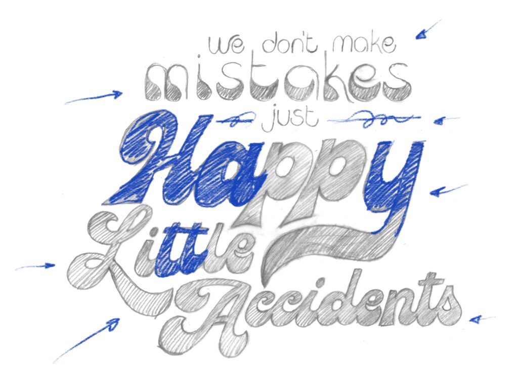
Extreme contrast for Caroline Esteves's work. Perhaps adding some decorative elements to cover up negative space?

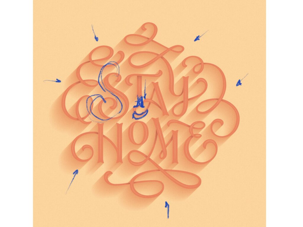
3. Watch out with your S: Raise your hand if you ever struggled with an S. Well, I have! 🙋🏻‍♀️ When drawing an S, focus on the space around rather than in the shape itself. If there's too much space on any of the sides, you might need to adjust the slant or shape of that S.

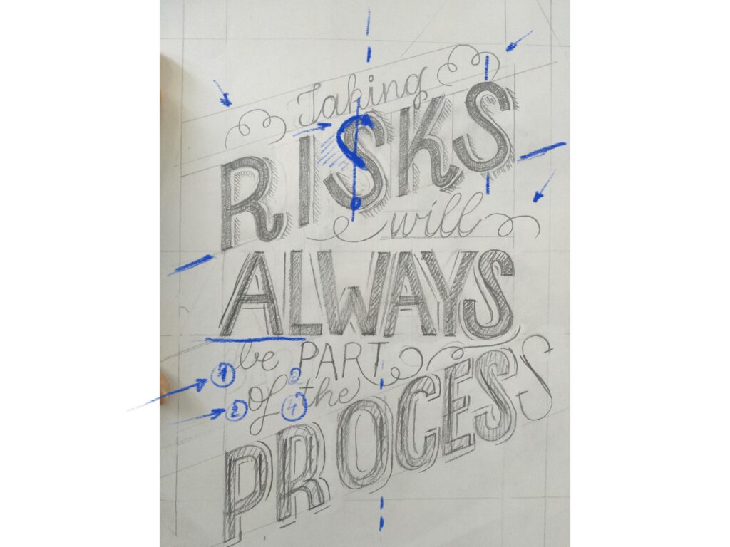
Helping Darshita Agarwal with that S.

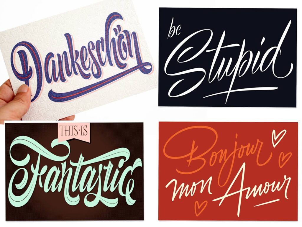
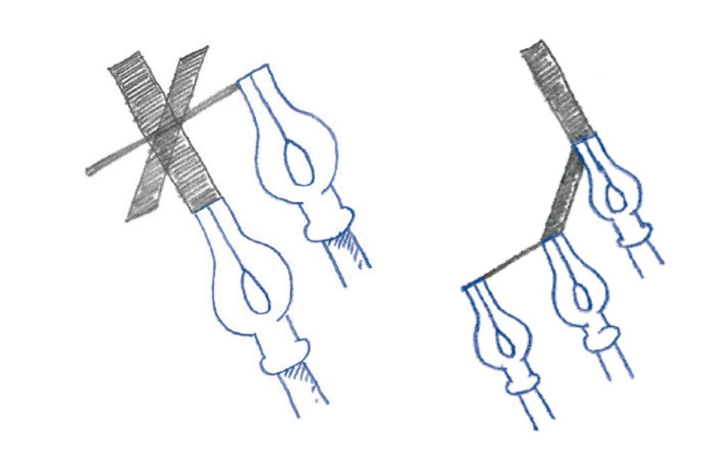
4. Use capital letters and design them all together: if possible, use as many capital letters as possible. Capital letters are normally more expressive and wild, and they will add tons of flavor to your piece. Also, when having multiple on your composition, design them all together, so that they share the same features and have the same complexity. 

Solid work by Jenn Rotschild. We suggested some flare for her capital letter A.

5. Confirm that is readable: especially when working on flourished compositions, there's the risk of compromising readability. Double-check with other readers if necessary. 

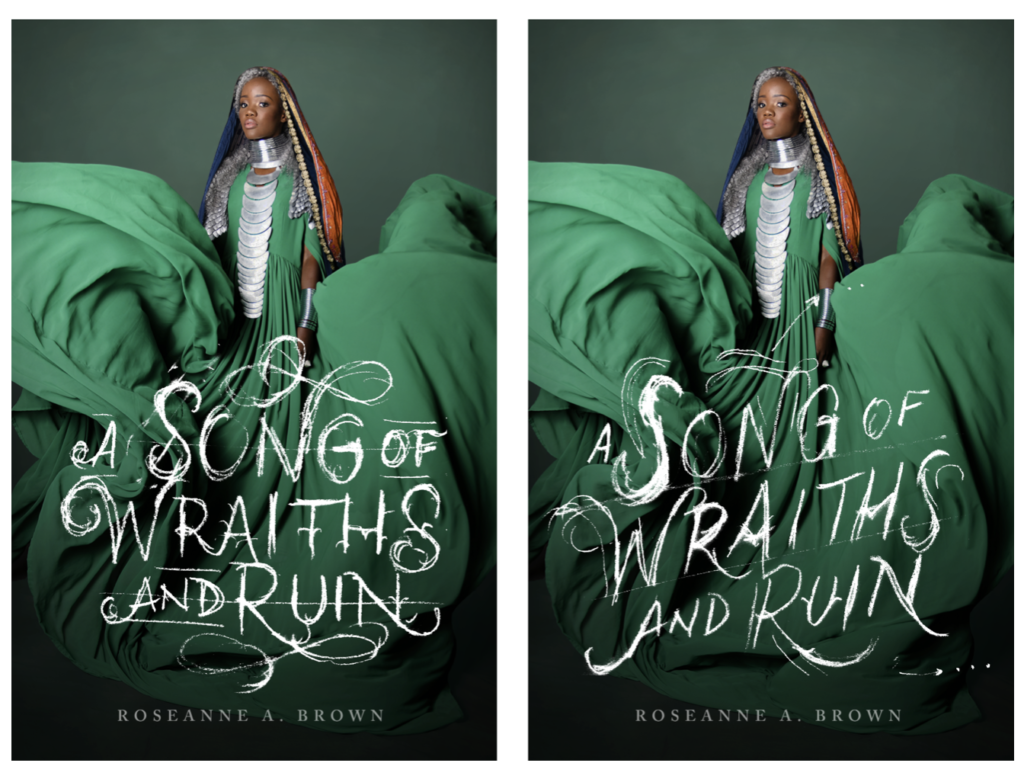
Irene Clua with a beautiful executed piece. It was mentioned that one of the flourishes mike read like a capital E.

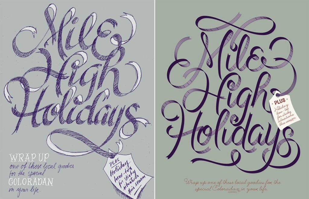
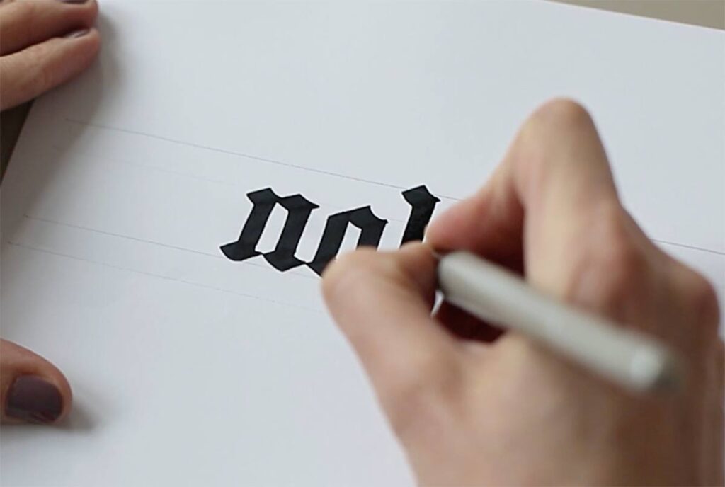
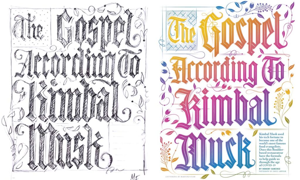
6. Solve most of the problems in your sketch: before moving on to the digital drawing, solve all of the problems in your hand sketch. This will make digitization much easier!.

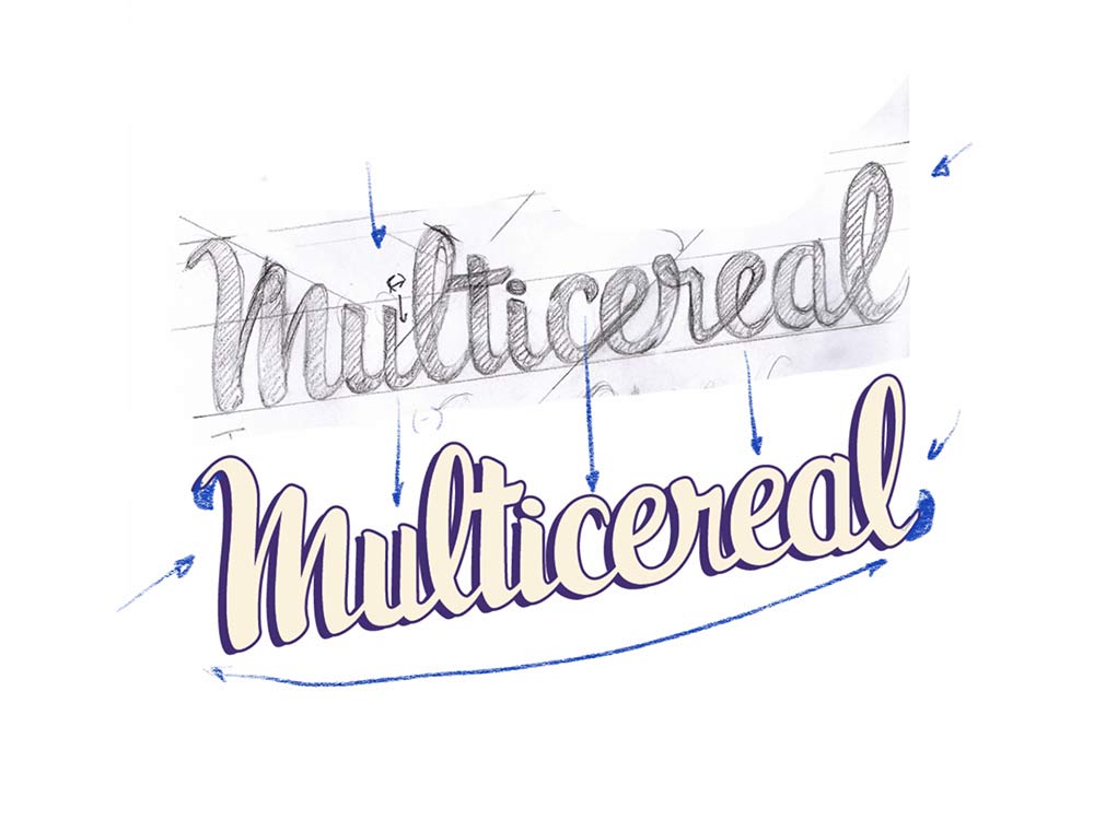
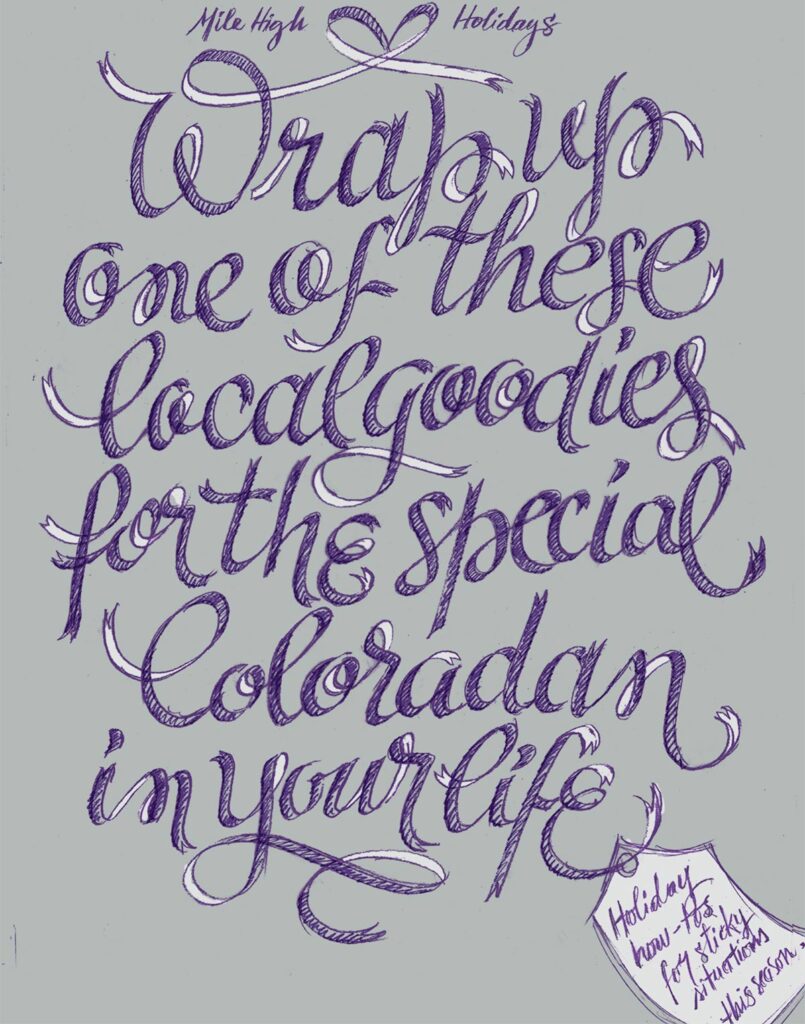
Jenny Mercer solved most of the problems in the hand sketch and continued improving her shapes as she moved on to the digital drawing.

I'll be hosting more sessions in the future, keep your eyes peeled! Have a great weekend. 

Martina.

July 17, 2020

Introducing FREE Lettering Crits

I'm uber-excited to introduce my first Lettering Crit, a new FREE live feedback session for lettering makers.

The Lettering Crit (short term for "critique") is a live event to provide feedback to selected work. Previously there will be a call for submissions. This is how it works in a nutshell:

Sessions will occur on YouTube, and everyone can attend. The fun thing is that you won't know if your work was selected upfront, you'll have to join the YouTube session to find out! During that session, attendees and I will comment on the pieces (it could be yours!) and provide tips and tricks to take it to the next level. Along the way, I'll be sharing valuable insights on lettering and letter design as well.

One important thing: these sessions are not made to crash anyone's work but to highlight the great bits and give feedback. One of the goals behind it is to discover new talent, that's why I'll be featuring the authors here in my newsletter and on my social networks.

See The Lettering Crit here.

Why feedback is important.

Having feedback from teachers and mentors was essential for me to improve my work with letters. Without them, it would have been really hard to spot the flaws in my work and make it better. Sometimes you need someone to point out at stuff and make you see it.​
​​
As important as understanding your flaws is having reaffirmation on what you're doing right, isn't it? I've always appreciated teachers and colleagues that were not only able to critique me but also give me a pat on the back. I want to be able to provide that to other letter makers out there, and this is why I'm hosting this Lettering Crit.

What do you think, are you in? I'm looking forward to seeing your work! Click here to join for free and submit your work.

May 28, 2020

That one time a rough sketch saved my life.

Drawing letters is an incredibly slow-moving job. This is one of the first things I realized when I started working with lettering full time. Since I used to run a one-woman studio and wanted to make a living from it, I had to come up with a workflow that would allow me to do multiple projects while responding to the working rhythm of agencies and publishing houses (where projects are due yesterday).

I still remember the first time that I received a big commission of lettering, it was for the cover of New Statesman magazine in the UK. I was so excited! This was my first assignment with the potential to have tons of exposure—the magazine has a circulation of 35.000 copies in the UK— and for me to make a great piece for my portfolio. 

The art director sent the brief and the exact words to illustrate. I had everything I needed to get started, and so I did. I worked three days straight on this artwork:

By the time I showed the artwork to the art director, the deadline was just one day away. Thank god she liked it because I would not have made it to the deadline if she would have not liked it! 

From that point on, I started to rethink my work process. I said to myself that there must be a more effective, less time-consuming process to work on my designs and, at the same time, be able to test ideas with my clients.

Working with sketches.

This is when I started working with sketches. Working with quick sketches is convenient for both the lettering designer and the client, as it allows you to deliver a concept in a short time and confirm if you are both on the same page regarding the direction of the project. If not, it is easy to sketch some new ideas and discuss them with the client.

I once received a commission with a really fast turnaround. Although the deadline was extremely tight, I was interested in the job and decided to take on the commission. Once I got the briefing and cleared some doubts with the art director, I started sketching some ideas right away. A few hours later, I sent a first colored sketch to the client. It looked like this:

The art director got back to me right away: she loved the direction. However, there was a little problem: I had used the wrong text for the lettering! The text I needed to illustrate were actually those three words at the top of my drawing.

For being an artist that works exclusively with text, I had made a huge mistake! After taking a deep breath, I wrote back apologizing and two hours later I was able to deliver a new sketch using the right text. I got positive feedback and could move on to the digital drawing and finalize the work as quickly as possible. 

Almost no time was lost considering that, ahem, I had started the project with the completely wrong text! Bottom line: sketching saved that commission, the relationship with the client, and all the future potential commissions that may arise from it.

Sketches: way to go.

Working with sketches has two more benefits. Although you are establishing a lot of essential elements in your first sketch, many of the details will follow later in the process, which keeps the work interesting for you and thrilling for the client. Another benefit is that sketches enable the client to experience the working process; she or he can see the individual steps and influence them. 

Additionally, in the digital era, a working process that involves hand-drawn sketches is well appreciated and adds value to your work. Clients will perceive your work as a craft and not only as a job.

Developing a good sketching technique is something that is worthwhile investing time in, not only because it can create a more effective workflow, but also because it can help you achieve more unique results. 

I’ll be hosting a FREE masterclass next week. Stay tuned and sign up for my newsletter below to be notified. 

May 26, 2020

Tell better stories with your lettering.

I cannot help to find awkward when someone says that lettering is “the new thing” because it has been there for a long while. You just have to raise your head and look around you.

This is the storefront of a bakery in Paris. By looking at this sign I can almost picture the bread they make. I can picture the baker, using THE BEST ingredients, and working carefully on each bun, in a beautifully equipped kitchen. The baker surely puts a lot of attention into making that bread, just like the artisan that made this sign, who carefully painted every single stroke and serif of that lettering. By looking at the sign you just want to eat that bread, that has to taste delicious—and I can say, it did taste delicious. That is the power of lettering, to communicate much more than the literal meaning of the words.

Why lettering styles matter.

As letters embody the message you want to convey, their shape is essential for your storytelling. Do you want your lettering to look friendly? Cold? Should your lettering look official, or throw you back to a specific time in history? The text and its shape are counterparts of the message.

I remember that when I started creating lettering I was fascinated with brush letter shapes. All I wanted to draw was brush lettering, and so I did. I drew tons of brush lettering pieces and became pretty good at it. It didn;t take me long to realize that brush lettering was not always a good fit for the message. I felt stuck there, like missing the words to tell new stories.

Brush lettering by Martina Flor

I realized that in order to become a better lettering artist, I needed to be able to approach other styles confidently. Furthermore, this would make my work more interesting for me! The great thing about being able to approach several styles is that you can get to tell more powerful stories. Aditionally, it enables you to approach different kinds of briefs, which comes in handy when you are looking to work commercially as a lettering artist.

Approaching a new style is always challenging, simply because it lays outside of our comfort zone. Understanding the principles of the style, its origins, and foundations can provide you a very good starting point.


Approaching a new lettering style.

These are essentially the steps to approach a new lettering style:
1- Research to find our where its origins are. Pro tip: it usually derives from a calligraphic style.
2- Try to understand the logic behind it and the underlying rules.
3- Customise it and make it your own.

Let’s take for instance black letter—Oh yes, I know that you might be wondering “could you please start with an easier one?”. Well, let’s knock the most challenging one and get it over with!

Blackletter is an umbrella term for a group of calligraphic styles widely used throughout Europe between the twelfth and seventeenth centuries. It is executed with a broad nib and is defined by its angular and narrow ductus. In broad-nib calligraphy, the tool is moved downwards and sideways in order to draw the letter shapes. It is held at a constant angle so that the nib always points in the same direction. The unchanging angle is what makes the thick and thin strokes consistent.

The curves of the letter shapes are often “broken” through abrupt changes in direction. As a result, the script has a dark, heavy look, and its basic shapes—especially those of capital letters—often deviate from Latin letterforms. Understanding how this calligraphic style works is essential to create blackletter lettering.

Here’s an example of a recent assignment I made for American magazine 5280. The art director approached me to “create an illuminated manuscript inspired lettering”. I didn’t need to write the headline with a broad nib here but knowing the foundations of blackletters calligraphy made the whole difference. Afterward, I could go ahead and customize the stroke endings and the shape of the flourishes. These cannot be achieved with a calligraphic tool and is what sets lettering apart from calligraphy: you can always draw it in a unique way.

Does this mean that you need to master black letter calligraphy to be able to create a black letter inspired lettering? Of course not! But understanding calligraphy is surely a necessary part of creating lettering. A smart lettering artist always has a set of calligraphic tools at hand!.

BTW, today is my birthday. I'm happy to celebrate it with you in this little space! 🎉

Sign up for more lettering tips delivered to your inbox:

May 20, 2020

The power of observation: 5 things you can look at to improve your lettering piece.

done is beautiful sketch

The power of observation is a tool that enables you to analyze shapes and evaluate your design. If you know where to look, the best solutions for a successful lettering piece can often be found in your drawing.

How can you hone your observation skills? The first step is to start looking at lettering with a critical attitude. This involves trying to discover the logic behind it. You can analyze a typographic piece from its overall picture to its particularities—in other words, from the obvious (the big picture) to the not so obvious (the details). The details can help you understand the larger whole. Let's look at some things you can pay attention to when trying to spot the flaws in your lettering piece. 


The style

In letter design, there are various (if not thousands!) of styles. However, we can separate them into two big umbrella categories: the roman letter shapes and the script or cursive letter shapes. If the letters fall in the first category, you can start asking questions: Do they have serifs? What is their shape? Are they all looking more or less similar?. If otherwise, the letters fall in the category of cursive letterforms, you will pay attention to other things like the rhythm and the connections, for instance, and you will check if those are consistent throughout the piece.

PRO TIP: Consistency is a widely used concept in lettering design. It refers to a few design decisions that are applied repeatedly in all the elements.  


The slant

The slant is the degree to which letters are slanted and this is easy to spot when you look at a lettering piece. Are letters sitting upright? Are letters leaning to one side? And if so, are they all leaning as much, or is there any "rebel letter" that is just following its own rules?  If so, go ahead and fix that!

 slant letter design theorySlant: The degree to which the letters are slanted.

PRO TIP: To spot the overall slant of your letters focus on the straight stems rather than the rounded shapes.  


The spacing

The spacing is a big topic in letter design. Drawing letters is not only about the letter itself (the substance) but also about the space around them. We will just start by saying that spacing is the space between your letters. So, now, try not to focus on any specific pairs of letters, but rather keep an eye on the overall picture: do you see a "whole" or "blank" somewhere? Is there any pair of letters where the space looks bigger than in other pairs? Pay special attention to letters like A, V, or T, as they normally cause trouble due to the nature of their shape.

PRO TIP: consider making your capital T and your capital L narrower to avoid spacing problems. 

Spacing: the space between the letters.


The rounded shapes

The rounded shapes are those shapes that are based on a circle or oval, for instance, the O, the C, the Q. If your letters are lowercase, you'll find that letters like the e and d also fall in this category. Because of their curves, they are easy to spot, and therefore is easy to compare them and analyze their features: are they all as wide? Are they rounded or oval? Go ahead and try to make them look like they belong to the same family.

rounded letter lettering design theory

Rounded capital letter shapes.

PRO TIP: if you're drawing a script lettering piece, you'll find a lot more rounded shapes. No worries, is the nature of that specific style. 


The strokes

Your letters are probably made of strokes that are thin and others that are thick, the big question here is: are they always the same? But wait, put that ruler down! It is not about their exact width, but about their optical width. Go ahead and adjust the strokes that look too thin or too thick. 

PRO TIP: strokes need to look the same, not necessarily be mathematically equal. Trust your eyes!

Optical adjustment: drawing letters has few to do with mathematics. For instance, rounded strokes need to be thicker in order to look equally wide than straight strokes.


The easiest way to train your observation skills is by studying the lettering you find around you. You can do it while you ride the bus or walk your dog. First, identify the design’s overall shape. For example, you can ask yourself why a certain street sign was designed in a particular way and what connotations and qualities the sign is trying to convey. Are these letters “friendly” or “serious”? Are they modern or traditional? Is the sign expressing softness or rigidity? How are its letters shaped in order to give that expression? It is helpful to think about whom the sign targets and which set of letterforms and elements it uses to talk to its intended audience.

Furthermore, try to find room for improvement: Is there any gap in the design? Are there any alternative shapes for individual letters that could work better? Below is one of my favorite signs in Berlin. Is there something that you really like about it? Is there anything you'll do differently? Feel free to comment below! 

Babylon Berlin

This sign is located in the facade of Babylon Berlin, opened in 1929 as one of the last silent movie cinemas. 

Sign up for more lettering tips delivered to your inbox:

April 28, 2020

Subscribe to our Lettering Tips newsletter!

Lettering Tips Newsletter

Sign up for weekly Lettering Tips!

Hey there,

my name is Martina Flor and I'm a lettering artist, author & teacher, and since 2010, I've helped illustrators, designers and makers turn letter design into their new creative playground. I am excited to introduce my Lettering Tips to the world!

So what are Lettering Tips all about?

I've started weekly series to share what I learned along my way as a lettering artist. Sometimes it maybe in the form of tips to draw letters, or an insiders trick, or an anecdote that might inspire you to grab your pencil and draw. Ill do my absolute best to share useful, relevant and fresh tips and inspiration with you each week. 

Sometimes, I might mention one of my projects, products or classes, but always with the intention of sharing with you what I do, and making you a part of it.

BTW Instagram is my favourite platform to connect on, and I often share, sketches and process, and other things that I don't share anywhere else. Follow me there! @martinaflor.

Join thousands of readers in this community and upgrade your lettering skills! If you're as excited as I am, send this link to a friend, so they can subscribe too. 

April 28, 2020

Introducing Lettering Maker newsletter!

Hey there,

we are excited to announce the release of our Lettering maker newsletter!

Lettering Maker is the ultimate tool to create a brief for your next lettering piece. Just choose complexity and start drawing. 

In the last few months, we have been tirelessly working to improve Lettering Maker and we believe that it can help you develop your lettering skills even more. 

So what is Lettering Maker all about?

Practicing is about repetition, and has no explicit goal, nor starting point. What you’re creating doesn’t really matter, as long as you’re doing it. Practicing lacks of the rewarding feeling of having that thing you created in your hands, which is what ultimately keeps you going for the next one. This is the reason why eventually most of us humans just give up practicing at some point.

Stop practicing, start making!

You can access our Lettering Maker directly on this link and sign up to my Lettering Tips newsletter to receive additional letter design advice.

April 1, 2020

Making of A Song of Wraiths and Ruin

We were approached by American publishing house Harper Collins to design the book cover of A Song Of Wraiths And Ruin, the first in a fantasy duology inspired by West African folklore, from debut author Roseanne A. Brown. With art direction by Jessie Gang, the brief was to create a lettering piece that complemented the work of photography-based artist Twany Chatmon while finding inspirations on elements of African folk culture.

Finding the composition
Our process started with small thumbnail sketches to find a composition that would enhance the portrait of the main character.

Adding layers of embellishment
Decorative elements contributed to create a cohesive piece.

Finding inspiration in the image
The movement in the picture informed some of the features of the letter shapes.

Creating a cohesive composition
Some of the elements of the illustration were reworked as decorative elements within the lettering.

See the finished project here.

October 25, 2018

Meet Decorata – My new font family

Thrilled to introduce DECORATA, the first font release of many collaborations with Positype. I developed the shapes for this typeface from one of my lettering designs. Neil then took those designs and created an enormous eight-style font family where each style can work separately as well as in combination with the others.⠀

Thanks to my power team Josefina Anglada and Soraya Cremalle for all their help and work in this project. To Josh Farmer for finding the best words to describe it. And special thanks to Sebastian Hähnlein, who was interning at the studio at the time and worked extensively on the drawings. Cheers to Positype, for making the entire journey so fun and enjoyable.⠀

Go see Decorata in its full glory exclusively at My fonts.

Join thousands of readers in this community and upgrade your lettering skills! If you're as excited as I am, send this link to a friend, so they can subscribe too. 

August 8, 2018

Open Studio – July 2018

According to the our new tradition, on Sunday July 8th, I opened the doors of my studio for the second time. At the main room, old and new artwork were exhibited, including personal projects, commercial work, my book, products, and some sneak peaks of projects that are to come. In the seminar room, we exhibited the work of the 10 international attendees of this year's summer lettering seminar.

Once again, it was a pleasure to welcome designers and letter aficionados and share with them a part of the bulk of work I've done throughout these years. 

Read more

Sparrstraße 20,
13353 Berlin, Germany (by appointment only)
+49 (0) 30 33877574 

Sparrstraße 20,
13353 Berlin, Germany (by appointment only)
+49 (0) 30 33877574 

Sparrstraße 20,
13353 Berlin, Germany (by appointment only)
+49 (0) 30 33877574 

Subscribe to the Lettering Tips newsletter and other important updates!


Liability Disclamer 

©2019 Studio Martina Flor. All rights reserved.


 ©2019 Studio Martina Flor. All rights reserved.