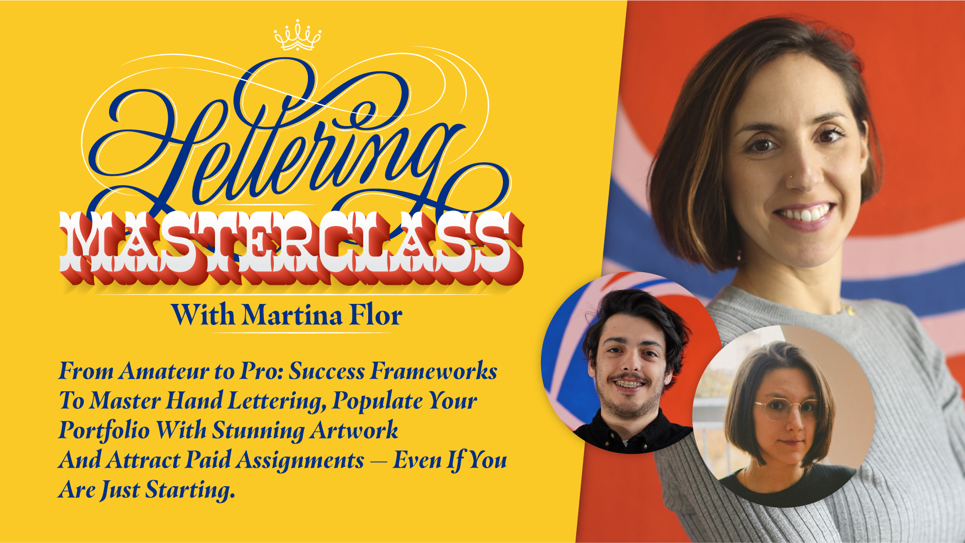
Join my upcoming Lettering Masterclass called "From Amateur to Pro: Success Frameworks To Master Hand Lettering, Populate Your Portfolio With Stunning Artwork And Attract Paid Assignments — Even If You Are Just Starting".
WHAT YOU'LL LEARN:
➵ The one thing you need to gain momentum and finally go from amateur to pro. ➵ The mistakes that all aspiring lettering artists need to avoid – if seeing real progress in your work is what you want ➵ The one thing that differentiates successful lettering artists from the rest of mortals – and that you can have too! ➵ The one thing that is stunting your growth and that you will find by joining this masterclass. ➵ How to put your foot in the door as a professional lettering artist and turn your passion into your livelihood. ➵ And more…
When: FEBRUARY 21st AT 09:00 AM ET. If you cannot make it, don't worry. I'll send you a replay right afterwards, but you’ve to sign up in order to receive it.
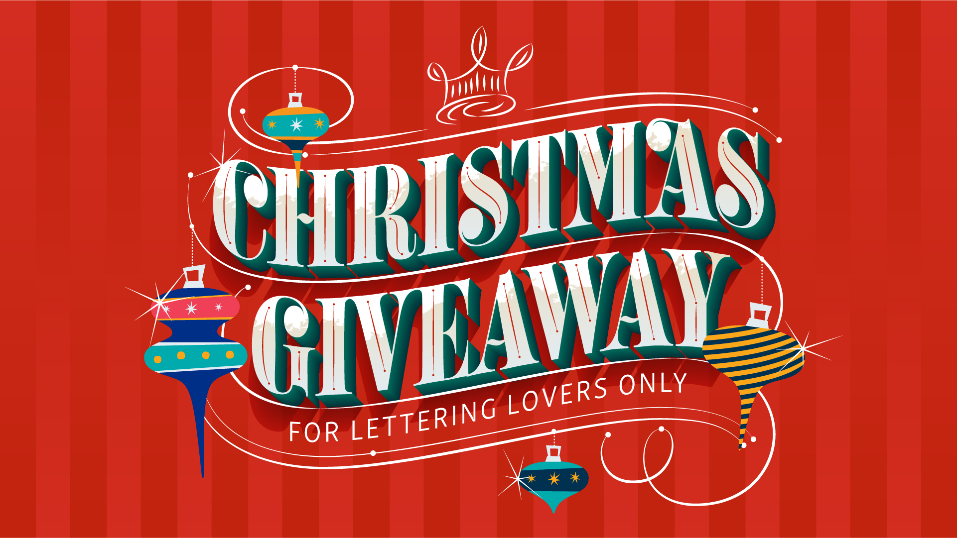
Christmas is just around the corner and I want to help you start the year making one big step toward achieving your lettering goals.
My team and I have put together a giveaway with a prize that is worth over $1000!
We are giving a prize to 3 lucky winners.
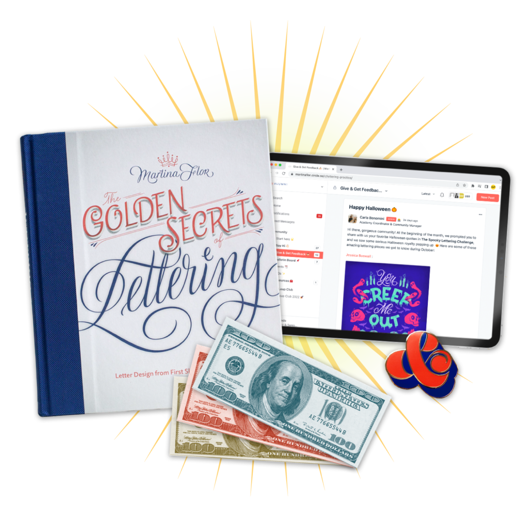
🏆This is what the prize includes: - a signed copy of my book The Golden Secrets Of Lettering - 6 months access to our private community of future hand-lettering masters - a Wonderampersand Pin - $300 in free trainings.
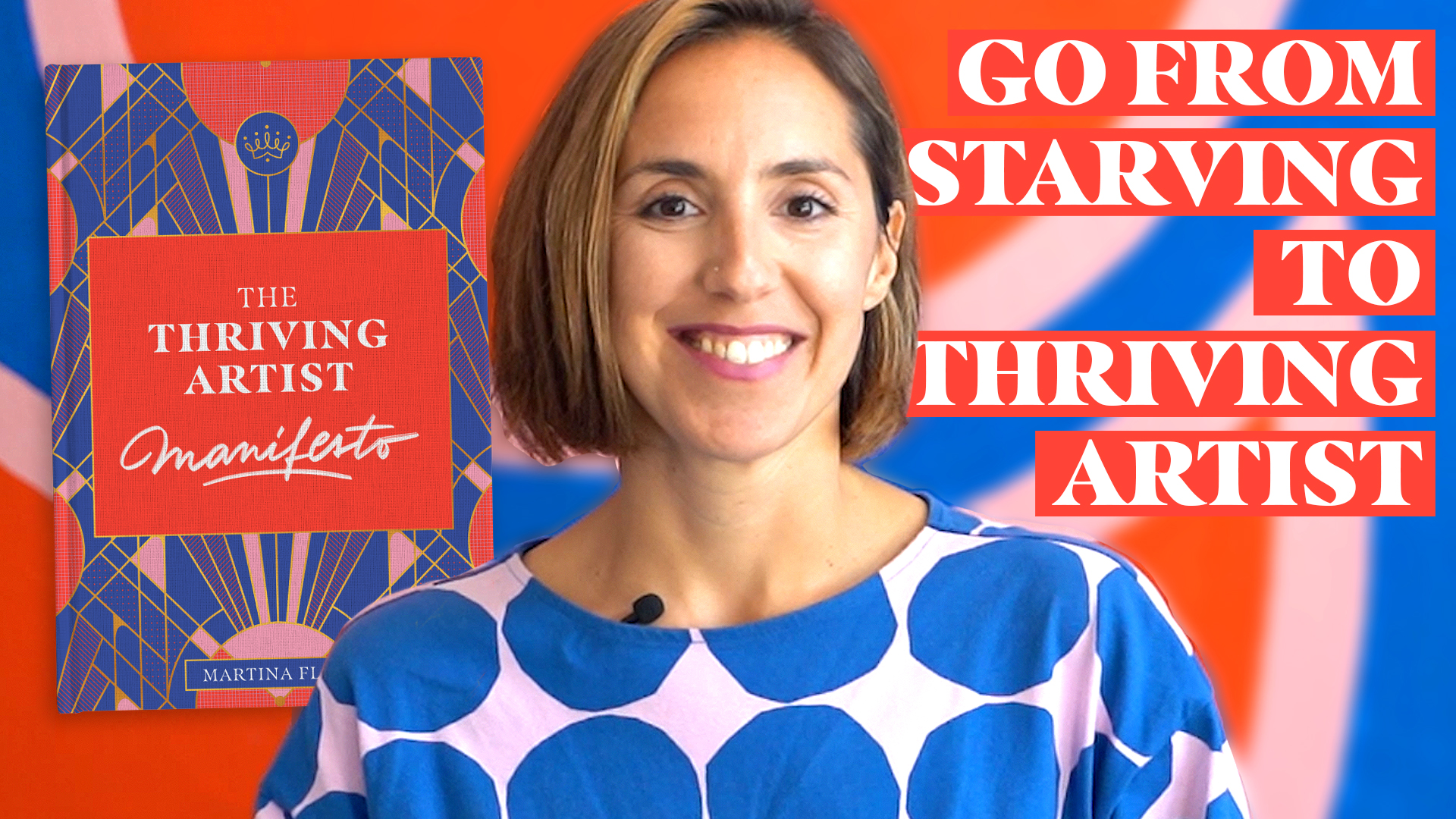
Successful artists all have one thing in common – they’ve trained their mind and didn’t let old narratives get in the way of achieving their goals.
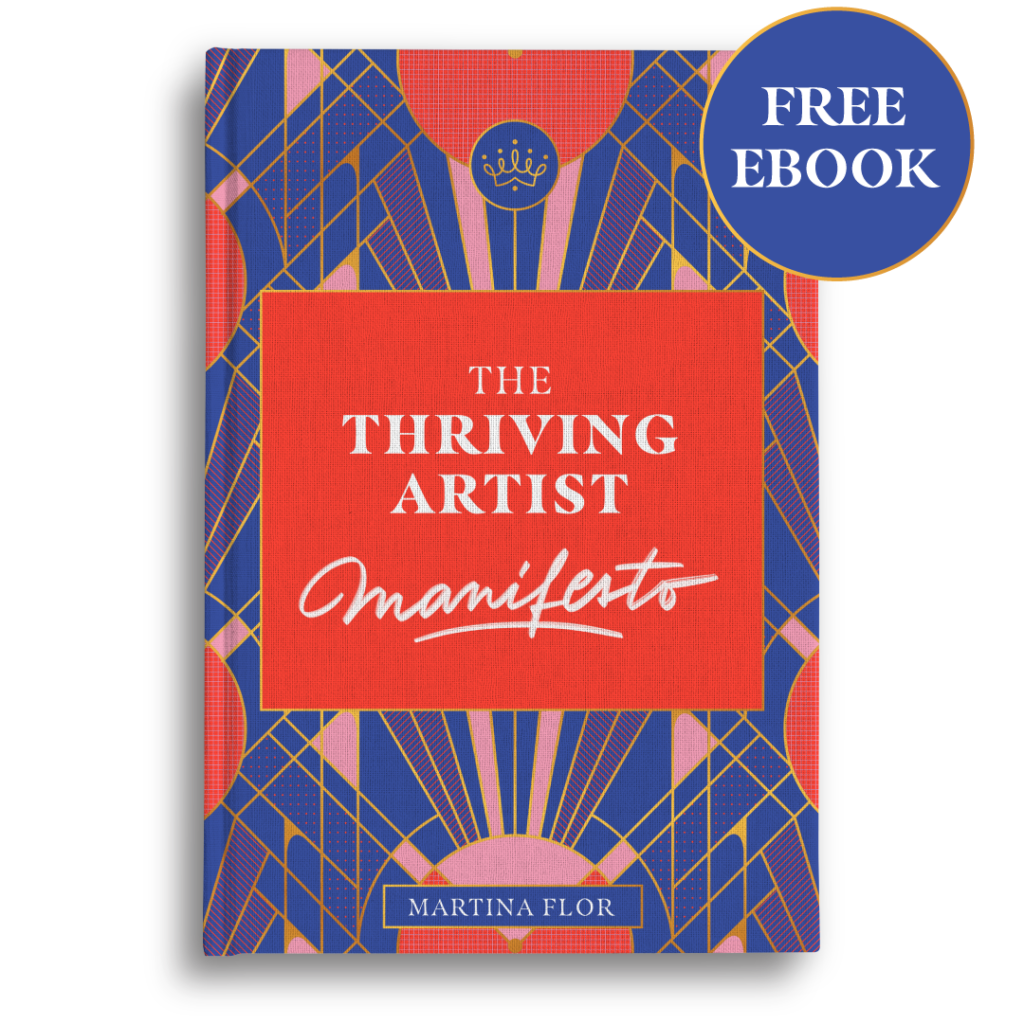
At the core of getting what you want is your mind-set and you can start training it today. Download The Thriving Artist Manifesto and join hundreds of other artists that are already thriving with their art. What you'll get: ✔️ The Thriving Artist Manifesto Ebook with 12 declarations ✔️ Poster to keep the declarations visible at all times and live up to the principles of a thriving artist. ✔️ Social media templates to commit to your thriving artist goals. I know that this ebook is going to leave a mark on you, go and download it for FREE clicking right here.
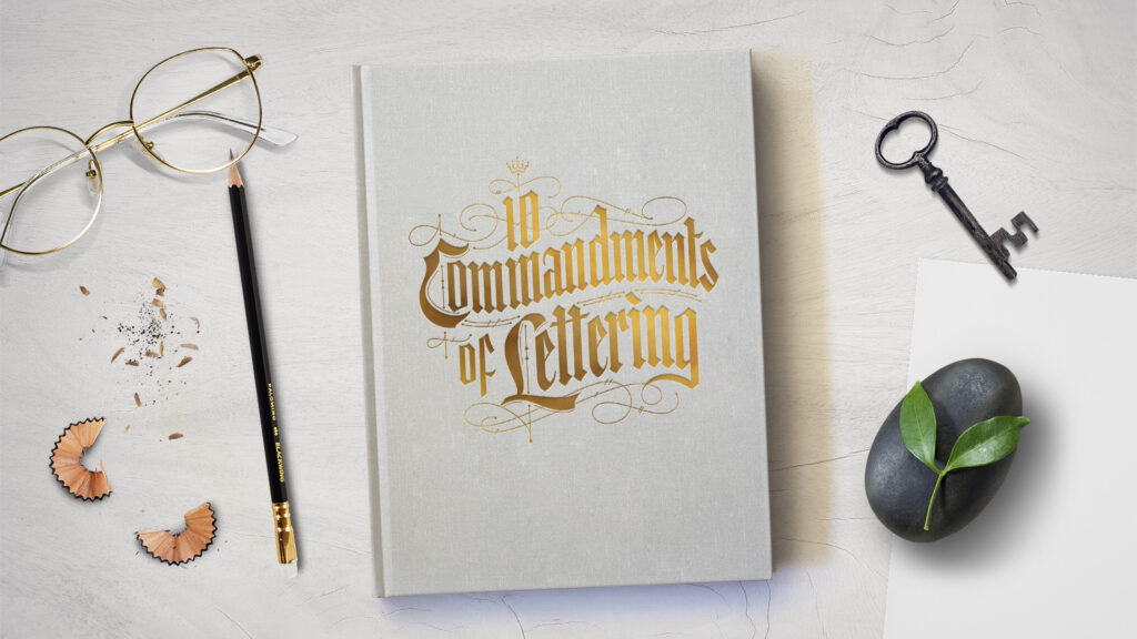
You'll agree with me when I say that your skills are not the only thing that defines you as an artist—your values, your story, mindset and your personal approach to the craft are part of it as well. I've been wanting to take this to the next level and create a training that combines all of it. And my team and I finally made it happen. I'm thrilled to announce a special registration window for FREE to my new mini-training called 10 Commandments of Lettering 💫 Click here to enroll for FREE and get instant access. In this mini-course, you’ll learn essential principles to guide you along your lettering journey. A witty and unconventional look at the rules of letterforms, how to use them...and break them. I know that this training is going to leave a mark on you. Because it won't only educate you but also make you think about HOW you create art, but most importantly WHY you do it.
And you might be wondering why I created this course... Here's why—writing my first book The Golden Secrets of Lettering was perhaps the most impactful thing I've done so far. It was printed in six languages and sold over 50.000 copies & counting. This book was a game-changer for many lettering artists and creatives, so much so that people call it The bible of lettering. This makes me feel extremely proud but also qualified enough to take things a step further and draft these 10 commandments. If we have a bible of lettering, we should also have a few ground rules, don't you think? The end of the year is a great time to make your letter-making resolutions. Adhering to the ten points laid down in this training is a great start.
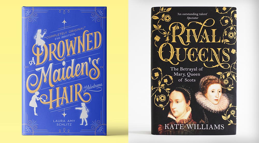
It's time for me to be completely honest with you: letters alone cannot do it all. Lettering is all about storytelling. By drawing your letters in a certain style or with a certain shape you can evoke memories in the reader's mind and trigger feelings. This is the superpower of what we do! But the truth is that commonly you need more than *just letters* to achieve that. Let me tell you why. I usually like to illustrate the power of storytelling with lettering by using book covers. With just one image, a book cover sums up a story and speaks to its readers. Look how different these stories are just by looking at their covers:
The shape of the letters plays a big role in telling these stories and connecting with the target reader, but without the decorative elements, frames and flourishes the piece would fall apart. Letters alone are just not making it. It took me years to realize how much decorative elements could support my work and help me not only create better compositions but also tell stories that would truly fascinate the reader and be memorable. My learning curve was slow and shaky. I used to be afraid of messing it all up, so I'd add one decorative element or a flourish here and there. I played it safe.
Furthermore, I was spending ridiculous amounts of time in the process!
Throughout time (and tons of trial and error tbh), I developed systems and techniques to add decoration and flourishing to my designs in a way that allows me to add a whole new level of finishing in a time-efficient manner. Now, why would you need to learn how to add decoration and flourishing to your designs?
they allow you to solve composition problems. Aleluya!
they can help you add an exquisite level of detail to your designs.
they can create that sense of wonder around your lettering.
they reinforce your storytelling.
they add a whole new level of finishing to the piece.
they allow you to create a personal mark that goes beyond the shape of the letters.
There's a reason why many professional artists dedicate time to incorporate decorative elements into their designs. Because I know that many lettering artists struggle with this, I created a training called Stunning Lettering. Click here to read more details.
In this intensive session I'll show you how to master the art of flourishing, decorate your lettering from the inside out, and bring a sense of wonder to your designs that delight your clients & peers. I'm looking forward to seeing you there!
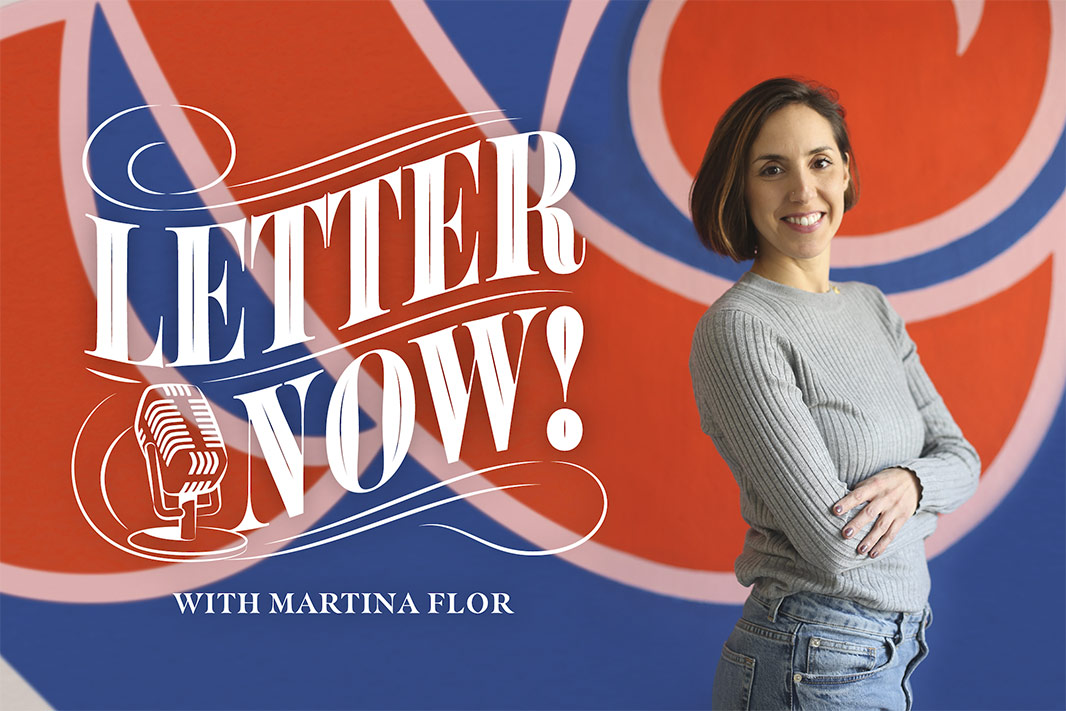
Say hello to Letter Now! a podcast where we nurture the hand-lettering masters of tomorrow, today.
Now, this is not another interview podcast, but it is one where my guests and I will be there to answer your questions and speak about the topics that are currently occupying your mind. This is not about us, it’s about YOU.
I named this podcast Letter Now! because I knew that if I’d put that magic word in there, “letter”, I was going to bring in all of you letter lovers and typography aficionados. But here’s my honest disclosure: this podcast won’t be about typography and letterforms. At least not exclusively.
It will be about something a lot more profound. I believe that your craft or whatever you love doing is a portal to discover more about yourself, and this is what this space will be all about.
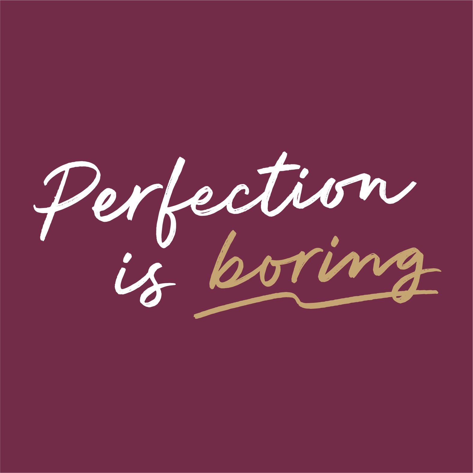
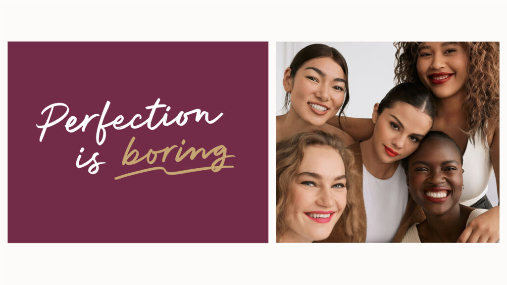
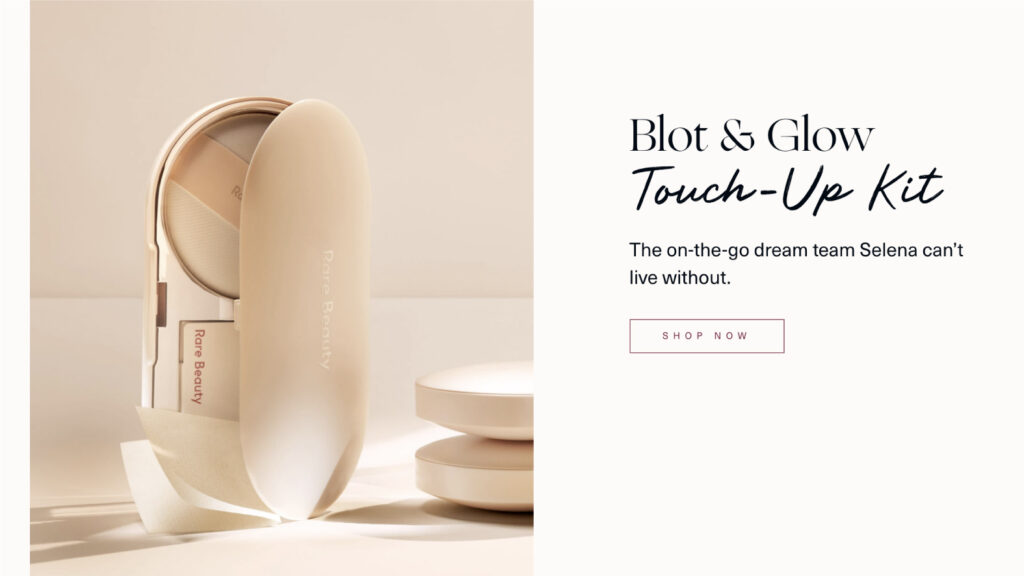
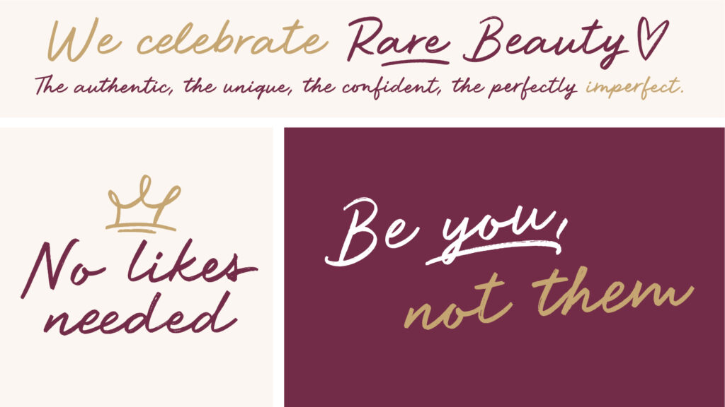
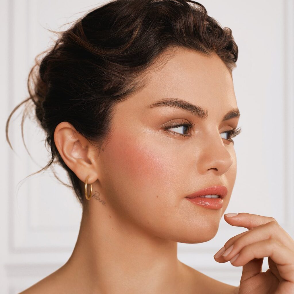
Excited to finally be able to share this project with you. Say hello to Rare Script, a handwritten custom typeface created for Rare Beauty, the new cosmetic brand by Selena Gomez.
We were commissioned by Established NY to develop a spontaneous, fresh-looking handwritten typeface. The design embraced the imperfections of handwriting and aligned with the vision of the brand: celebrating the imperfect beauty in people (loved that concept!).
Funny fact, this is how my handwriting looks when I try to make it look tidy and relaxed 😁 What do you think about it?
On top of this, almost accidentally we spotted a little tattoo under Selena's ear written with the typeface that we have designed!
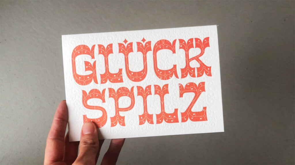
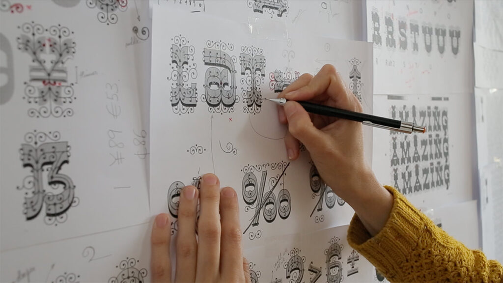
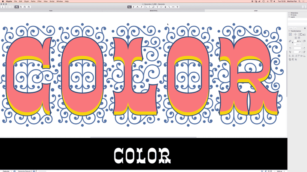
Creating Decorata Typeface was perhaps one of the most rewarding things I’ve done so far. Decorata was inspired by one of my lettering pieces. One of the great things about lettering is that it’s unique and created for an specific use. One of the downsides of it, is that those shapes will no longer be used!
I remember creating that lettering for a postcard (it was a client assignment). It was new, and I liked it, I hand’t done anything like this before! However it was used in that ONE postcard that was sold in a few retail stores in Berlin.
Years later, I decided to make better use of those shapes, and started working on the typeface. I expanded the words into an alphabet and started working on each one of the layers. A time later, Decorata was born. Writing the first words with your font is a feeling that is hard to transmit. It’s just pretty awesome.
Nowadays I use Decorata for client projects, but also, other designers are able to use it as well. So, cheers for that.
Thank you Neil from Positype forever, for helping me bring this project to life.
A few months ago, I sent an email around asking if you have ever thought of designing a font and what was holding you back. I received hundreds of replies saying YES! If you were one of them, you're not alone! I also asked what is it that makes you postpone this project and these were some of the reasons: ☛ "I don't know the tools to actually make it into a font" ☛ "learning new software already seems overwhelming" ☛ "studying font making is too expensive and time-consuming" ☛ "creating an alphabet with figures, punctuation, and so on seems overly complicated" ☛ "I feel very unconfident about doing it without support"
I replied to each one of these e-mails and took notes to incorporate these comments into my upcoming course in display type Letter&Co. However, I want to take the time to address one very important question right here, right now. I feel this cannot wait any other minute:
"Why creating a new font if the world already has so many of them?"
I've heard this question many times and I think it's time to give my personal answer to it. I believe that there shouldn't be anything holding us back from creating new work and exploring new creative playground, so I decided to create a video to answer this question directly. Let me know what you think in the comments below.
The Lettering Crit - Display Type Special was so much fun and there are so many takeaways to share with you. Everyone was truly engaged with giving feedback to the projects, and I'm sure that the authors of the selected projects Derek Munn, Prateek Bisht, Jamie Otelsberg, and Ana Michel got tons of information to continue working on their projects. If you missed it, here's a replay.
Here are the main takeaways of this session:
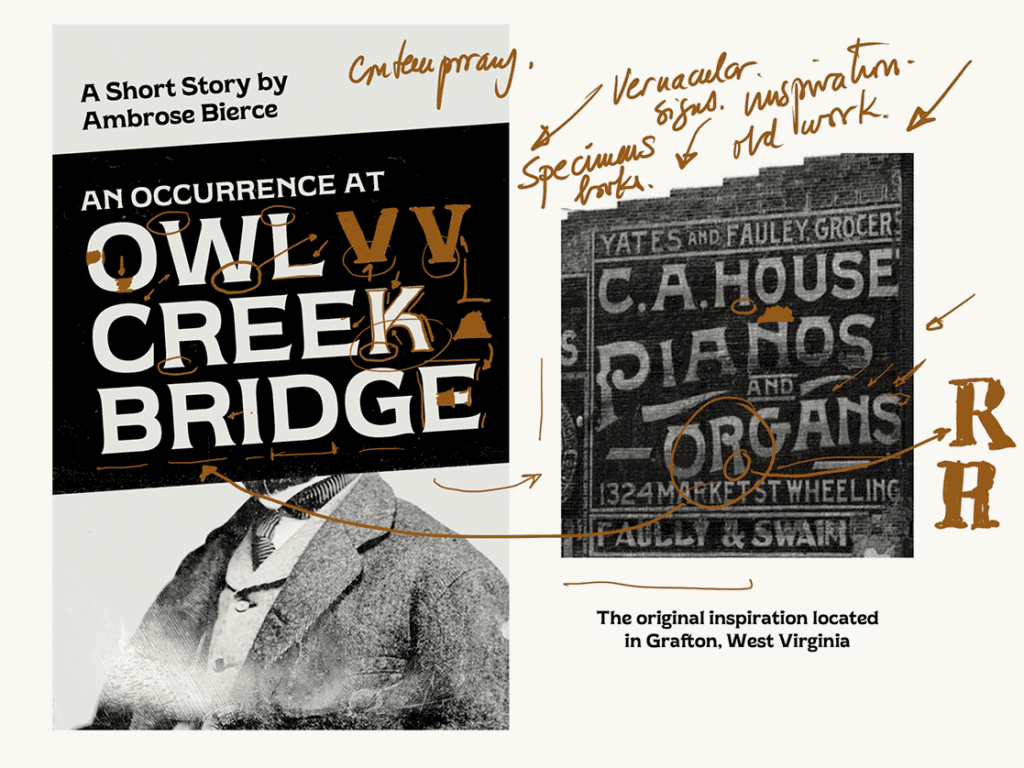
1. Finding inspiration in vernacular typography: old signs, old specimen books and graphic material can be a great starting point for a unique typeface (although not the only one). Beware, you'll probably have to redesign/reshape many letterforms to make them suitable to a contemporary eye. That's when your unique perspective plays an important role!
Derek's project is a good example of using and repurposing vernacular typography for a modern typeface.
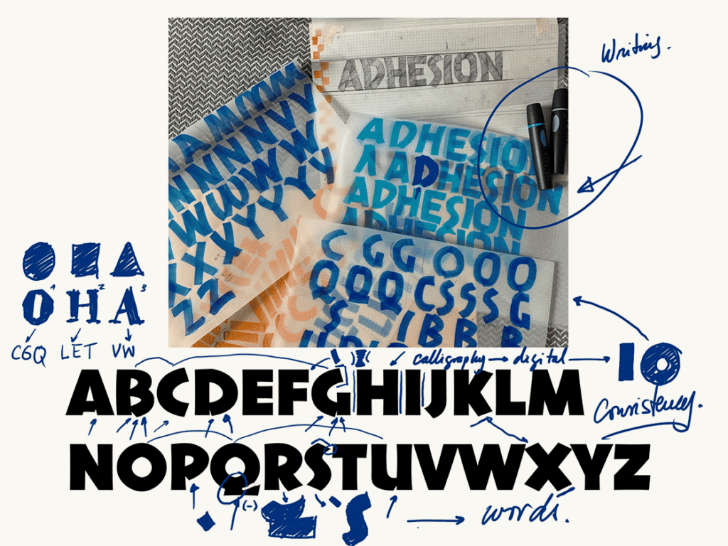
2. Use your calligraphy: calligraphy as the mother of all letterforms can help you easily stick to a style and achieve consistency within your alphabet. Why? Because the letters will be all essentially "written" by the same hand.
Jamie's project translates her calligraphy into an alphabet, and through that process she keeps consistency all along.
3. Expand your alphabet: find the mother shapes and use them to inform the shape of other letters. Your mother shapes are those that look like a rectangle, a circle or a triangle. For instance, your "O" is the mother shape for your C, Q, and gives you tons of information to draw your D or P. Can you see why? Of course! All these letters share a rounded shape.
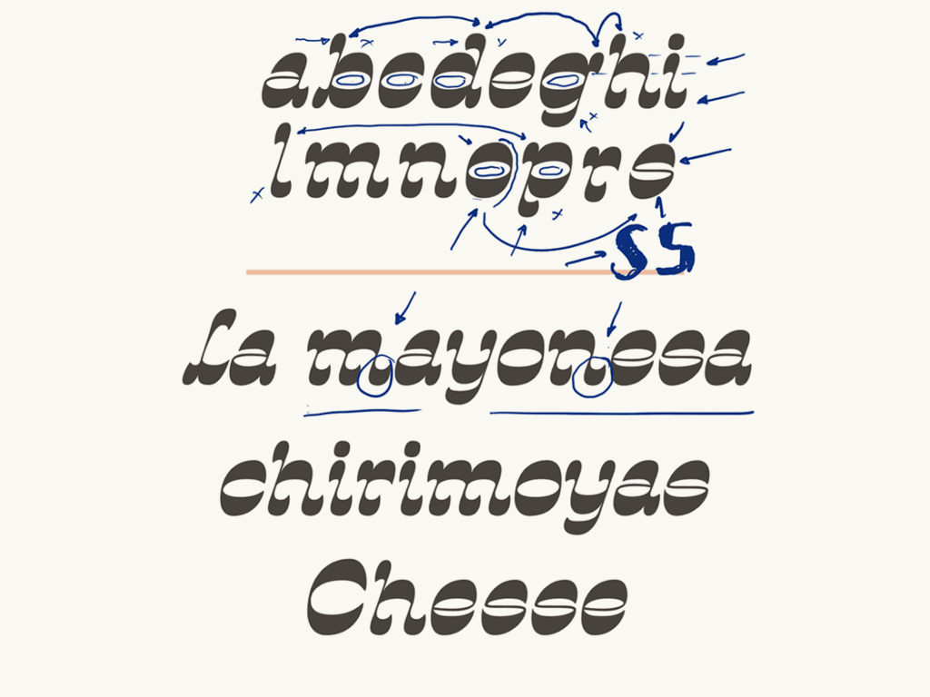
4. Consistency: make a couple of strong decisions and try to apply them consistently in all letter shapes. That decision could be making your letters high contrast, or inverting the contrast completely or using bananas to build your letterforms. Everything is possible as long as it's possible on all letters.
Ana's project stands through using one strong decision that applies to all letters. In this case, she's using inverted contrast for all shapes.
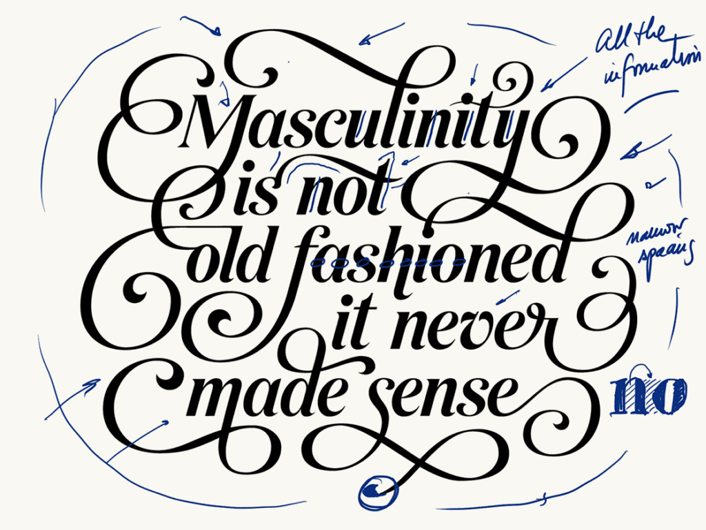
5. Design words: move onto setting words with your letters sooner than later. Remember that designing letters is not about the isolated shape itself, but about how well that interacts with all the rest.
6. Mind the gap (spacing): designing letters is not only about the substance (the black part) but also about the space around them. Remember the rule of thumb for finding your ideal spacing—the space within the letters should be similar to the space between the letters.
Prateek's project displays consistency through a consistent slant, contrast, and weight. Also, the spacing is considered as part of the design.
Give it up for Anna, Prateek, Jamie and Derek for their great work! 👏🏻👏🏻👏🏻👏🏻👏🏻 I'll be delivering more tips to create typefaces in the next few weeks, and on September 4 I'll be opening registration for Letter&Co. my latest course about display type design. Cannot wait!