May 26, 2020

Tell better stories with your lettering.

I cannot help to find awkward when someone says that lettering is “the new thing” because it has been there for a long while. You just have to raise your head and look around you.

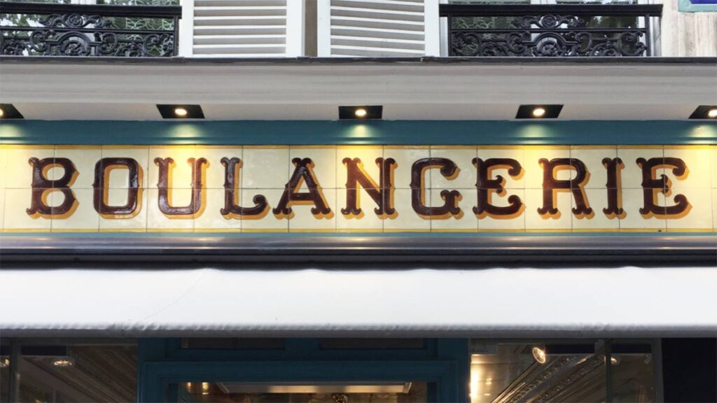
This is the storefront of a bakery in Paris. By looking at this sign I can almost picture the bread they make. I can picture the baker, using THE BEST ingredients, and working carefully on each bun, in a beautifully equipped kitchen. The baker surely puts a lot of attention into making that bread, just like the artisan that made this sign, who carefully painted every single stroke and serif of that lettering. By looking at the sign you just want to eat that bread, that has to taste delicious—and I can say, it did taste delicious. That is the power of lettering, to communicate much more than the literal meaning of the words.

Why lettering styles matter.

As letters embody the message you want to convey, their shape is essential for your storytelling. Do you want your lettering to look friendly? Cold? Should your lettering look official, or throw you back to a specific time in history? The text and its shape are counterparts of the message.

I remember that when I started creating lettering I was fascinated with brush letter shapes. All I wanted to draw was brush lettering, and so I did. I drew tons of brush lettering pieces and became pretty good at it. It didn;t take me long to realize that brush lettering was not always a good fit for the message. I felt stuck there, like missing the words to tell new stories.

Brush lettering by Martina Flor

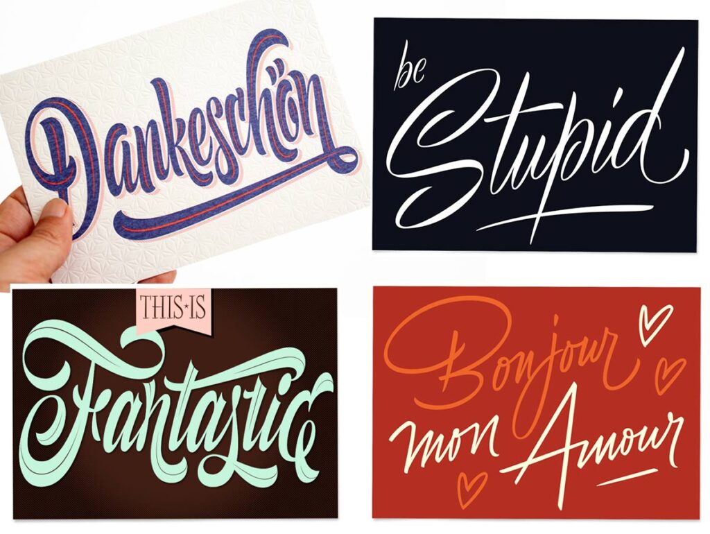
I realized that in order to become a better lettering artist, I needed to be able to approach other styles confidently. Furthermore, this would make my work more interesting for me! The great thing about being able to approach several styles is that you can get to tell more powerful stories. Aditionally, it enables you to approach different kinds of briefs, which comes in handy when you are looking to work commercially as a lettering artist.

Approaching a new style is always challenging, simply because it lays outside of our comfort zone. Understanding the principles of the style, its origins, and foundations can provide you a very good starting point.


Approaching a new lettering style.

These are essentially the steps to approach a new lettering style:
1- Research to find our where its origins are. Pro tip: it usually derives from a calligraphic style.
2- Try to understand the logic behind it and the underlying rules.
3- Customise it and make it your own.

Let’s take for instance black letter—Oh yes, I know that you might be wondering “could you please start with an easier one?”. Well, let’s knock the most challenging one and get it over with!

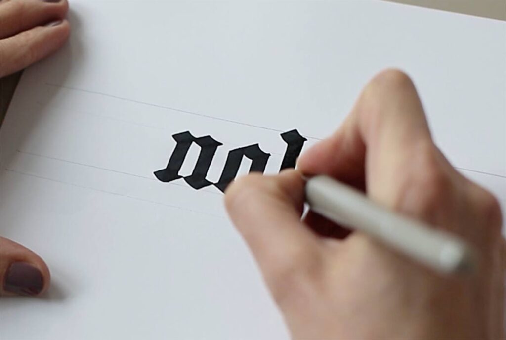
Blackletter is an umbrella term for a group of calligraphic styles widely used throughout Europe between the twelfth and seventeenth centuries. It is executed with a broad nib and is defined by its angular and narrow ductus. In broad-nib calligraphy, the tool is moved downwards and sideways in order to draw the letter shapes. It is held at a constant angle so that the nib always points in the same direction. The unchanging angle is what makes the thick and thin strokes consistent.

The curves of the letter shapes are often “broken” through abrupt changes in direction. As a result, the script has a dark, heavy look, and its basic shapes—especially those of capital letters—often deviate from Latin letterforms. Understanding how this calligraphic style works is essential to create blackletter lettering.

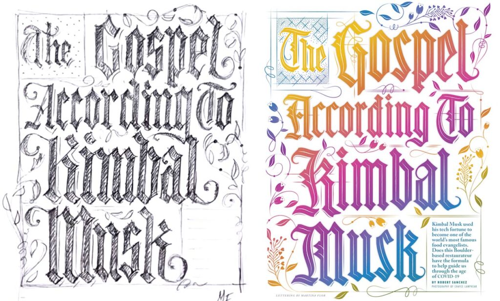
Here’s an example of a recent assignment I made for American magazine 5280. The art director approached me to “create an illuminated manuscript inspired lettering”. I didn’t need to write the headline with a broad nib here but knowing the foundations of blackletters calligraphy made the whole difference. Afterward, I could go ahead and customize the stroke endings and the shape of the flourishes. These cannot be achieved with a calligraphic tool and is what sets lettering apart from calligraphy: you can always draw it in a unique way.

Does this mean that you need to master black letter calligraphy to be able to create a black letter inspired lettering? Of course not! But understanding calligraphy is surely a necessary part of creating lettering. A smart lettering artist always has a set of calligraphic tools at hand!.

BTW, today is my birthday. I'm happy to celebrate it with you in this little space! 🎉

Sign up for more lettering tips delivered to your inbox:

May 20, 2020

The power of observation: 5 things you can look at to improve your lettering piece.

done is beautiful sketch

The power of observation is a tool that enables you to analyze shapes and evaluate your design. If you know where to look, the best solutions for a successful lettering piece can often be found in your drawing.

How can you hone your observation skills? The first step is to start looking at lettering with a critical attitude. This involves trying to discover the logic behind it. You can analyze a typographic piece from its overall picture to its particularities—in other words, from the obvious (the big picture) to the not so obvious (the details). The details can help you understand the larger whole. Let's look at some things you can pay attention to when trying to spot the flaws in your lettering piece. 


The style

In letter design, there are various (if not thousands!) of styles. However, we can separate them into two big umbrella categories: the roman letter shapes and the script or cursive letter shapes. If the letters fall in the first category, you can start asking questions: Do they have serifs? What is their shape? Are they all looking more or less similar?. If otherwise, the letters fall in the category of cursive letterforms, you will pay attention to other things like the rhythm and the connections, for instance, and you will check if those are consistent throughout the piece.

PRO TIP: Consistency is a widely used concept in lettering design. It refers to a few design decisions that are applied repeatedly in all the elements.  


The slant

The slant is the degree to which letters are slanted and this is easy to spot when you look at a lettering piece. Are letters sitting upright? Are letters leaning to one side? And if so, are they all leaning as much, or is there any "rebel letter" that is just following its own rules?  If so, go ahead and fix that!

 slant letter design theorySlant: The degree to which the letters are slanted.

PRO TIP: To spot the overall slant of your letters focus on the straight stems rather than the rounded shapes.  


The spacing

The spacing is a big topic in letter design. Drawing letters is not only about the letter itself (the substance) but also about the space around them. We will just start by saying that spacing is the space between your letters. So, now, try not to focus on any specific pairs of letters, but rather keep an eye on the overall picture: do you see a "whole" or "blank" somewhere? Is there any pair of letters where the space looks bigger than in other pairs? Pay special attention to letters like A, V, or T, as they normally cause trouble due to the nature of their shape.

PRO TIP: consider making your capital T and your capital L narrower to avoid spacing problems. 

Spacing: the space between the letters.


The rounded shapes

The rounded shapes are those shapes that are based on a circle or oval, for instance, the O, the C, the Q. If your letters are lowercase, you'll find that letters like the e and d also fall in this category. Because of their curves, they are easy to spot, and therefore is easy to compare them and analyze their features: are they all as wide? Are they rounded or oval? Go ahead and try to make them look like they belong to the same family.

rounded letter lettering design theory

Rounded capital letter shapes.

PRO TIP: if you're drawing a script lettering piece, you'll find a lot more rounded shapes. No worries, is the nature of that specific style. 


The strokes

Your letters are probably made of strokes that are thin and others that are thick, the big question here is: are they always the same? But wait, put that ruler down! It is not about their exact width, but about their optical width. Go ahead and adjust the strokes that look too thin or too thick. 

PRO TIP: strokes need to look the same, not necessarily be mathematically equal. Trust your eyes!

Optical adjustment: drawing letters has few to do with mathematics. For instance, rounded strokes need to be thicker in order to look equally wide than straight strokes.


The easiest way to train your observation skills is by studying the lettering you find around you. You can do it while you ride the bus or walk your dog. First, identify the design’s overall shape. For example, you can ask yourself why a certain street sign was designed in a particular way and what connotations and qualities the sign is trying to convey. Are these letters “friendly” or “serious”? Are they modern or traditional? Is the sign expressing softness or rigidity? How are its letters shaped in order to give that expression? It is helpful to think about whom the sign targets and which set of letterforms and elements it uses to talk to its intended audience.

Furthermore, try to find room for improvement: Is there any gap in the design? Are there any alternative shapes for individual letters that could work better? Below is one of my favorite signs in Berlin. Is there something that you really like about it? Is there anything you'll do differently? Feel free to comment below! 

Babylon Berlin

This sign is located in the facade of Babylon Berlin, opened in 1929 as one of the last silent movie cinemas. 

Sign up for more lettering tips delivered to your inbox:

April 28, 2020

Subscribe to our Lettering Tips newsletter!

Lettering Tips Newsletter

Sign up for weekly Lettering Tips!

Hey there,

my name is Martina Flor and I'm a lettering artist, author & teacher, and since 2010, I've helped illustrators, designers and makers turn letter design into their new creative playground. I am excited to introduce my Lettering Tips to the world!

So what are Lettering Tips all about?

I've started weekly series to share what I learned along my way as a lettering artist. Sometimes it maybe in the form of tips to draw letters, or an insiders trick, or an anecdote that might inspire you to grab your pencil and draw. Ill do my absolute best to share useful, relevant and fresh tips and inspiration with you each week. 

Sometimes, I might mention one of my projects, products or classes, but always with the intention of sharing with you what I do, and making you a part of it.

BTW Instagram is my favourite platform to connect on, and I often share, sketches and process, and other things that I don't share anywhere else. Follow me there! @martinaflor.

Join thousands of readers in this community and upgrade your lettering skills! If you're as excited as I am, send this link to a friend, so they can subscribe too. 

Sparrstraße 20,
13353 Berlin, Germany (by appointment only)
+49 (0) 30 33877574 

Sparrstraße 20,
13353 Berlin, Germany (by appointment only)
+49 (0) 30 33877574 

Sparrstraße 20,
13353 Berlin, Germany (by appointment only)
+49 (0) 30 33877574 

Subscribe to the Lettering Tips newsletter and other important updates!


Liability Disclamer 

©2019 Studio Martina Flor. All rights reserved.


 ©2019 Studio Martina Flor. All rights reserved.