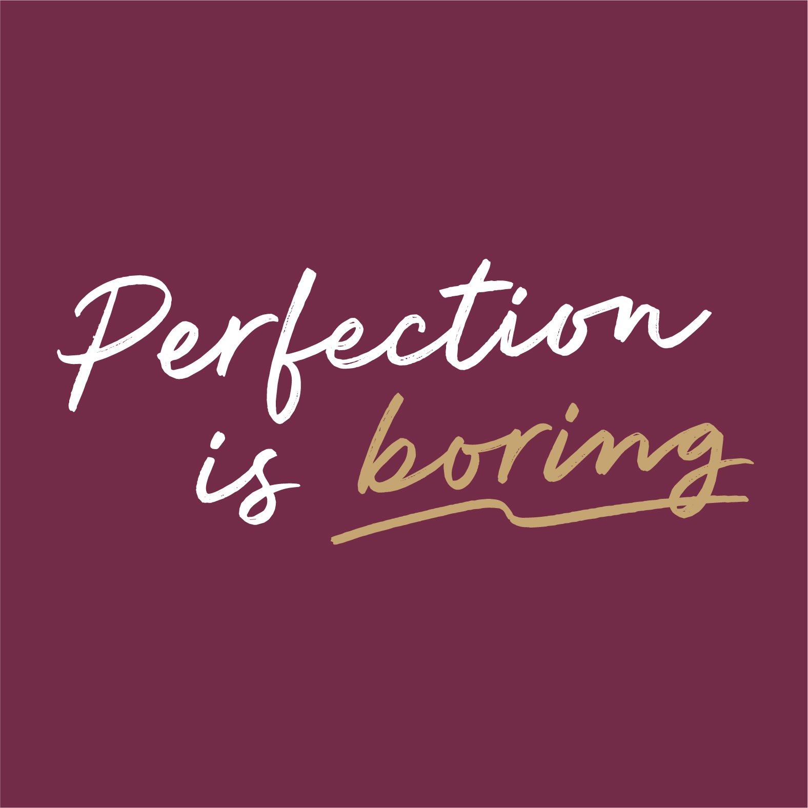
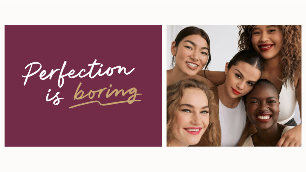
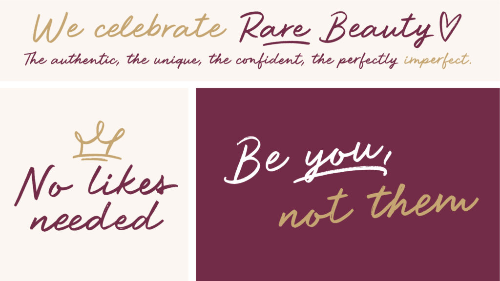
Excited to finally be able to share this project with you. Say hello to Rare Script, a handwritten custom typeface created for Rare Beauty, the new cosmetic brand by Selena Gomez.
We were commissioned by Established NY to develop a spontaneous, fresh-looking handwritten typeface. The design embraced the imperfections of handwriting and aligned with the vision of the brand: celebrating the imperfect beauty in people (loved that concept!).
Funny fact, this is how my handwriting looks when I try to make it look tidy and relaxed 😁 What do you think about it?
On top of this, almost accidentally we spotted a little tattoo under Selena's ear written with the typeface that we have designed!
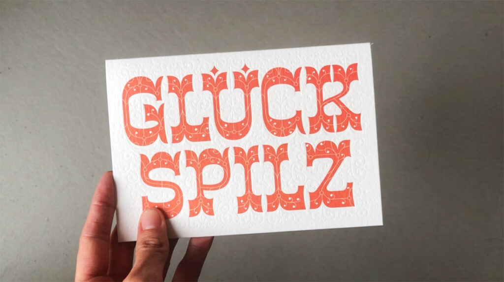
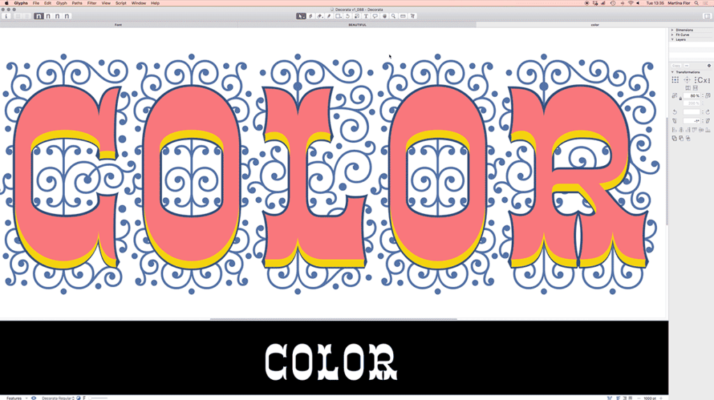
Creating Decorata Typeface was perhaps one of the most rewarding things I’ve done so far. Decorata was inspired by one of my lettering pieces. One of the great things about lettering is that it’s unique and created for an specific use. One of the downsides of it, is that those shapes will no longer be used!
I remember creating that lettering for a postcard (it was a client assignment). It was new, and I liked it, I hand’t done anything like this before! However it was used in that ONE postcard that was sold in a few retail stores in Berlin.
Years later, I decided to make better use of those shapes, and started working on the typeface. I expanded the words into an alphabet and started working on each one of the layers. A time later, Decorata was born. Writing the first words with your font is a feeling that is hard to transmit. It’s just pretty awesome.
Nowadays I use Decorata for client projects, but also, other designers are able to use it as well. So, cheers for that.
Thank you Neil from Positype forever, for helping me bring this project to life.
The Lettering Crit - Display Type Special was so much fun and there are so many takeaways to share with you. Everyone was truly engaged with giving feedback to the projects, and I'm sure that the authors of the selected projects Derek Munn, Prateek Bisht, Jamie Otelsberg, and Ana Michel got tons of information to continue working on their projects. If you missed it, here's a replay.
Here are the main takeaways of this session:
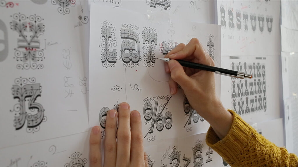
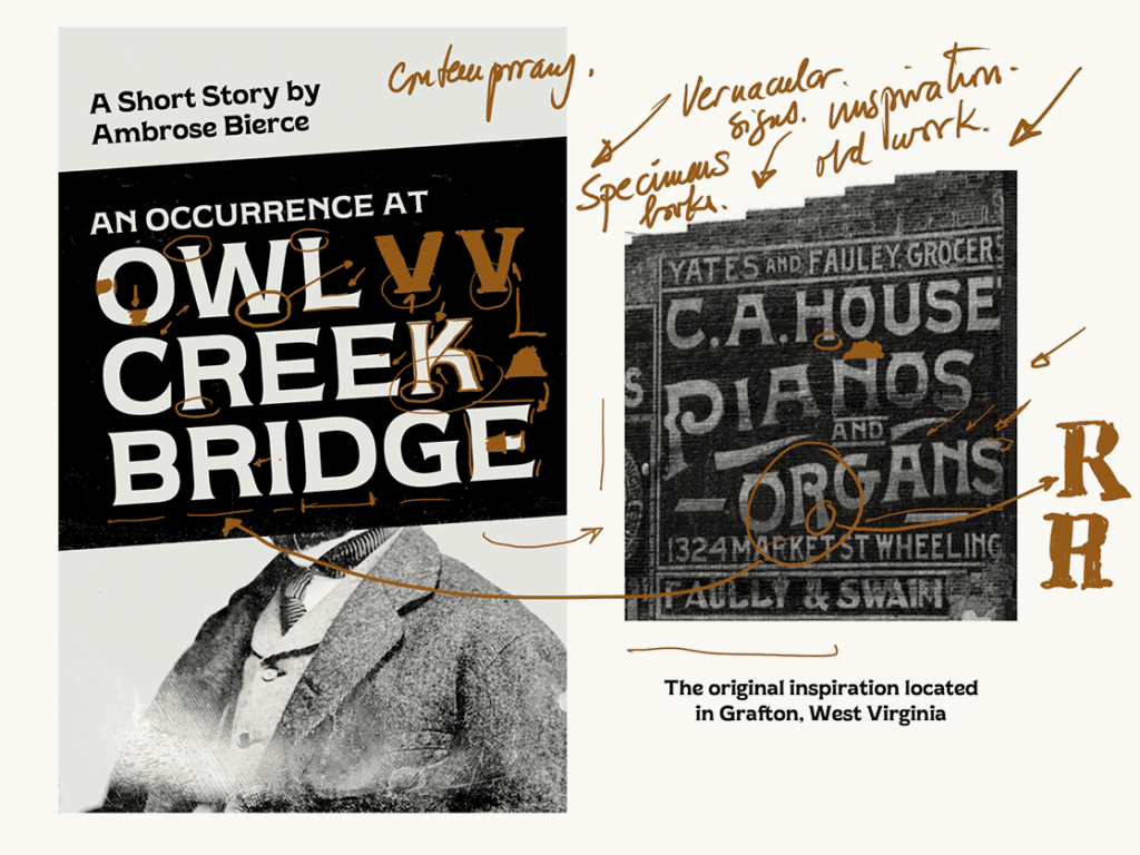
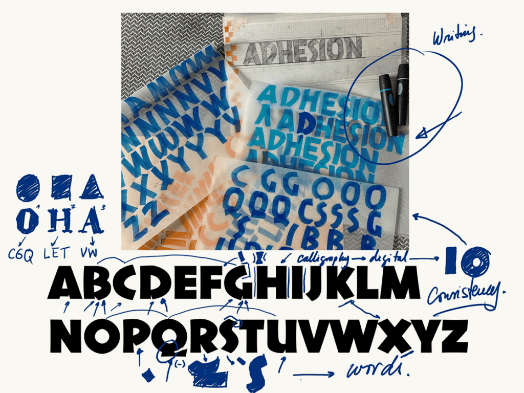
1. Finding inspiration in vernacular typography: old signs, old specimen books and graphic material can be a great starting point for a unique typeface (although not the only one). Beware, you'll probably have to redesign/reshape many letterforms to make them suitable to a contemporary eye. That's when your unique perspective plays an important role!
Derek's project is a good example of using and repurposing vernacular typography for a modern typeface.
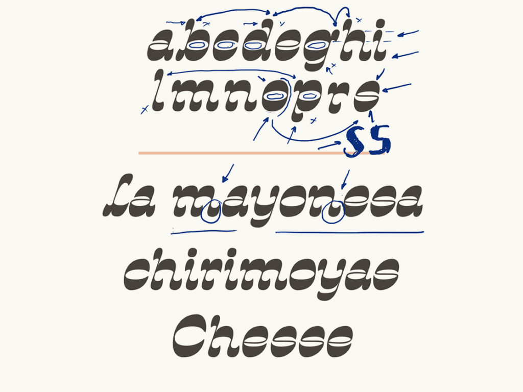
2. Use your calligraphy: calligraphy as the mother of all letterforms can help you easily stick to a style and achieve consistency within your alphabet. Why? Because the letters will be all essentially "written" by the same hand.
Jamie's project translates her calligraphy into an alphabet, and through that process she keeps consistency all along.
3. Expand your alphabet: find the mother shapes and use them to inform the shape of other letters. Your mother shapes are those that look like a rectangle, a circle or a triangle. For instance, your "O" is the mother shape for your C, Q, and gives you tons of information to draw your D or P. Can you see why? Of course! All these letters share a rounded shape.
4. Consistency: make a couple of strong decisions and try to apply them consistently in all letter shapes. That decision could be making your letters high contrast, or inverting the contrast completely or using bananas to build your letterforms. Everything is possible as long as it's possible on all letters.
Ana's project stands through using one strong decision that applies to all letters. In this case, she's using inverted contrast for all shapes.
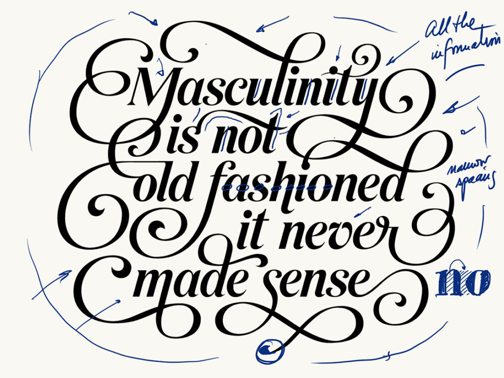
5. Design words: move onto setting words with your letters sooner than later. Remember that designing letters is not about the isolated shape itself, but about how well that interacts with all the rest.
6. Mind the gap (spacing): designing letters is not only about the substance (the black part) but also about the space around them. Remember the rule of thumb for finding your ideal spacing—the space within the letters should be similar to the space between the letters.
Prateek's project displays consistency through a consistent slant, contrast, and weight. Also, the spacing is considered as part of the design.
Give it up for Anna, Prateek, Jamie and Derek for their great work! 👏🏻👏🏻👏🏻👏🏻👏🏻 I'll be delivering more tips to create typefaces in the next few weeks, and on September 4 I'll be opening registration for Letter&Co. my latest course about display type design. Cannot wait!