May 20, 2020

The power of observation: 5 things you can look at to improve your lettering piece.

done is beautiful sketch

The power of observation is a tool that enables you to analyze shapes and evaluate your design. If you know where to look, the best solutions for a successful lettering piece can often be found in your drawing.

How can you hone your observation skills? The first step is to start looking at lettering with a critical attitude. This involves trying to discover the logic behind it. You can analyze a typographic piece from its overall picture to its particularities—in other words, from the obvious (the big picture) to the not so obvious (the details). The details can help you understand the larger whole. Let's look at some things you can pay attention to when trying to spot the flaws in your lettering piece. 


The style

In letter design, there are various (if not thousands!) of styles. However, we can separate them into two big umbrella categories: the roman letter shapes and the script or cursive letter shapes. If the letters fall in the first category, you can start asking questions: Do they have serifs? What is their shape? Are they all looking more or less similar?. If otherwise, the letters fall in the category of cursive letterforms, you will pay attention to other things like the rhythm and the connections, for instance, and you will check if those are consistent throughout the piece.

PRO TIP: Consistency is a widely used concept in lettering design. It refers to a few design decisions that are applied repeatedly in all the elements.  


The slant

The slant is the degree to which letters are slanted and this is easy to spot when you look at a lettering piece. Are letters sitting upright? Are letters leaning to one side? And if so, are they all leaning as much, or is there any "rebel letter" that is just following its own rules?  If so, go ahead and fix that!

 slant letter design theory
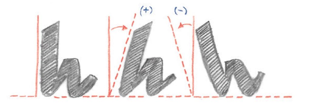
Slant: The degree to which the letters are slanted.

PRO TIP: To spot the overall slant of your letters focus on the straight stems rather than the rounded shapes.  


The spacing

The spacing is a big topic in letter design. Drawing letters is not only about the letter itself (the substance) but also about the space around them. We will just start by saying that spacing is the space between your letters. So, now, try not to focus on any specific pairs of letters, but rather keep an eye on the overall picture: do you see a "whole" or "blank" somewhere? Is there any pair of letters where the space looks bigger than in other pairs? Pay special attention to letters like A, V, or T, as they normally cause trouble due to the nature of their shape.

PRO TIP: consider making your capital T and your capital L narrower to avoid spacing problems. 

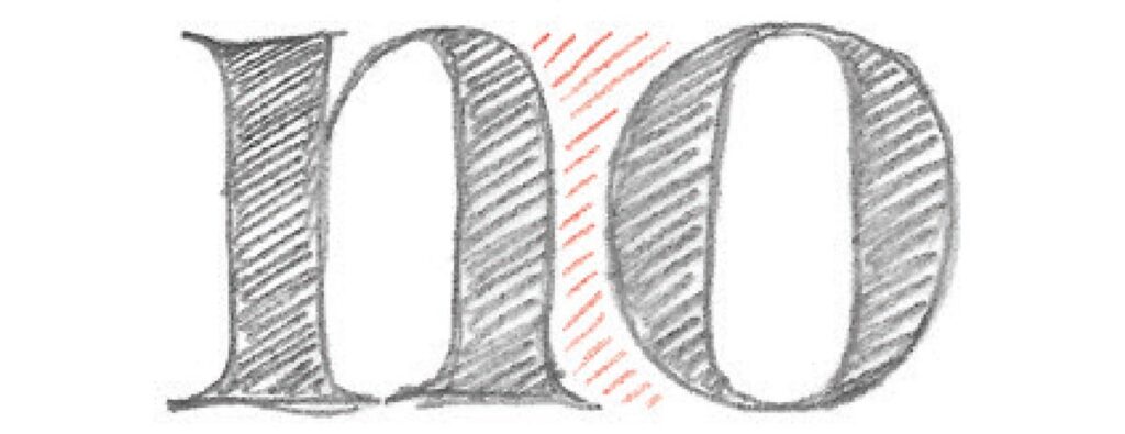
Spacing: the space between the letters.


The rounded shapes

The rounded shapes are those shapes that are based on a circle or oval, for instance, the O, the C, the Q. If your letters are lowercase, you'll find that letters like the e and d also fall in this category. Because of their curves, they are easy to spot, and therefore is easy to compare them and analyze their features: are they all as wide? Are they rounded or oval? Go ahead and try to make them look like they belong to the same family.

rounded letter lettering design theory

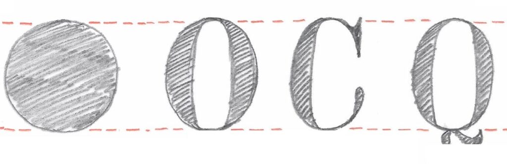
Rounded capital letter shapes.

PRO TIP: if you're drawing a script lettering piece, you'll find a lot more rounded shapes. No worries, is the nature of that specific style. 


The strokes

Your letters are probably made of strokes that are thin and others that are thick, the big question here is: are they always the same? But wait, put that ruler down! It is not about their exact width, but about their optical width. Go ahead and adjust the strokes that look too thin or too thick. 

PRO TIP: strokes need to look the same, not necessarily be mathematically equal. Trust your eyes!

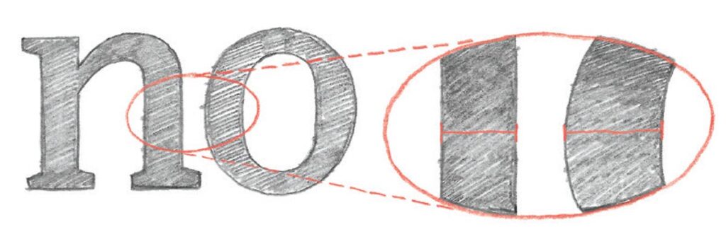
Optical adjustment: drawing letters has few to do with mathematics. For instance, rounded strokes need to be thicker in order to look equally wide than straight strokes.


The easiest way to train your observation skills is by studying the lettering you find around you. You can do it while you ride the bus or walk your dog. First, identify the design’s overall shape. For example, you can ask yourself why a certain street sign was designed in a particular way and what connotations and qualities the sign is trying to convey. Are these letters “friendly” or “serious”? Are they modern or traditional? Is the sign expressing softness or rigidity? How are its letters shaped in order to give that expression? It is helpful to think about whom the sign targets and which set of letterforms and elements it uses to talk to its intended audience.

Furthermore, try to find room for improvement: Is there any gap in the design? Are there any alternative shapes for individual letters that could work better? Below is one of my favorite signs in Berlin. Is there something that you really like about it? Is there anything you'll do differently? Feel free to comment below! 

Babylon Berlin

This sign is located in the facade of Babylon Berlin, opened in 1929 as one of the last silent movie cinemas. 

Sign up for more lettering tips delivered to your inbox:

April 28, 2020

Subscribe to our Lettering Tips newsletter!

Lettering Tips Newsletter

Sign up for weekly Lettering Tips!

Hey there,

my name is Martina Flor and I'm a lettering artist, author & teacher, and since 2010, I've helped illustrators, designers and makers turn letter design into their new creative playground. I am excited to introduce my Lettering Tips to the world!

So what are Lettering Tips all about?

I've started weekly series to share what I learned along my way as a lettering artist. Sometimes it maybe in the form of tips to draw letters, or an insiders trick, or an anecdote that might inspire you to grab your pencil and draw. Ill do my absolute best to share useful, relevant and fresh tips and inspiration with you each week. 

Sometimes, I might mention one of my projects, products or classes, but always with the intention of sharing with you what I do, and making you a part of it.

BTW Instagram is my favourite platform to connect on, and I often share, sketches and process, and other things that I don't share anywhere else. Follow me there! @martinaflor.

Join thousands of readers in this community and upgrade your lettering skills! If you're as excited as I am, send this link to a friend, so they can subscribe too. 

April 1, 2020

Making of A Song of Wraiths and Ruin

We were approached by American publishing house Harper Collins to design the book cover of A Song Of Wraiths And Ruin, the first in a fantasy duology inspired by West African folklore, from debut author Roseanne A. Brown. With art direction by Jessie Gang, the brief was to create a lettering piece that complemented the work of photography-based artist Twany Chatmon while finding inspirations on elements of African folk culture.

Finding the composition
Our process started with small thumbnail sketches to find a composition that would enhance the portrait of the main character.

Adding layers of embellishment
Decorative elements contributed to create a cohesive piece.

Finding inspiration in the image
The movement in the picture informed some of the features of the letter shapes.

Creating a cohesive composition
Some of the elements of the illustration were reworked as decorative elements within the lettering.

See the finished project here.

October 25, 2018

Meet Decorata – My new font family

Thrilled to introduce DECORATA, the first font release of many collaborations with Positype. I developed the shapes for this typeface from one of my lettering designs. Neil then took those designs and created an enormous eight-style font family where each style can work separately as well as in combination with the others.⠀

Thanks to my power team Josefina Anglada and Soraya Cremalle for all their help and work in this project. To Josh Farmer for finding the best words to describe it. And special thanks to Sebastian Hähnlein, who was interning at the studio at the time and worked extensively on the drawings. Cheers to Positype, for making the entire journey so fun and enjoyable.⠀

Go see Decorata in its full glory exclusively at My fonts.

Join thousands of readers in this community and upgrade your lettering skills! If you're as excited as I am, send this link to a friend, so they can subscribe too. 

August 8, 2018

Open Studio – July 2018

According to the our new tradition, on Sunday July 8th, I opened the doors of my studio for the second time. At the main room, old and new artwork were exhibited, including personal projects, commercial work, my book, products, and some sneak peaks of projects that are to come. In the seminar room, we exhibited the work of the 10 international attendees of this year's summer lettering seminar.

Once again, it was a pleasure to welcome designers and letter aficionados and share with them a part of the bulk of work I've done throughout these years. 

Read more

August 8, 2018

Summer Lettering Seminar – July 2018

In its second edition, I hosted a 3 days intensive seminar where attendees designed a piece of lettering from sketch to final color digital artwork. This year we welcomed attendees from France, Hungary, The United States, The Netherlands and Germany.

The seminar consists of theoretical and practical input within sessions of hands-on work. I’m permanently in place to provide guidance and comments to the attendees. Results were exhibited during our yearly open studio in Berlin. Here’s an overview of what happened:

DAY 1

It was 100% analog and all about sketching letters shapes, training our typographic eye and understanding the basics of letter design. I shared my work process and my approach to achieve more personal, unique results.

DAY 2

We polished the hand sketch and got it ready to start digitising. We used Adobe Illustrator to draw letter shapes with anchors points.

In the evening, we had a private guided tour to the Buchstabenmuseum, a museum that collects and exhibits pieces of rescued vernacular lettering pieces from all over Germany.

DAY 3

We continued polishing our vector drawing and some of us incorporated color and texture to the design. We displayed the entire process from hand sketch to digital drawing, and reviewed all projects.

ATTENDANTS INSIGHTS

"It was the most inspiring experience in my carrier. Thanks Martina and her amazing crew."

-

"Martina's motivation & knowledge is very fascinating, she is not only a marvellous handlettering artist but also an amazing teacher."


OPEN STUDIO

All results were exhibited at my open studio along with the studio work. The exhibition included personal projects, commercial work, my books, and products. I enjoyed speaking about what the studio has been up to in the last years and what’s coming next. If you want to know more about the Open Studio read the post I dedicated to the event following this link. 

December 21, 2017

What happened in 2017

In this post, I'm taking the chance look back and think about what happened this year at the studio: 2017 was truly exceptional.

Read more

August 9, 2017

Open Studio – July 2017

photoseminar

On Sunday, August 30th, I opened the doors of my studio for the first time. Old and new artwork were exhibited, including personal projects, commercial work, my book, and products. It was really interesting for me to put together a big part of my bulk of work throughout these years and to realize the progression of my art.

Read more

August 1, 2017

South American Speaking & Teaching Tour

170801SouthAmericanTour-MartinaFlor
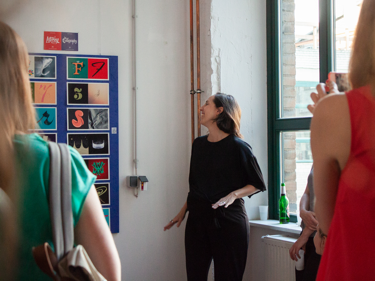
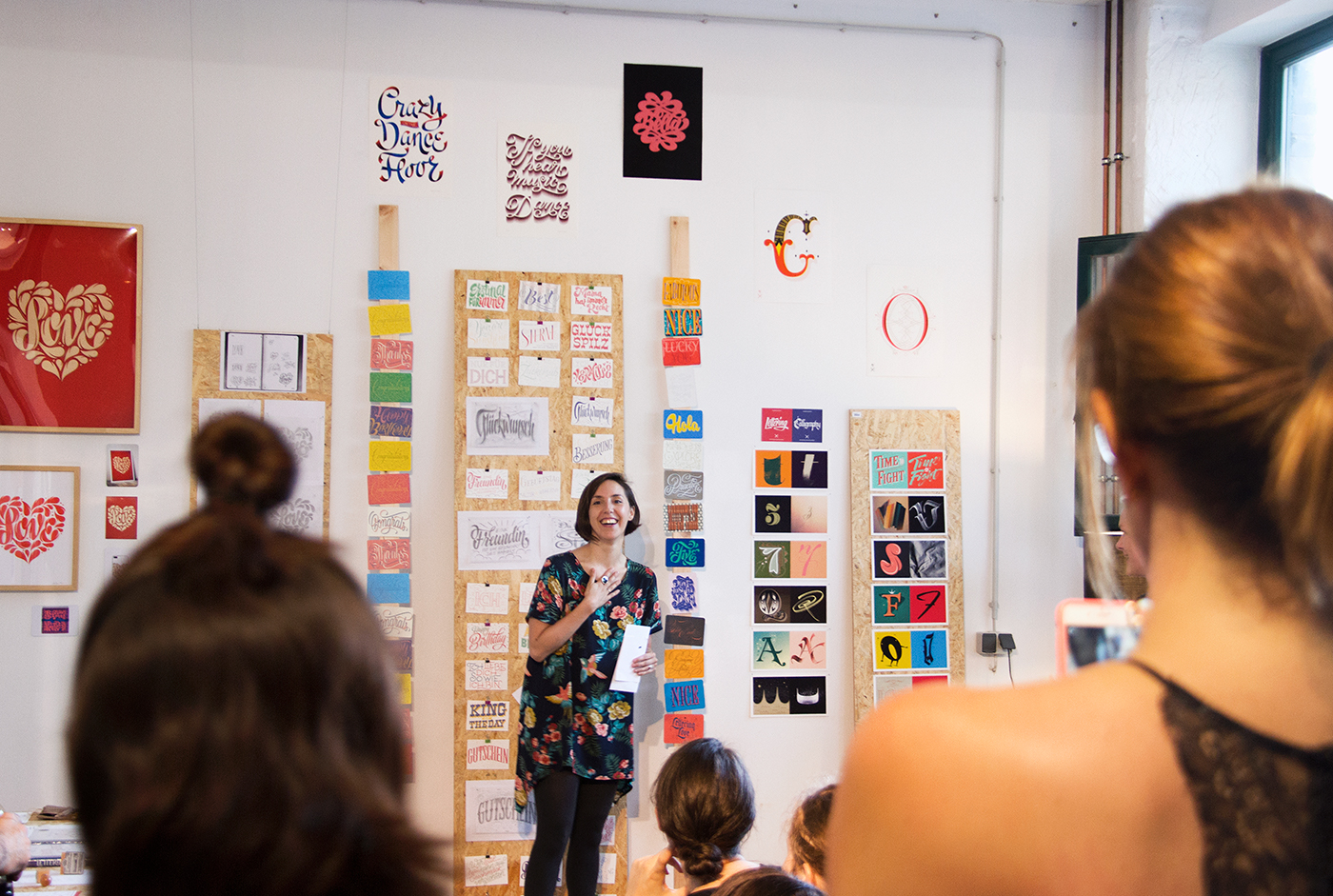
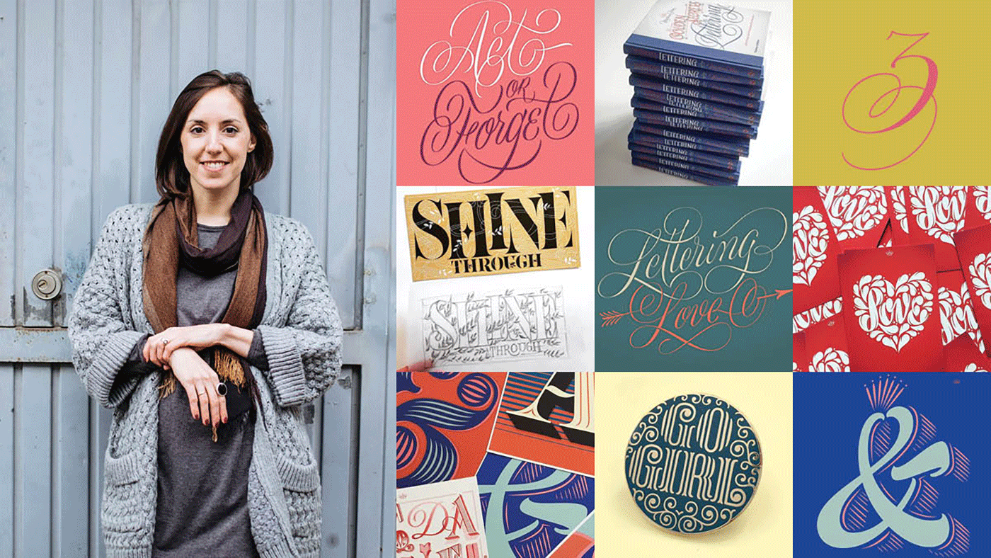
I'm thrilled to announce that I'll be visiting South America this August to talk and teach lettering workshops in several cities. I'll be bringing books and products form my shop with me, too!. The workshops are booked out but you can join me at the talks. Here's a list of workshops and talks per city.

Read more

July 24, 2017

Open Studio – Summer 2017

OpenStudioMartinaFlor-2017

I will be opening the doors of my studio on Sunday, July 30th, 2017.

Within a relaxed atmosphere, I will talk about the commercial work with lettering and the creative process of letter design from sketch to final art.


Read more

Sparrstraße 20,
13353 Berlin, Germany (by appointment only)
+49 (0) 30 33877574 

Sparrstraße 20,
13353 Berlin, Germany (by appointment only)
+49 (0) 30 33877574 

Sparrstraße 20,
13353 Berlin, Germany (by appointment only)
+49 (0) 30 33877574 

Subscribe to the Lettering Tips newsletter and other important updates!


Liability Disclamer 

©2019 Studio Martina Flor. All rights reserved.


 ©2019 Studio Martina Flor. All rights reserved.