HERE ARE THE SOLUTIONS
The Ultimate Lettering Quiz
Letterform Archive edition
The Ultimate Lettering Quiz Letterform Archive edition
Congratulations on completing the Quiz!

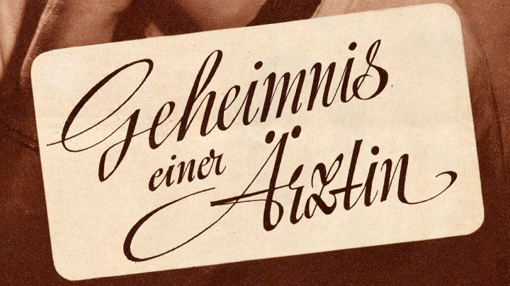
01: First things first, let’s test your calligraphic eye! What tool did the author use for this letter set?
Correct answer: Broad-nib brush. The shapes of these calligraphic letters correspond to a broad-nib translation tool with interrupted strokes.
➸ Learn more about this image.
02: If you could draw the word “Olympic” again, what would you improve?
Correct answer: Spacing and width. Some groups of letters, such as LYM, appear too tightly packed and narrow in comparison to the others.
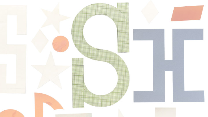
03: What does this S lack?
Correct answer: Optical adjustment. Matter went for symmetrical geometry here, so the “S” appears upside down, with its top part appearing larger than the bottom part. In most cases, to achieve optical balance, the top would be slightly smaller.
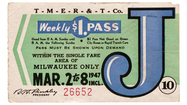
04: How do you call the rounded shape at the bottom of the letter J?
Correct answer: It is called a drop terminal. A drop terminal is a rounded shape found at the end of a stroke, contributing to both legibility and stylistic expression.
05: Script lettering is widely known for its roots in...
Correct answer: Handwriting. It draws inspiration from the organic forms of cursive writing with connected strokes between letters.
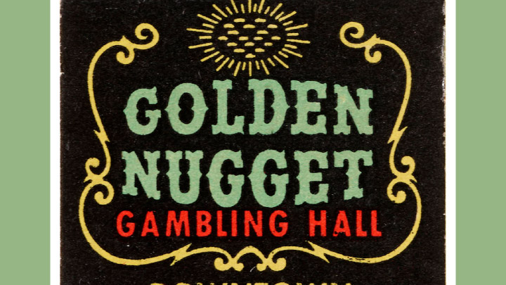
06: “Golden Nugget” has a particular kind of serif. What’s its name?
Correct answer: Bifurcated serifs. Their shape appear to be split or divided into two separate strokes or lines.
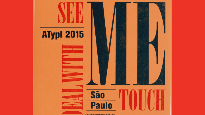
07: Look at this Letter Press poster design. What affirmations about these letters do you agree with?
Correct answer: The letters are condensed. Their proportions are narrow and tightly spaced.
08: Almost done! These letterforms have their roots in...
Correct answer: Pointed-nib calligraphy. The letters’ contrast shows signs of using an expanded nib calligraphy tool.
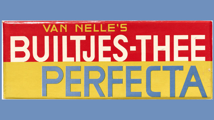
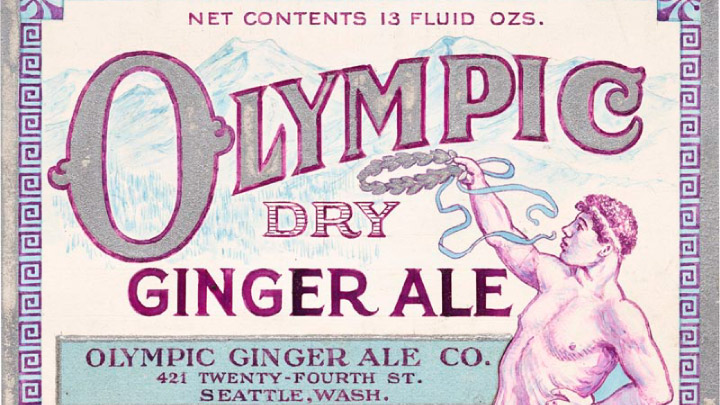
09: Lovely packaging, isn’t it? But what could be improved?
Correct answer: All of the above. Both spacing and width consistency can be adjusted. Some letters like the J and the T seem too narrow compared to the B. There is also lack of spacing consistency.
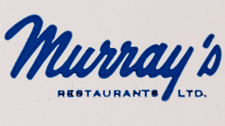
10: What lettering style is used in “Murray’s”?
Correct answer: Script. All letters are connected to each other continuously.
11: What decade does this lettering suggest?
Correct answer: 1960’s. The 60’s had a profound influence on psychedelic lettering, characterized by vibrant, flowing, and often distorted typography that reflected the era's counterculture.
➸ Learn more about this image.
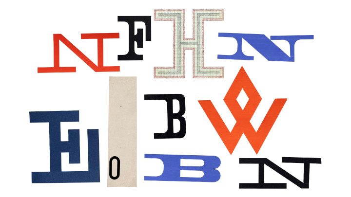
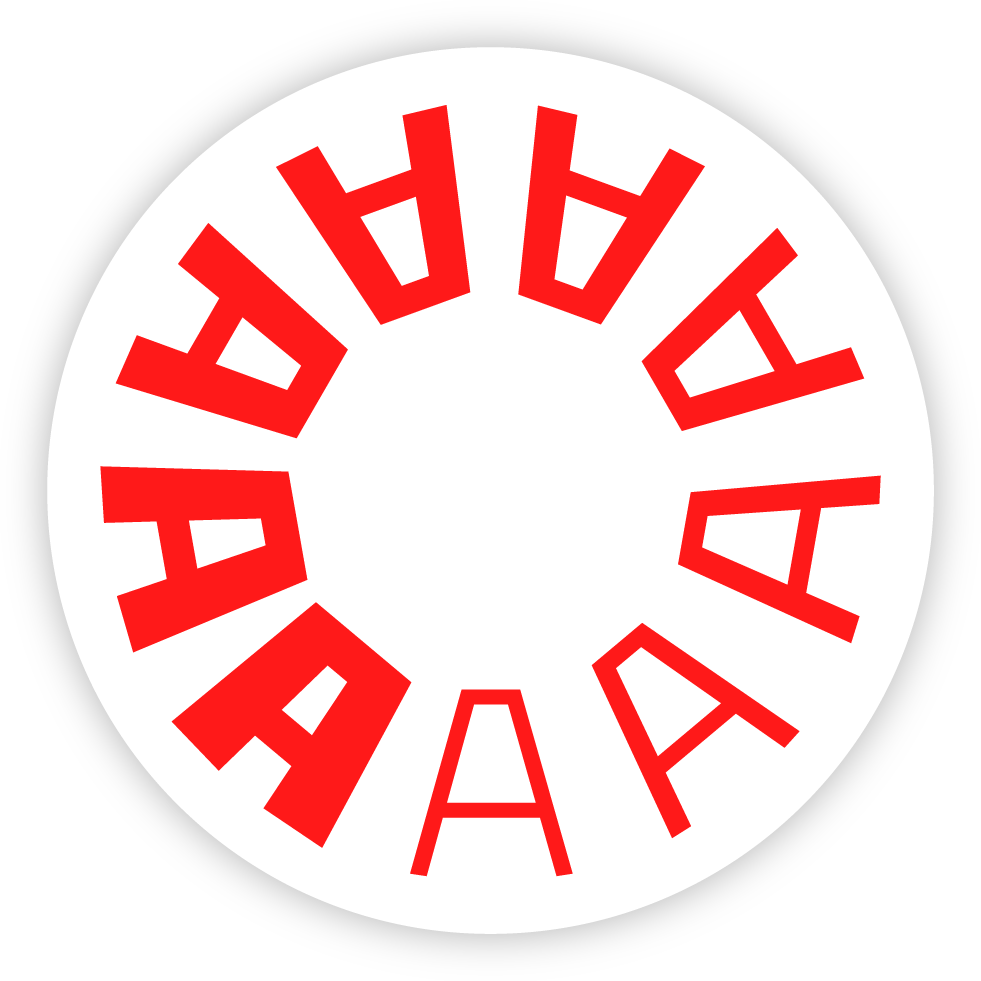
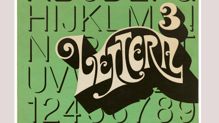
12: Last question! What do all these letters have in common?
Correct answer: They are all colorful. The only common feature is the mixture of letterforms from different styles, including serifs and sans serifs.
➸ Learn more about this image.
Your Next Step
The Ultimate Lettering Quiz Letterform Archive edition
Success Frameworks To Master Hand Lettering, Populate Your Portfolio With Stunning Artwork And Attract Paid Assignments — Even If You Are Just Starting
Success Frameworks To Master Hand Lettering, Populate Your Portfolio With Stunning Artwork And Attract Paid Assignments — Even If You Are Just Starting
IN THIS FREE LIVE MASTERCLASS YOU WILL LEARN:
➵ The one thing you need to gain momentum and finally go from amateur to pro.
➵ The mistakes that all aspiring lettering artists need to avoid – if seeing real progress in your work is what you want
➵ The one thing that differentiates successful lettering artists from the rest of mortals – and that you can have too!
➵ What’s stunting your growth and what you can do about it.
➵ How to put your foot in the door as a professional lettering artist and turn your passion into your livelihood.
➵ And more…
WHEN: STARTS OCTOBER 12, at 9 AM E.T. (3 PM CET)
If you cannot make it, don't worry. I'll send you replays after each session, but you’ve to sign up in order to receive them. This masterclass is free.