

DREMLEN BY JAMIE OTELSBERG
AWARDED WITH DISTINCTION • 2020 EDITION
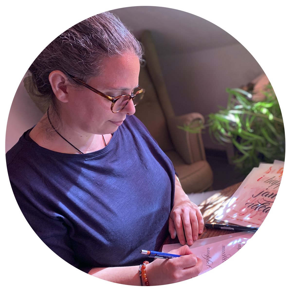
My name is Jamie Otelsberg and I'm a graphic designer from Los Angeles, CA. For as long as I can remember I have been deeply intrigued by letterforms, and have understood the profound role that typography plays in how we perceive the world around us. As a designer, I’ve taken it as my duty to learn as much as I can about type, so that I could make responsible design decisions in my work.
From a desire to learn more deeply about typography, I took an interest in learning lettering and calligraphy and enrolled myself in as many courses and workshops as I could find. I jumped at the opportunity to enroll in Martina Flor's multi-week Lettering Seminar that came out this year. It hadn't really occurred to me that I could learn to design type. I figured that I would never be able to develop the kind of specialized skills that type design would require. But the more I practiced lettering the more I became intrigued. I signed up for Letter&Co the first day registration opened.
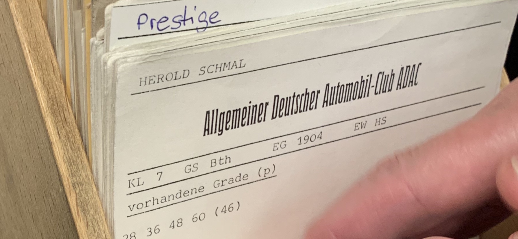
I got the opportunity to visit the Gutenberg Museum workshop in Mainz, Germany before Letter&Co started and I spotted a specimen that had Herold Schmal typeface printed on it. It really stood out to me so I took a picture of it and decided to check if a digital version was available. I found more than one digital revival of Herold, and I realized that the digital versions very much accentuated the art nouveau features of the typeface, which was cool, but I thought it might be nice to design a display typeface that is inspired by Herold Schmal’s proportions, but with a more rhythmic relationship between the forms and counterspaces. So that became the basis for my brief for Letter&Co.
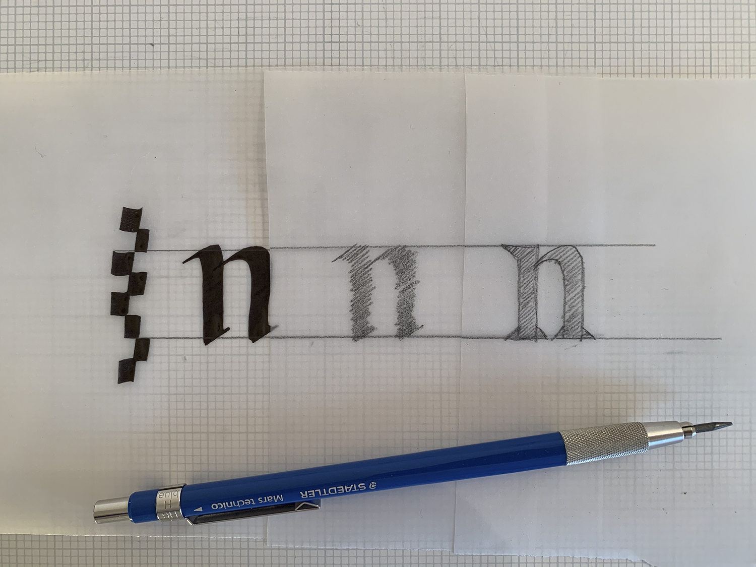
Once I decided on my brief, I started to sketch. Using calligraphy as the basis, I began to carve out my letterforms and really get an idea of where I want to go with this design. Martina’s “Sketching Letterforms” unit in Letter&Co really guided me strategically through this process.
I had some experience digitizing lettering in Illustrator, but was a beginner with Glyphs. It was an incredible opportunity to learn from Glyphs Expert and Letter&Co Instructor Rainer Scheichelbauer. We showed us how to construct our outlines methodically and gave us some incredible tips along the way on how to get the most out of Glyphs.
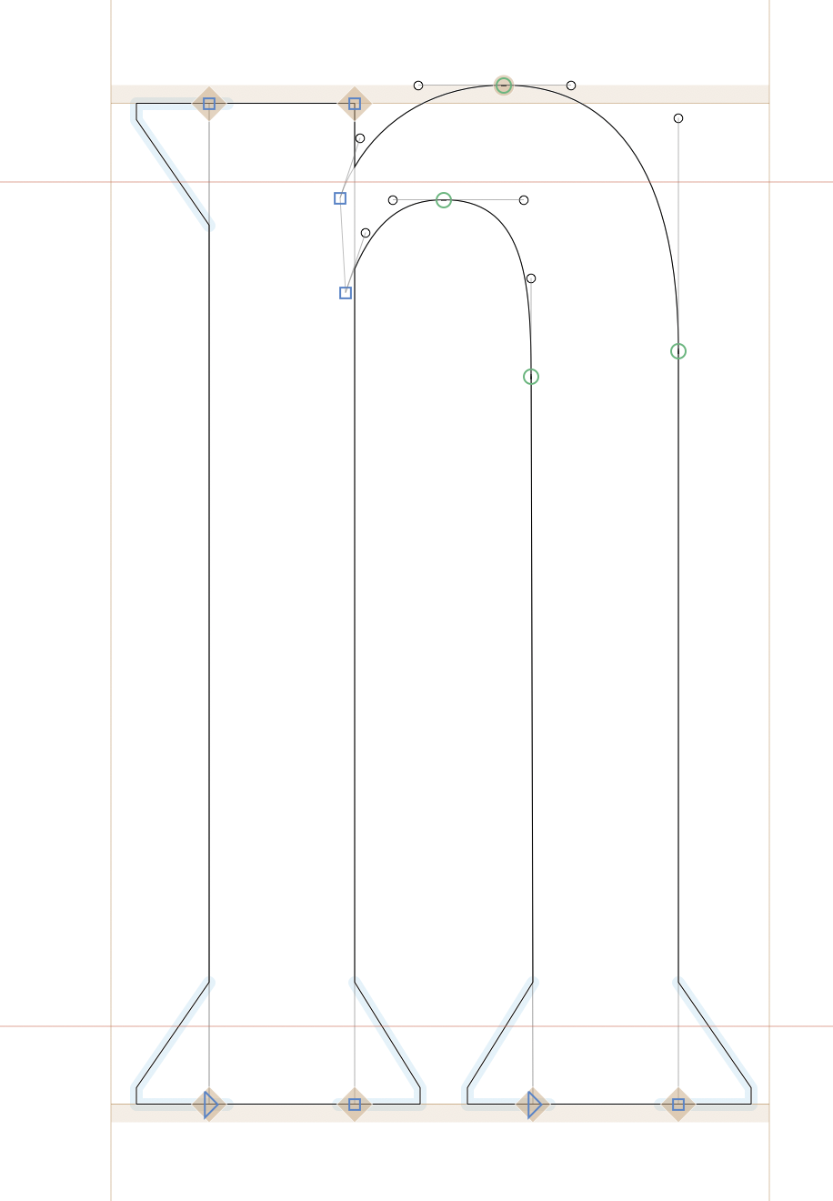
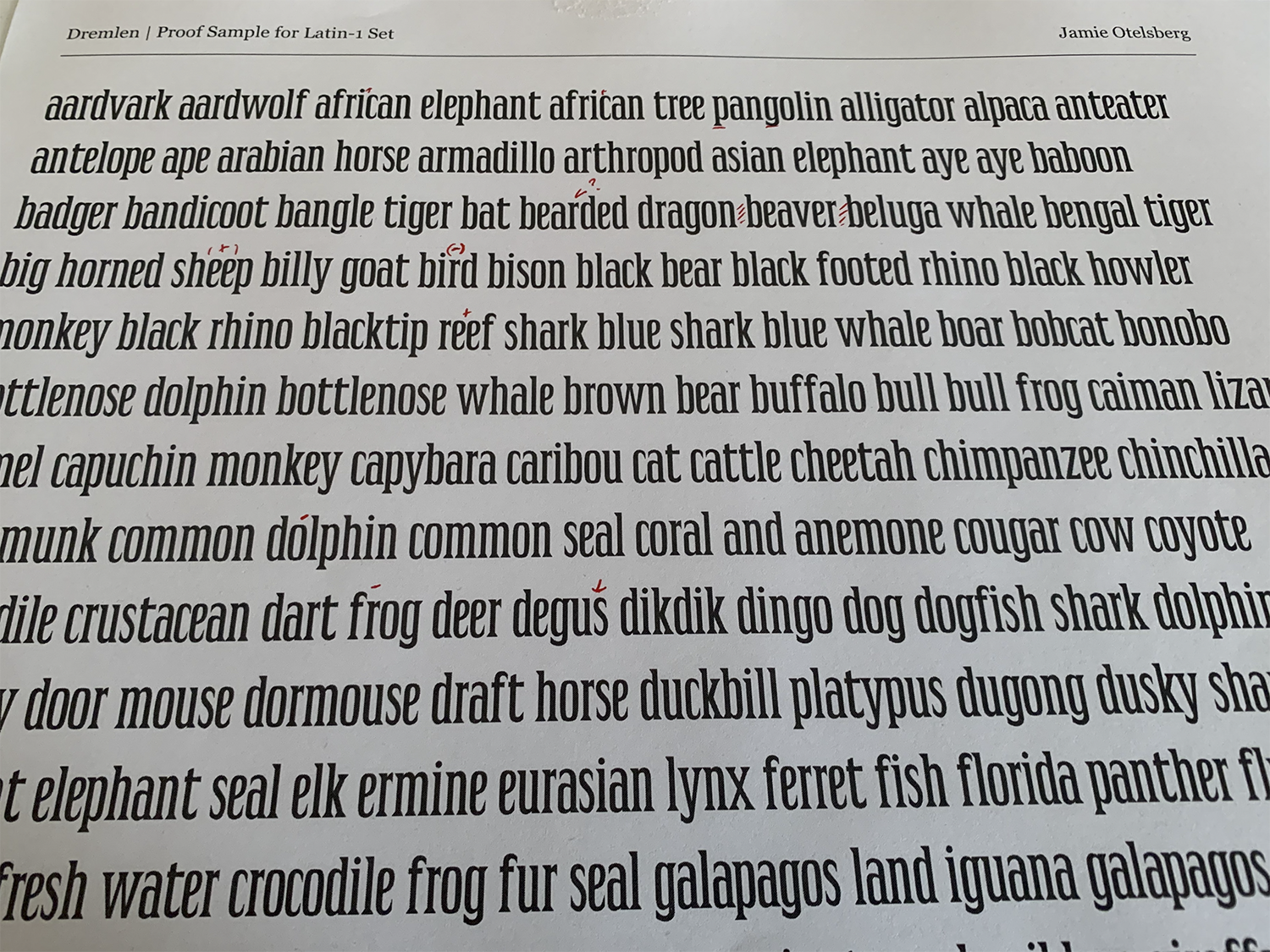
I spent a lot of time working with my outlines and creating my lowercase control characters all the while keeping my mind on the spacing. Instructor Sol Matas guided us through the process of spacing our glyphs and learning how to use spacing strings and proofs to analyze and improve our work. She also has a great lesson on designing diacritical marks for language support.
The technical aspect of type design has always intimidated me since I only have rudimentary skills in coding, but Ulrike Rausch gave a great introduction and made it seem a lot less scary and a lot more practical than I thought it would be. Since my design is still in progress, I’m looking forward to going back to these lessons in the future and working on ligatures and adding other opentype features into my font.
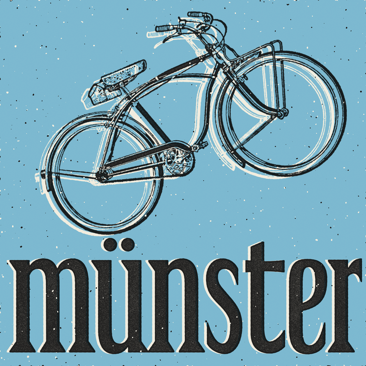
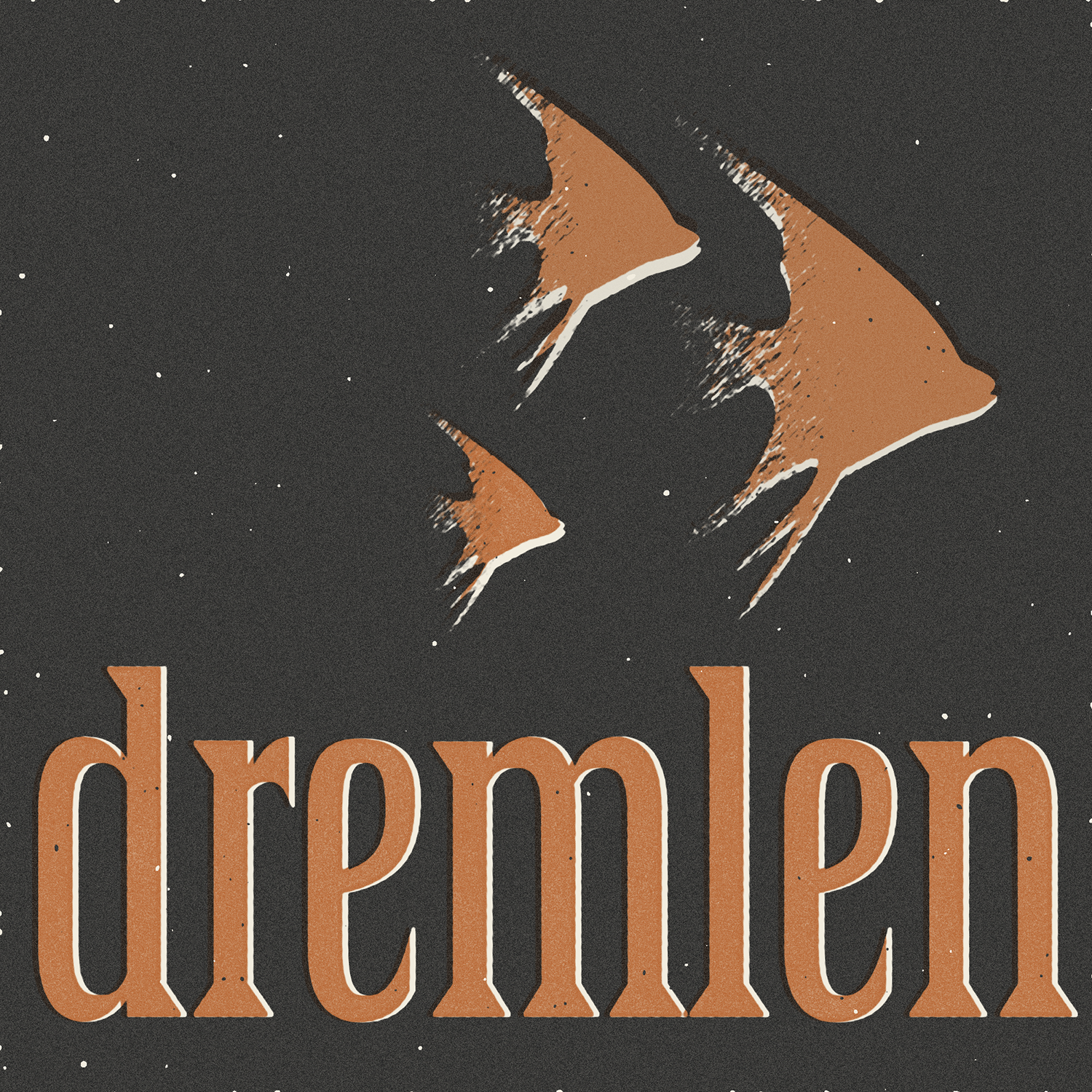
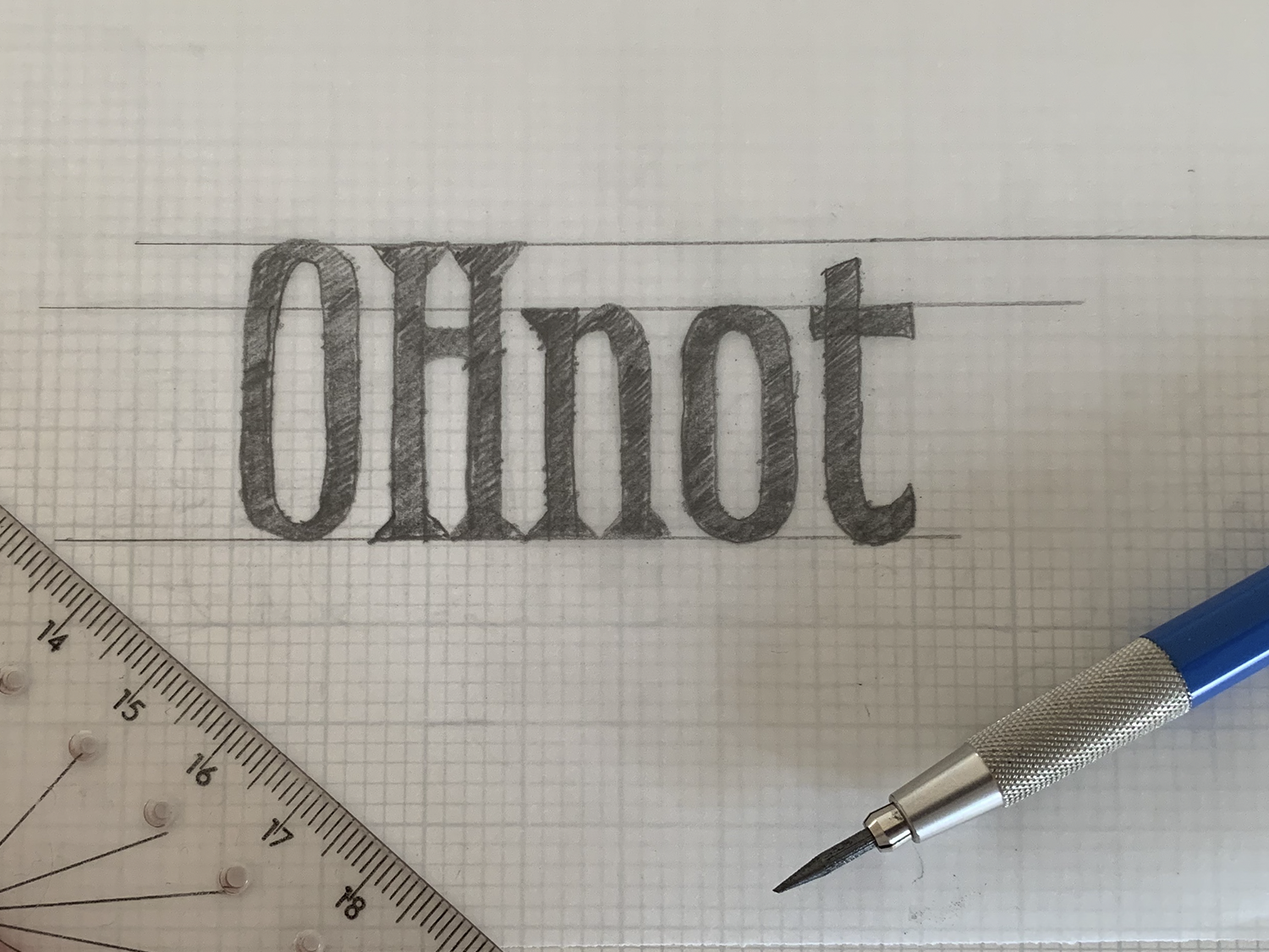
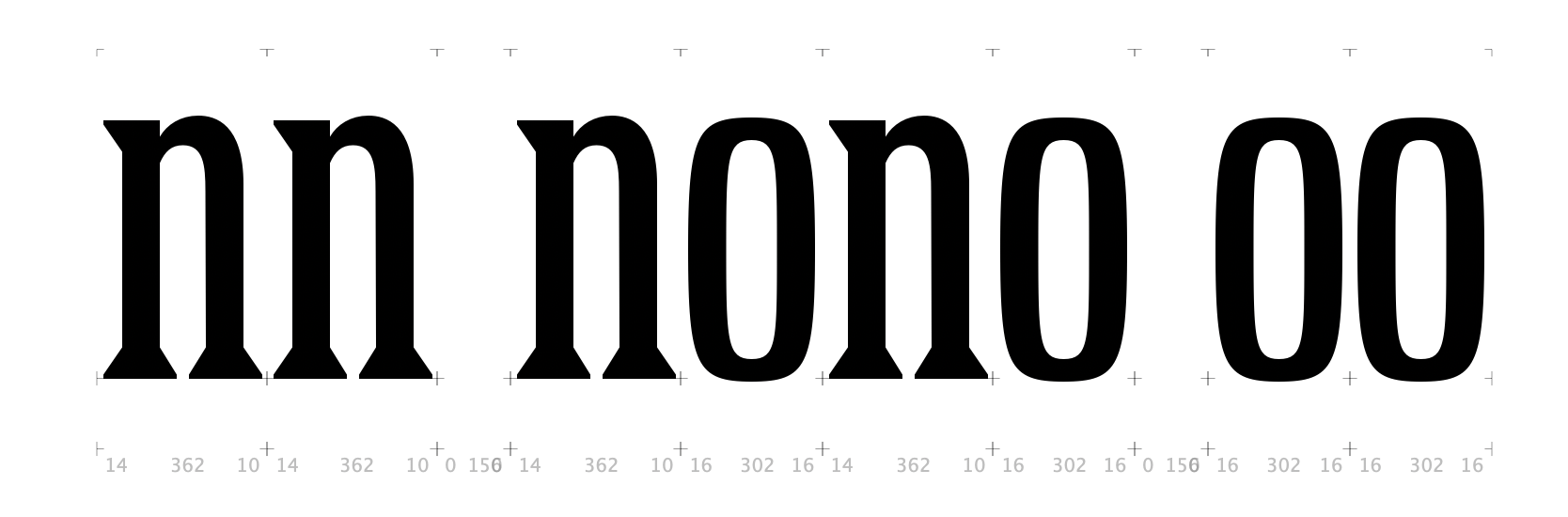
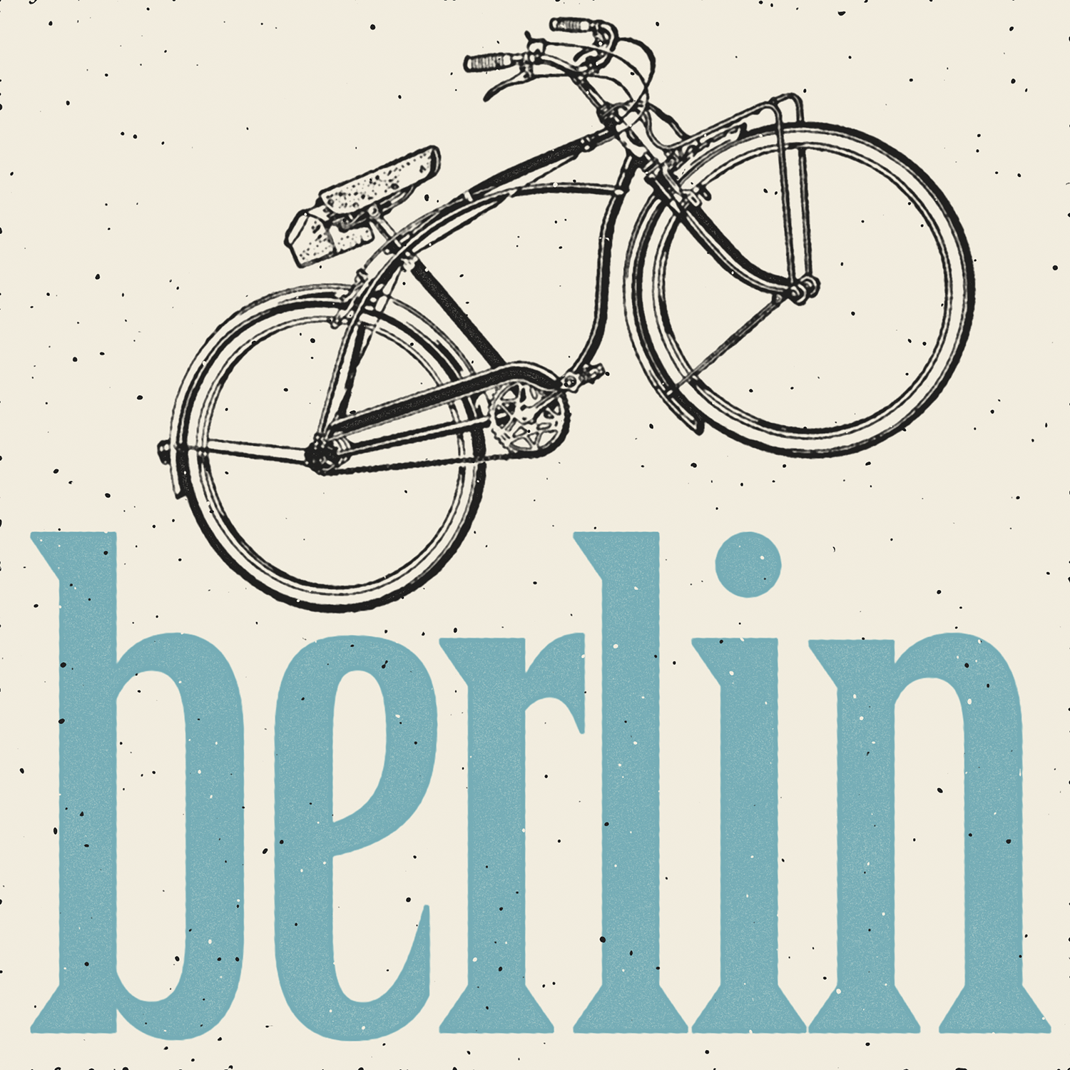
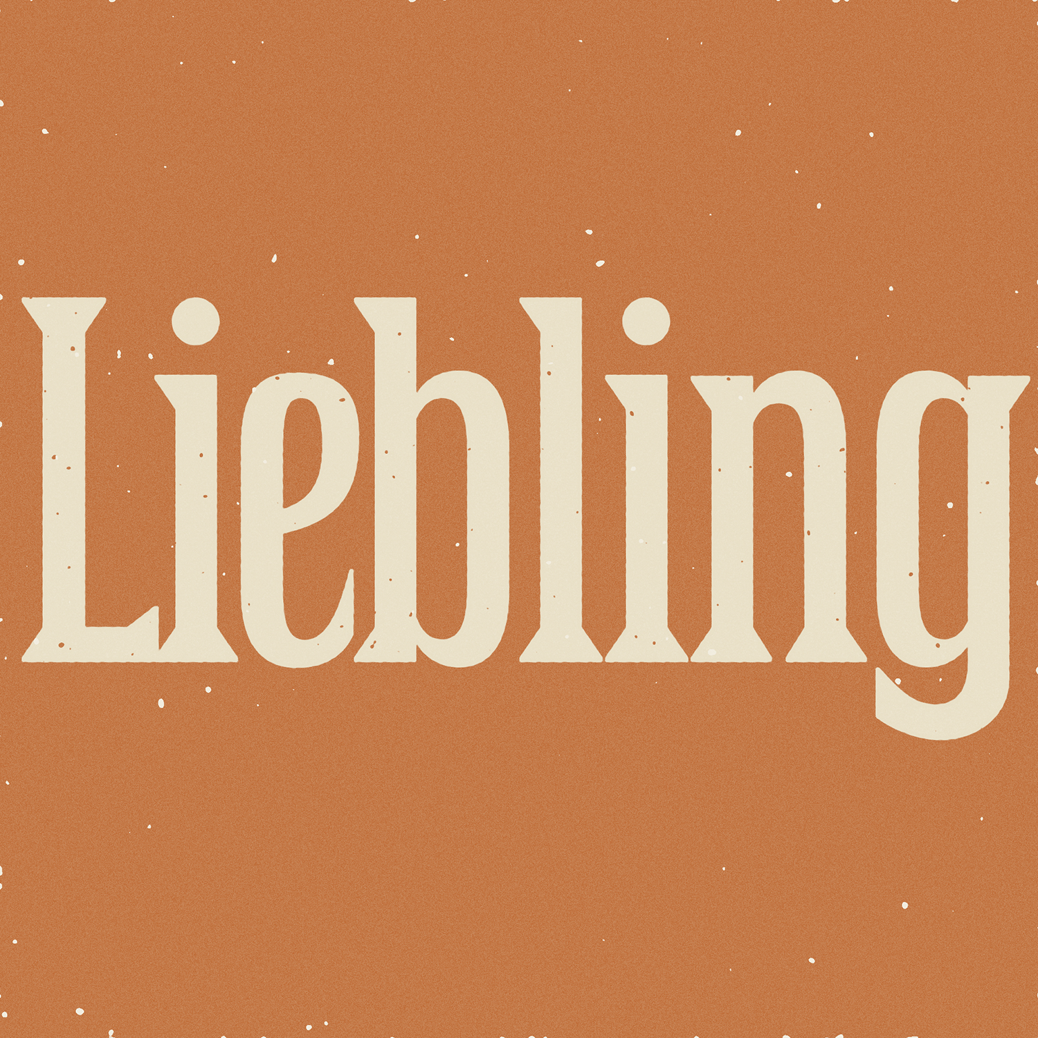
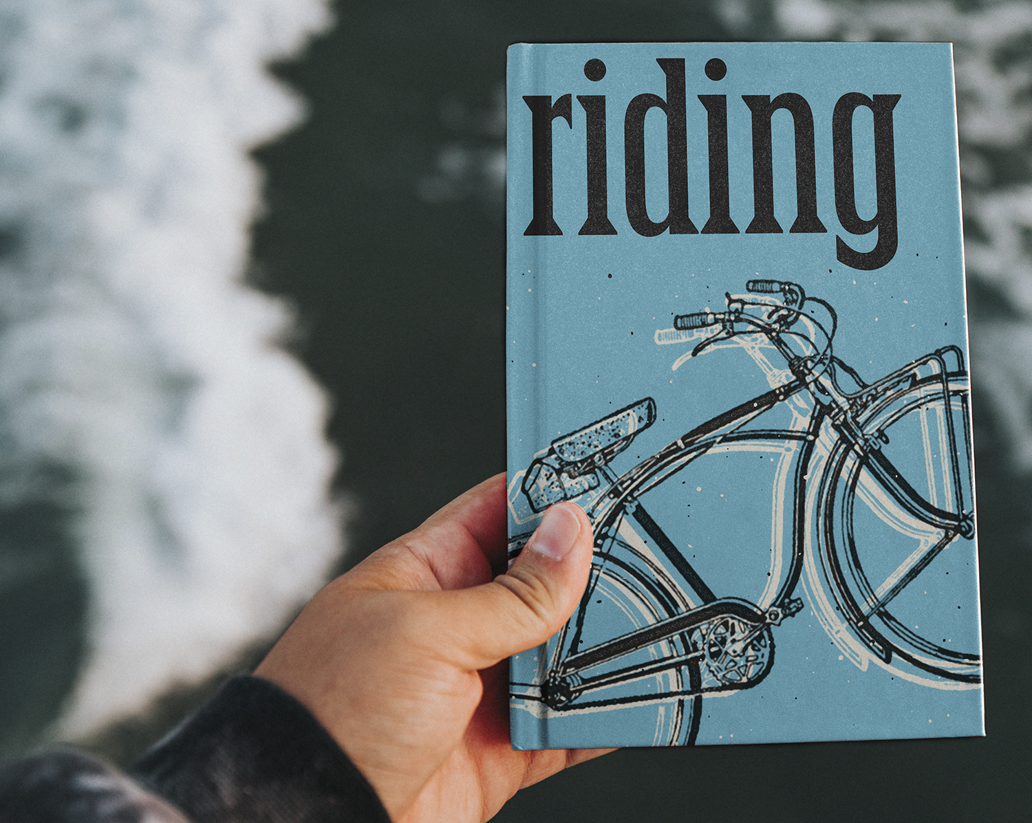
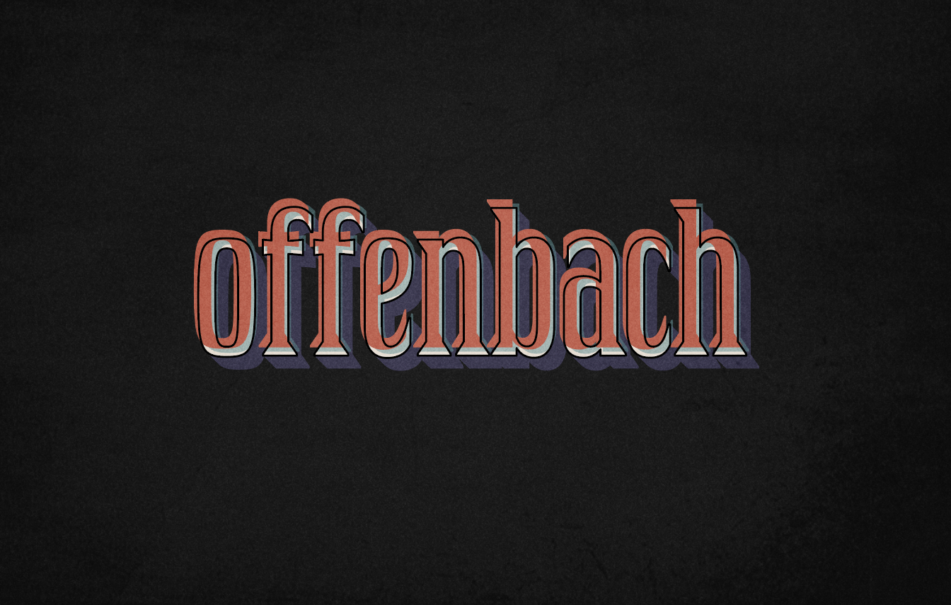
My display typeface is called Dremlen, which is a Yiddish word meaning to have a short dream-filled nap. The design was inspired by Jugenstil or the Art Nouveau movement, but with an edge. Dremlen is intended to be used in headlines, for anything from travel and concert posters, to book covers and logo designs.
Letter&Co was an immensely valuable program and I would recommend it to anyone who wants to learn type design. The program is structured in such a methodical way that you get an opportunity to understand what it takes to design a font from start to finish, with the most knowledgeable and distinguished group of instructors to guide you along the way. I still have a long way to go to finish my font, but this program gave me clear instructions on how to get there, and the best part is that the course content is always there for me to reference down the line. The virtual field trips with Dan Reynolds and Ferdinand Ulrich were so fun and inspiring, almost like we were really there. The type crit and the QA sessions were invaluable and really helped me to improve my work and my workflow. Besides all of the amazing instructors and high quality content, one of the nicest things about Letter&Co is the warm and inclusive atmosphere and tone that is set by Martina and all of the instructors and students, that I found so conducive to learning.
TAKE ME TO...
CONTACT US
Sparrstraße 20,
13353 Berlin, Germany (by appointment only)
+49 (0) 30 33877574
Sparrstraße 20,
13353 Berlin, Germany (by appointment only)
+49 (0) 30 33877574
Sparrstraße 20,
13353 Berlin, Germany (by appointment only)
+49 (0) 30 33877574
Subscribe to the Lettering Tips newsletter and other important updates!
©2019 Studio Martina Flor. All rights reserved.