
SURE THING BY JOAQUÍN DIAZ
AWARDED WITH DISTINCTION • 2020 EDITION
Hi, my name is Joaquin Diaz and I'm a designer from Madrid. I grew up and lived in different countries around Europe and I'm currently living and working in Berlin at Edenspiekermann. I'm mostly focused on shaping Brand and digital experiences, so typography plays a big role on my daily visual communication craft.
My love for letter shapes and typography made me start digging into type design a couple years ago, training my eye, my letter drawing skills and shaping my own type library and resources (books, manuals, specimens…).
So at some point it felt quite natural to get into it. I would love to be able to create custom fonts and to shape my own typefaces. I find extremely exciting the idea of releasing a tool that can be used by other designers or by myself in a wide range of applications or projects… I have a quite strong musical background and somehow I see a lot of similarities between type design and sound design or music production.
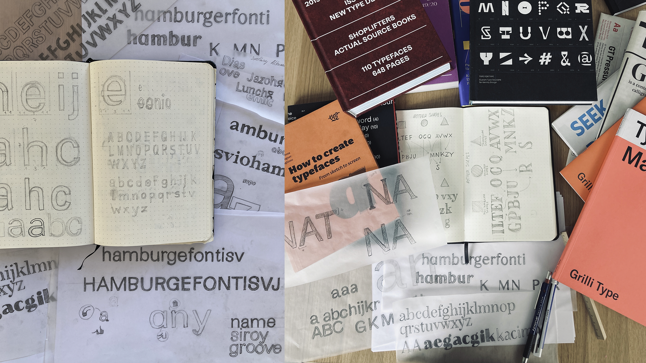
Regarding the first steps of the Letter&Co project, I first did some explorations and went through books and specimens to find inspiration. I was between Serif and Sans serif, I had some cool letter drafts for both directions.
Then I went through Adrian Frutiger's "Complete Works" book and I thought, why not take a timeless classic like Univers as a starting point for inspiration? I was also simultaneously listening to a lot of Blue Note records while doing the explorations and drawing sessions and I really love the covers of the label. So I took both as my main inspiration and started to draw letters and think about how to keep the timeless and bespoke flavour of those inspirations while adding a modern and funky vibe to it… A versatile and jazzy font, that could fit into any cool project or application.
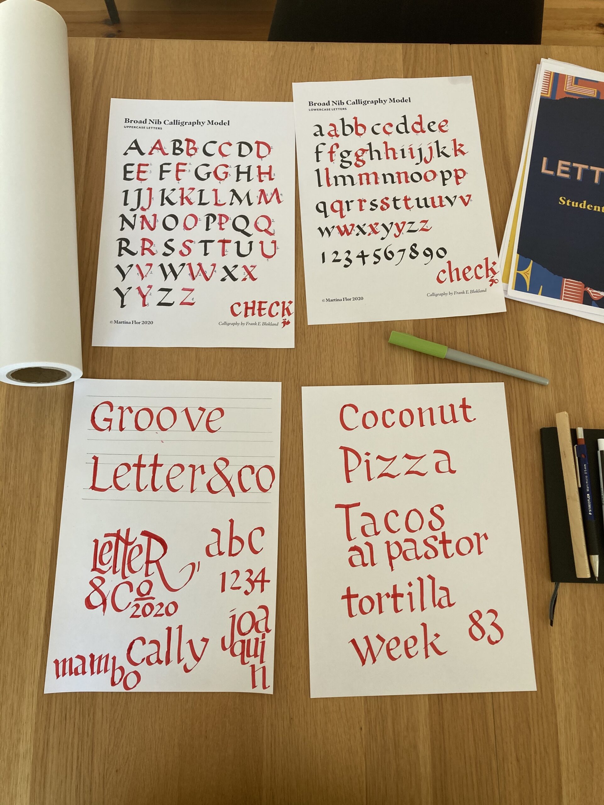
Through the drawing explorations I played quite a lot with the angles on the stems, the spurs, the terminals or the curves, trying to shape a first draft that reflected the concept. I found extremely handful and interesting redrawing and modifying letters using tracing paper. Then I kind of settled the basis of my letter shapes. The exploration techniques learned during the first Units and the calligraphy sessions were pretty helpful!
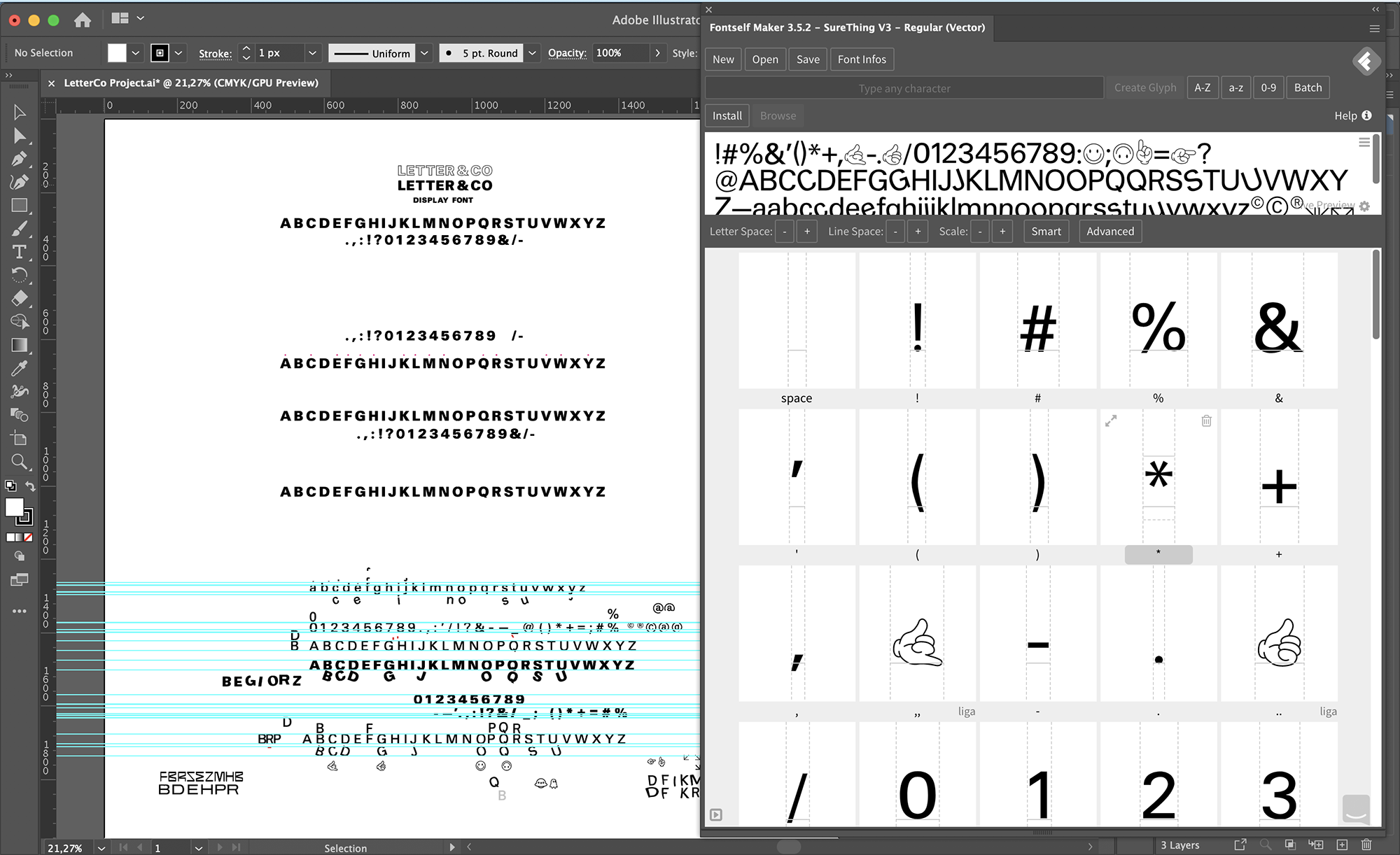
As suggested on the course I first digitalised everything in Illustrator and used FontSelf to export a very first prototype and start testing it and plating with it in some applications and mockups. Being used to the software it made the first approach of digitalisation the letters smoother and faster. I believe it's quite a good technique to quickly shape a prototype.
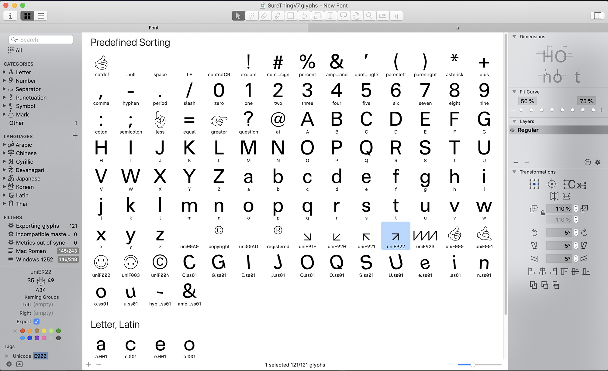
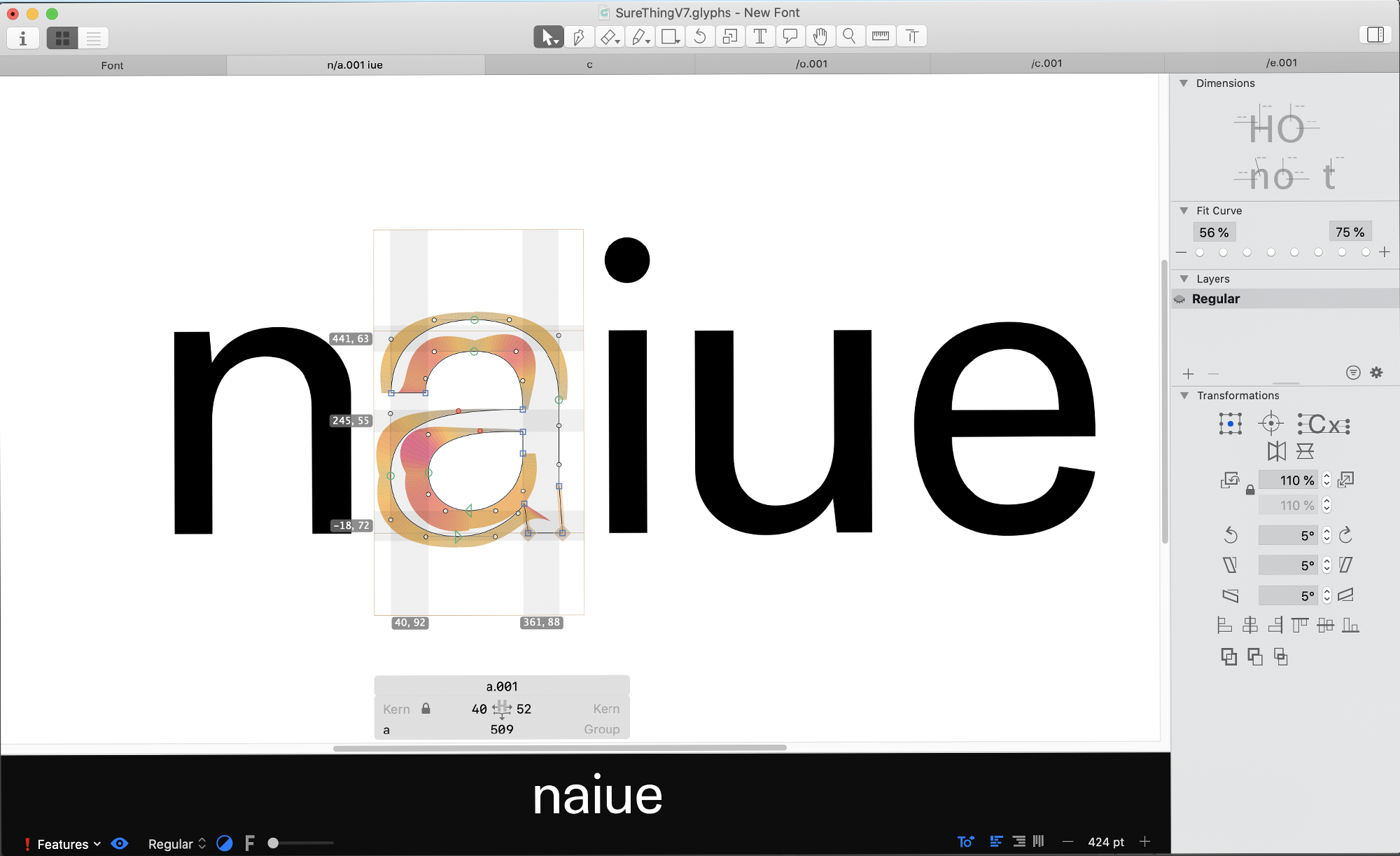
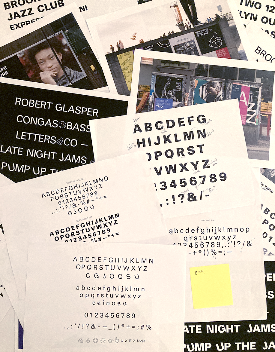
Then I jumped into Glyphs and worked on refining the letters and adding more glyphs and special characters. Once I had a basic set of characters I kept improving them with the feedback from the instructors during the type critiques and the Q&A's. And then went through quite a few testing/printing/correcting sessions.
The font programming Unit was also very useful to add the stylistic set and special characters. I wanted to have some of the letters a bit slanted to add some groove and make those letters dance a bit. A way to make it funkier and add a stronger identity to the font.
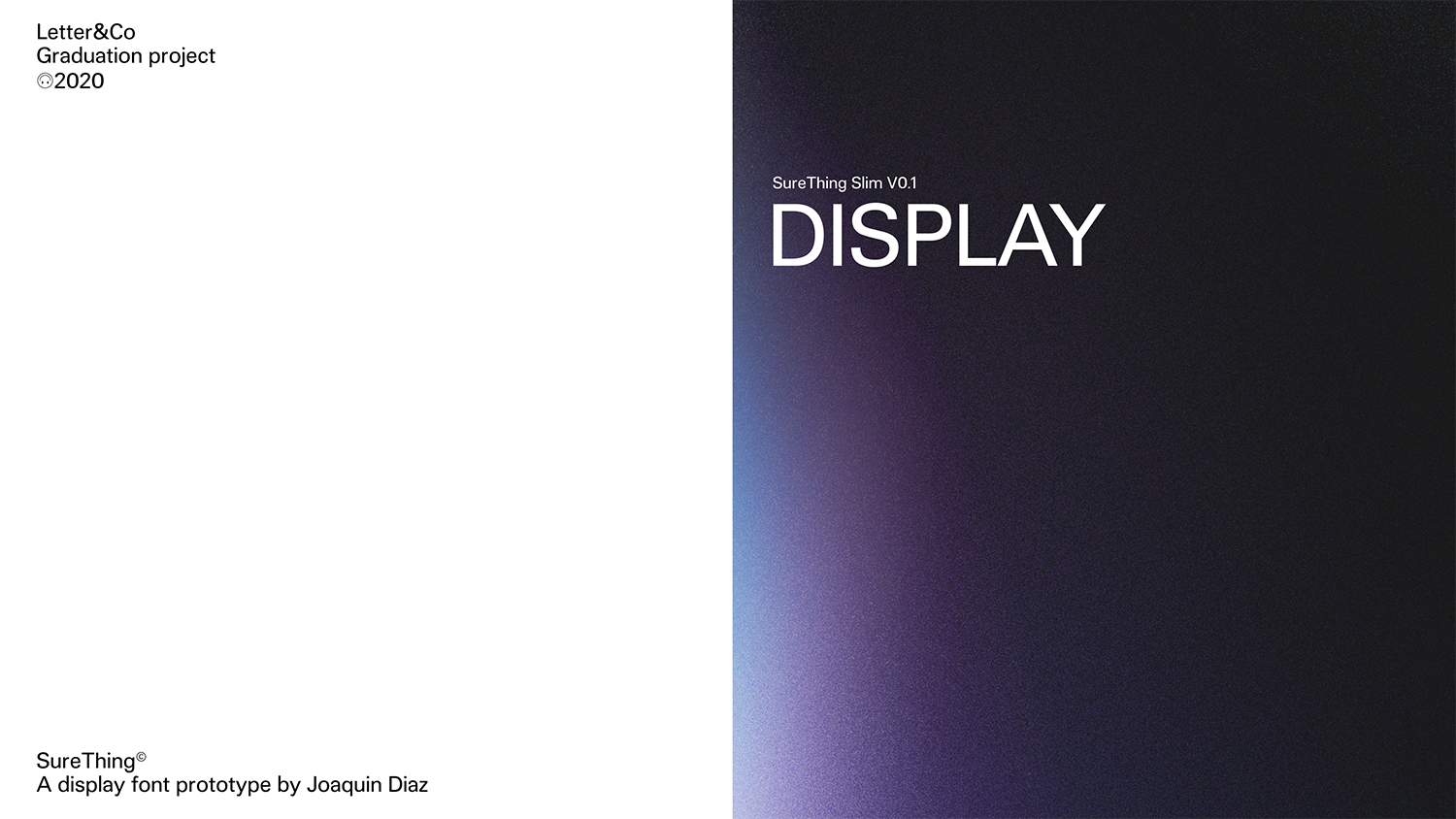
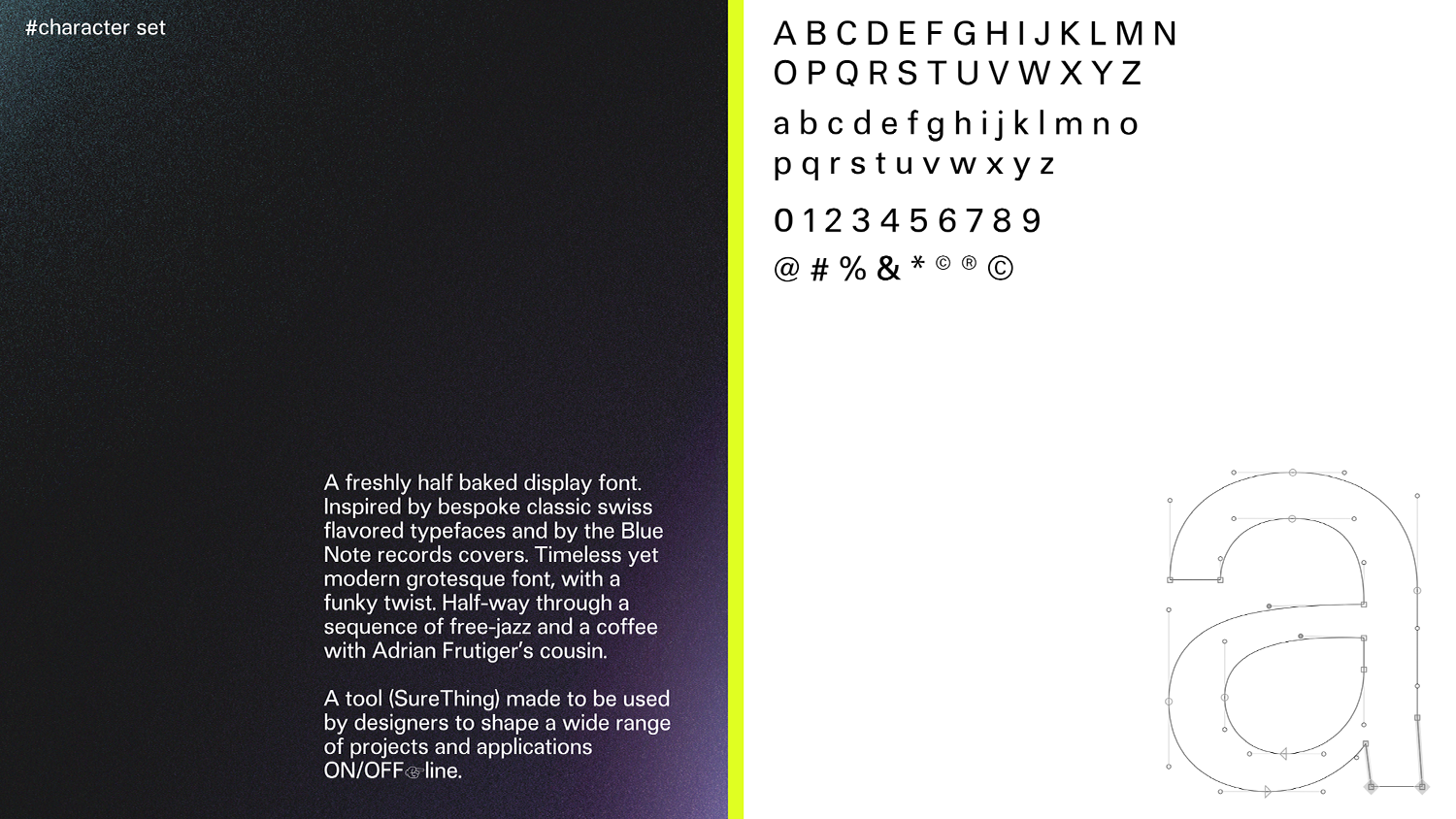
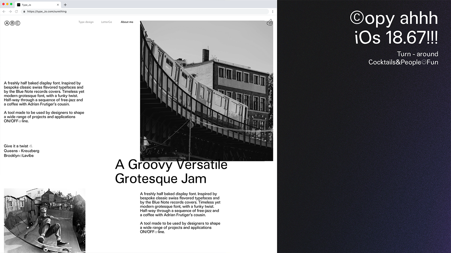
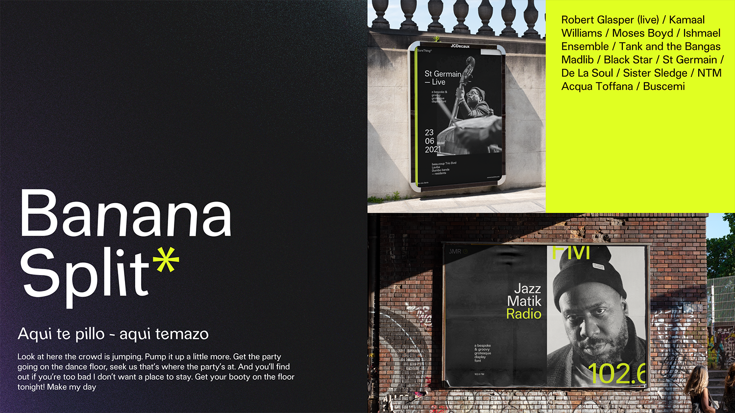
SureThing is a freshly half baked display font. A groovy grotesque that finds his roots on bespoke swiss typefaces and his groove on the classic yet modern Blue Note Records covers and tracks. A typeface starting point, aiming to be a versatile tool for brand and digital product designs. A modern sans serif with attitude and funky moves for both Offline and Online vibes...
Letter&Co gave me the push I needed to properly get into type design. I spent a year reading typography and type design books and manuals, playing with Glyphs, drawing and exploring letter shapes… But at some point everything was a bit overwhelming and I didn't knew how to start building my own project.
Letter&Co and the great instructors gave me the guidance and support I needed to start applying all that knowledge and theory into a real project. It also helped to start creating my type design network.
The type critics were extremely valuable. Having deadlines, a project schedule and well known profesional type designers teaching and supporting, were definitely key to achieve the goal. The overall experience was very nice! I totally recommend it.
©2019 Studio Martina Flor. All rights reserved.
©2019 Studio Martina Flor. All rights reserved.