

SPIGOLA BY BRYAN GERAGHTY
AWARDED WITH DISTINCTION • 2020 EDITION
Bryan is from Denver, Colorado, and studied graphic design at Colorado State University. His current career path has led him astray from his true interest and first love: typography and letterforms. He hopes to shift his career focus by learning all he can about type design, calligraphy, and lettering. Bryan is currently a freelance graphic designer based in Rome, Italy. When he's not designing he's probably on his bicycle or at the movies.
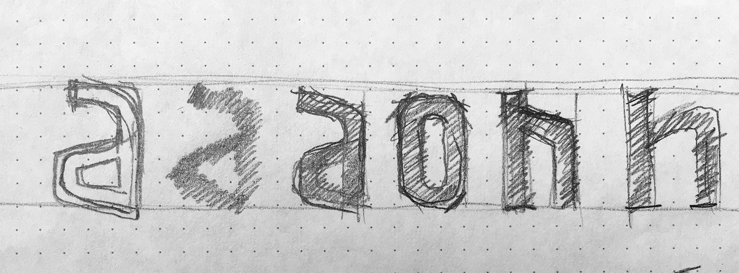
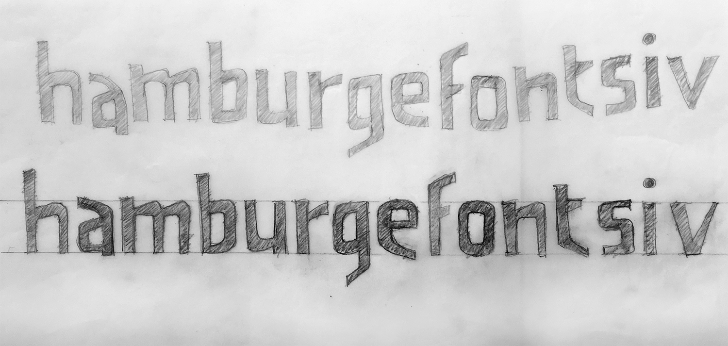
The project originated from a free-form sketch based on simple, random parameters generated from TypeCooker.com. Initial sketches were un-inspiring so I decided to change it up a bit. The process was to trace over initial drawings and modify shapes and forms with each new sheet or "layer", a process taught in Letter&Co lessons. My initial sketches looked like a simple sans-serif, but I wanted to create something akin to a display font. Inspired by the hand lettering of Saul Bass and Timothy Goodman, the aim was to give the letters a more playful feel by modifying the stems, bowls, and shoulders of the letters.
The process of digitizing sketches was simple, getting it right was harder. I traced scans of my limited character set in Illustrator, expanded the alphabet, and exported with FontSelf into Glyphs. Easy, right? Well, sort of. I'm not a stranger to Illustrator's pen tool but getting my letters to resemble what I had sketched was more challenging than I had thought.
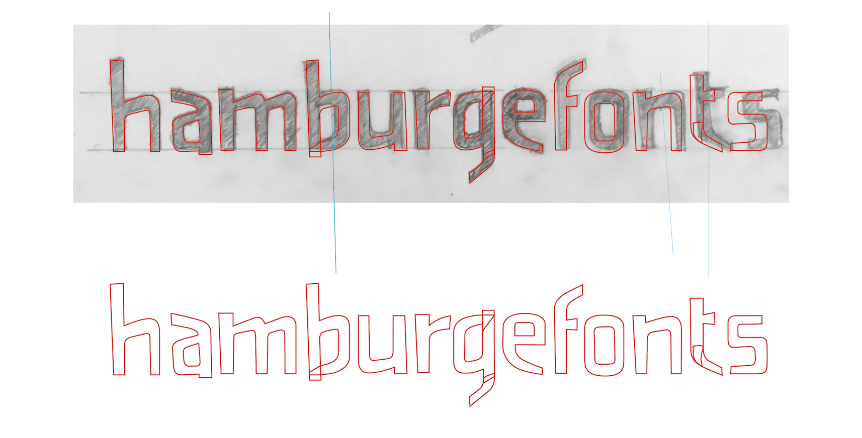
I spent a lot of time perfecting the original paths in Illustrator. When I switched to Glyphs, it felt much easier to manipulate and mold the letterforms. There's a learning curve but basic path functions allow you to optimize curves sweat-free.
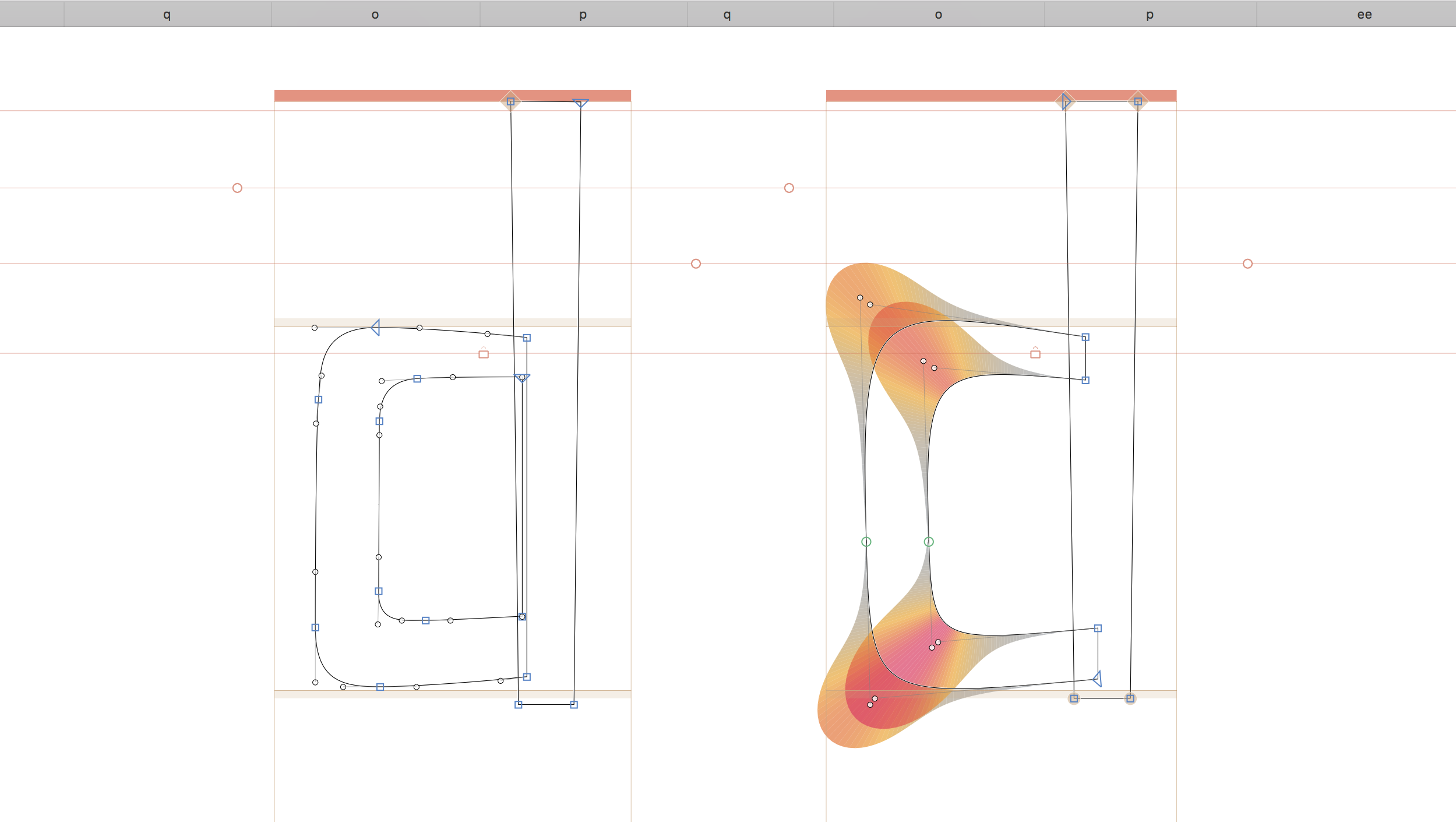
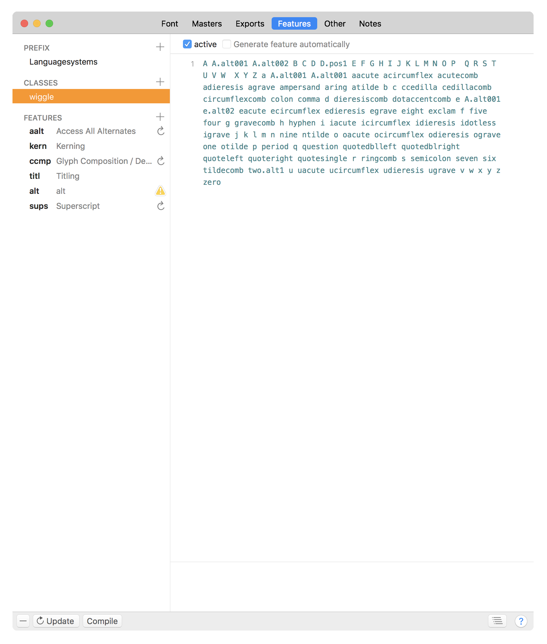
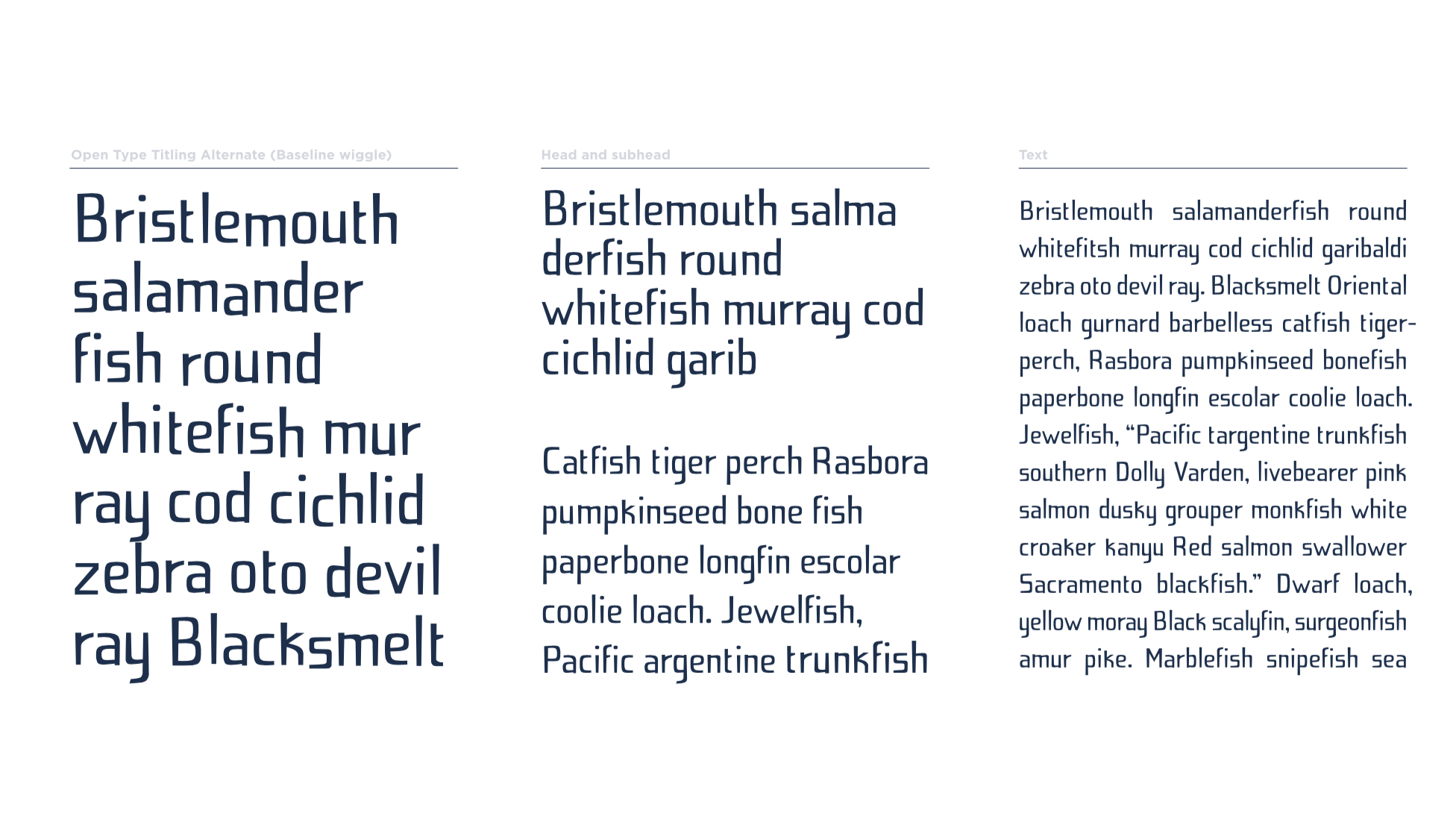
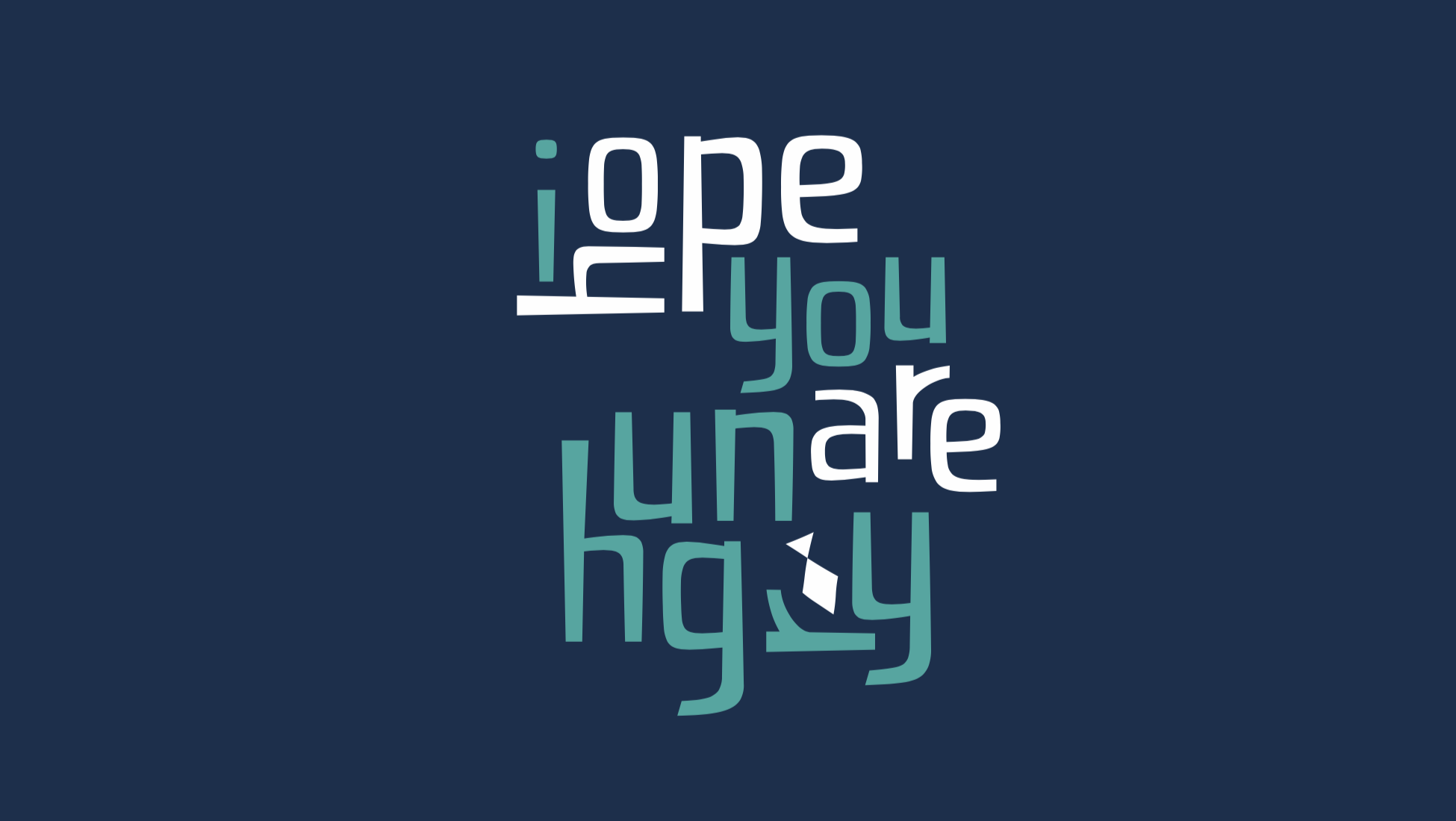
As I became more comfortable with Glyphs, it felt more fluid and practical for manipulating letterforms and necessary for its accurate measuring, spacing, kerning, components, and…a number of other reasons. Advanced features like interpolation and support for Open Type, will be harder for me to learn and take advantage of. That said, with the help of a script (created by Letter&Co's Glyphs guru, Rainer Erich), I integrated an Open Type feature that gives characters a random baseline shift. This was exciting because it emphasized the loose nature at the heart of the design.
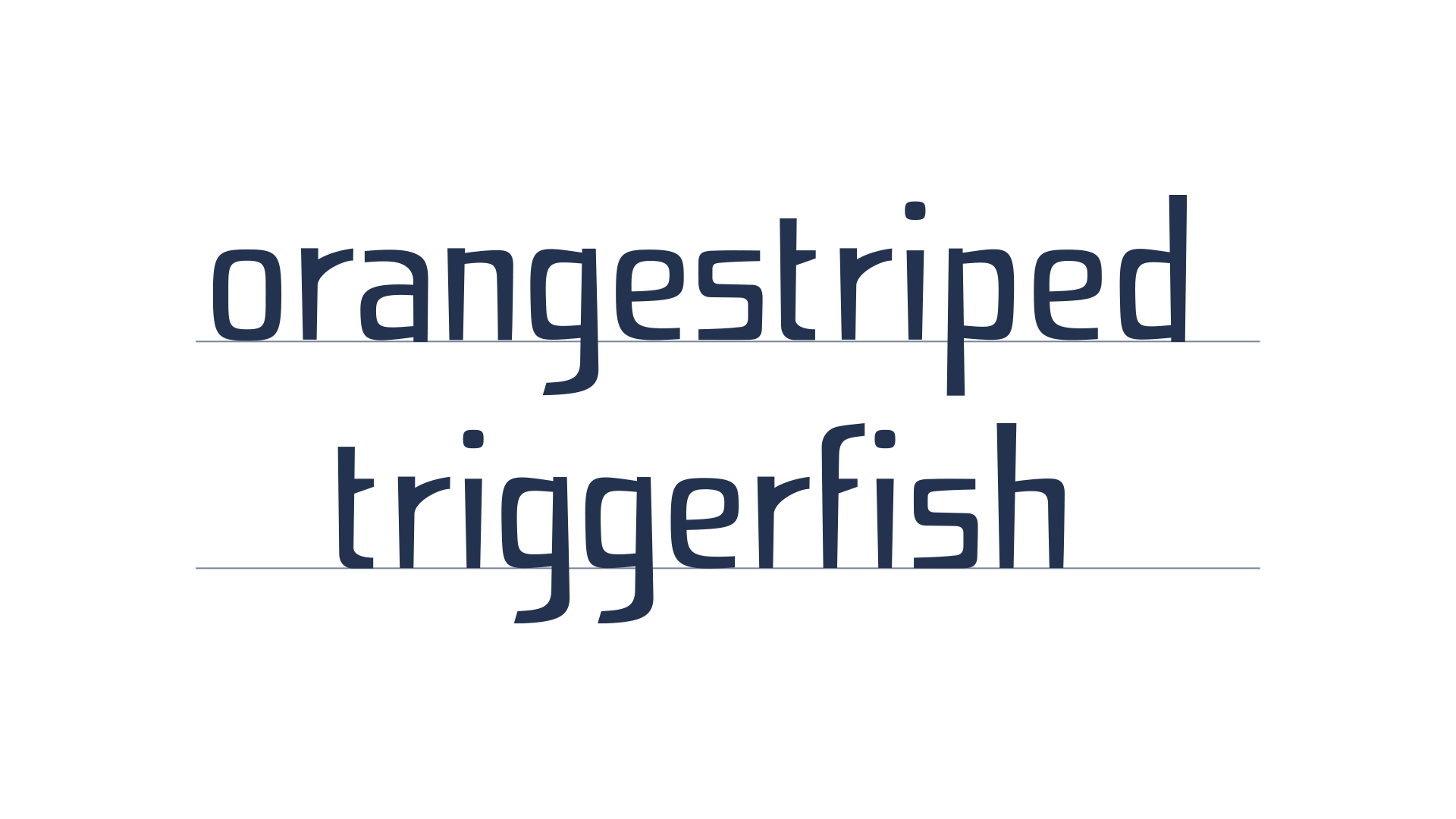
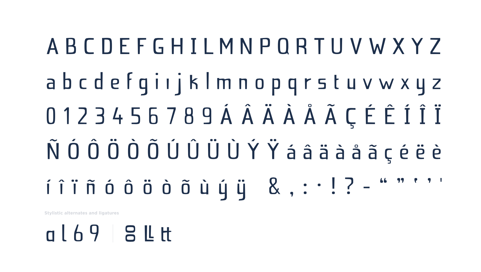
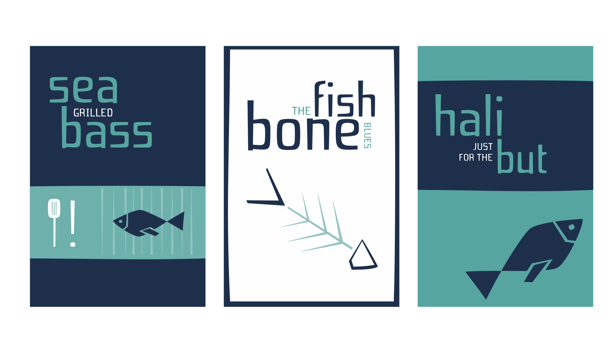
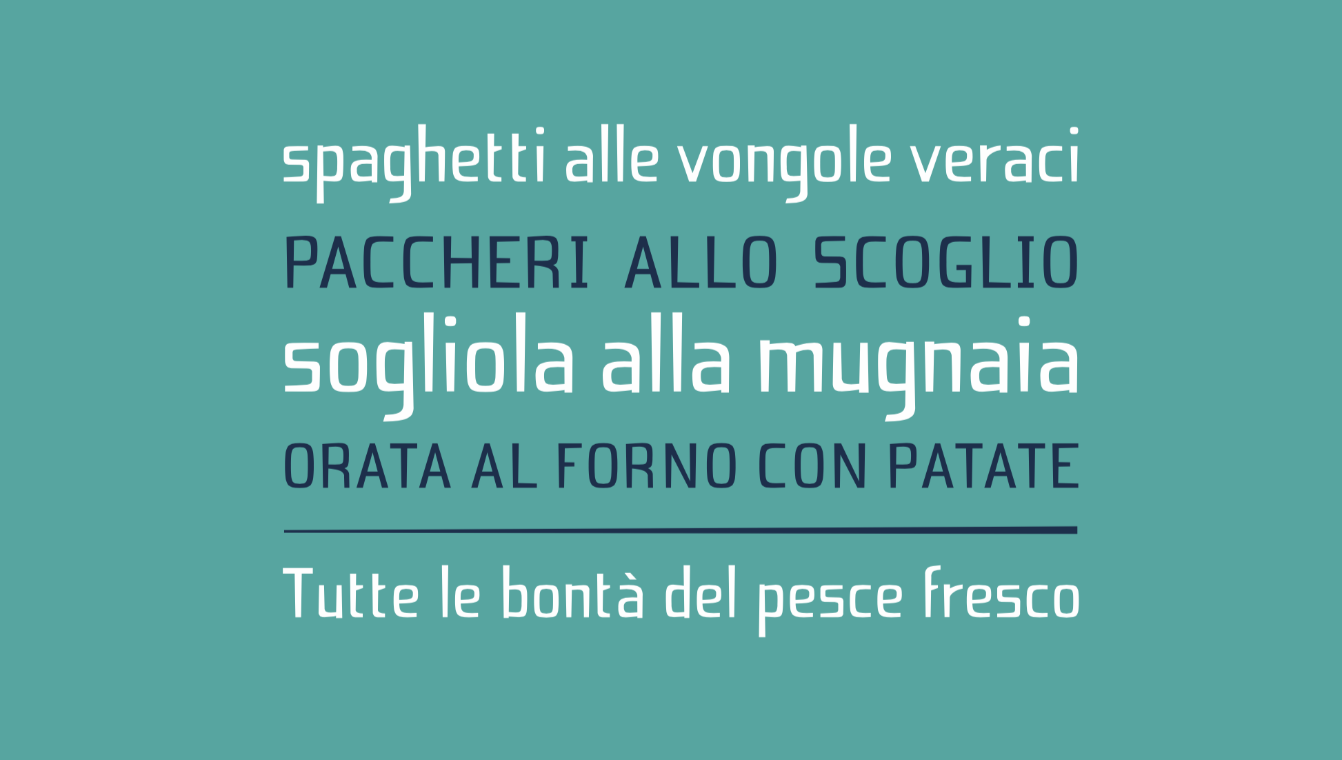
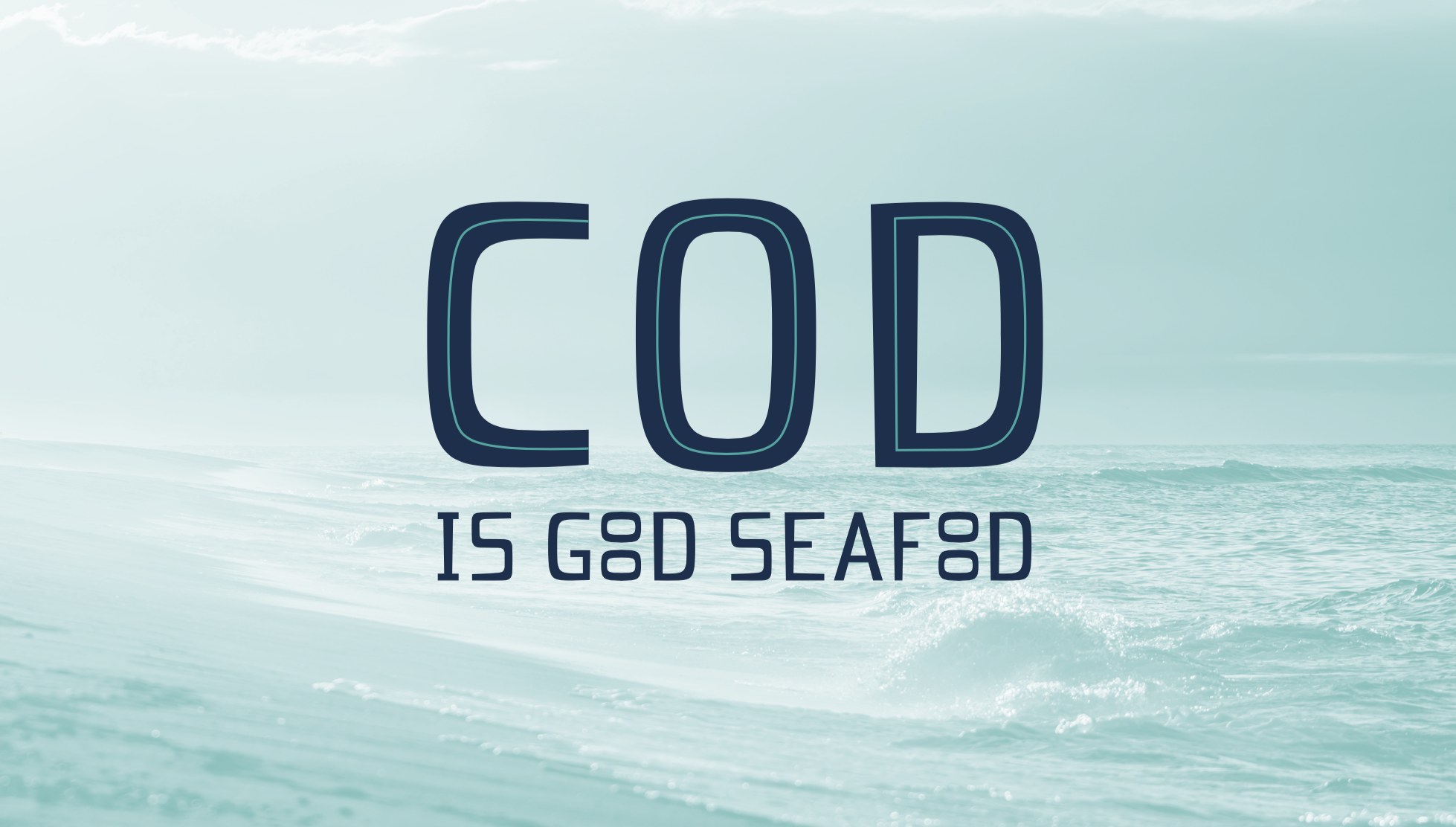
Spigola is a work in progress font. Original sketches resembled more of a functional sans-serif. As the design progressed, the goal was to reshape it into a display font. Modifications were made to the stems changing angles, creating a tapered effect. The bowls and shoulders were reshaped by slightly adding contrast asymmetrically. Also, the descenders were rounded in a more confident, swooping manner. The result is a font that balances rigidity and fun. Inspired by the lettering of Saul Bass and Timothy Goodman, the font barely resembles the source of its origins but has an off-beat functionality applicable to projects requiring a loose feel without looking too childlike.
Spigola is a type of Mediterranean sea bass, a reference to my inspiration. For some reason it makes me think of food.
Letter&Co helped create my font for many reasons. The emphasis on calligraphy and sketching was invaluable. Though my calligraphy is dreadful, I learned how essential it is to understanding the structure of letters and its importance to type design. The course was well balanced. With field trips, practical experimentation, and new software, variety wasn't lacking and I was learning new skills in the process.
Live critiques were crucial and direct feedback from the instructors was encouraging and informative. As a result, my project benefited. Also, I found the course well organized. Lessons are arranged by units and topics in a clean, user-friendly interface. Everything was easy to reference; very important when I sat down to actually do the work. A myriad of sources are provided to further inspire and inform along the way. Most important, a big thanks to all the instructors who proved to be professional, prepared, knowledgeable, and possessed an affable, positive energy, keeping me and my font interested and motivated.
©2019 Studio Martina Flor. All rights reserved.
©2019 Studio Martina Flor. All rights reserved.