

BIRBAL BY TANVI DESHPANDE
AWARDED WITH DISTINCTION • 2020 EDITION
Hi, I am Tanvi Deshpande. I graduated as a commercial artist and did my post grad in graphic design. While I am a freelance graphic designer now and specialize in branding, it was fascinating and amusing for me to know that some people sit and draw letterforms all day long and make a living out of it. The ability to draw a complete alphabet in one style, in different scripts, is so challenging yet so much fun. The multilingual aspect of typography is what draws me towards letterforms and motivated me to learn type design.
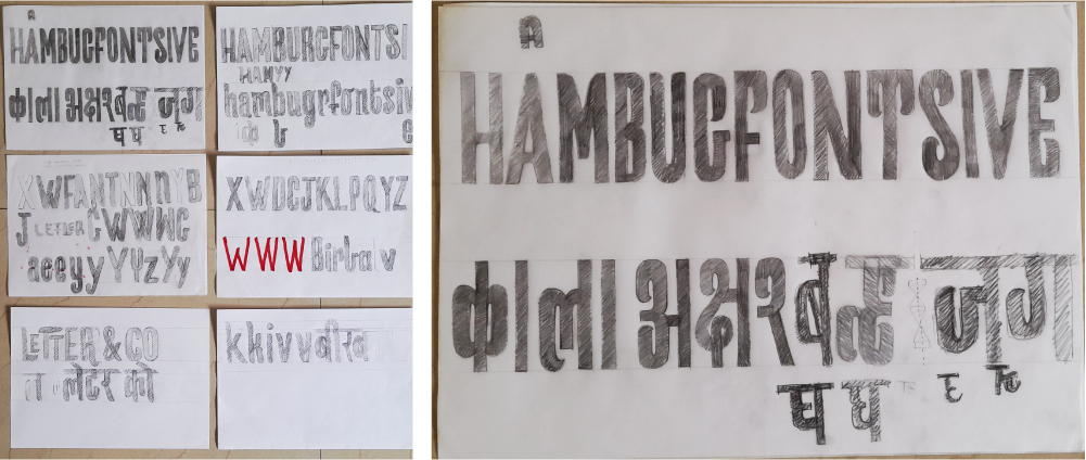
I started on paper by exploring different calligraphy tools, trying to get a hang of how different letters are constructed. It is so intriguing to know how the letter construction works in different scripts. I had decided to work on two scripts , Devanagari and Latin for my project. Hand sketching feels like therapy. There is so much to a shape of a letter that needs to be kept in mind before drawing them. Condensed, expanded, thin, bold, serif, san serif and so on... so many aspects to explore!
The particular exercise where we had to take a base font and build on it, was very enlightening. It helped me build my confidence about being able to draw a set of letters in the same style. The ‘Type Cooker’ exercise also helped to come up with ideas for my font. It helped me validate my letter shapes to the recipe that I was working on, so that I don’t lose track.
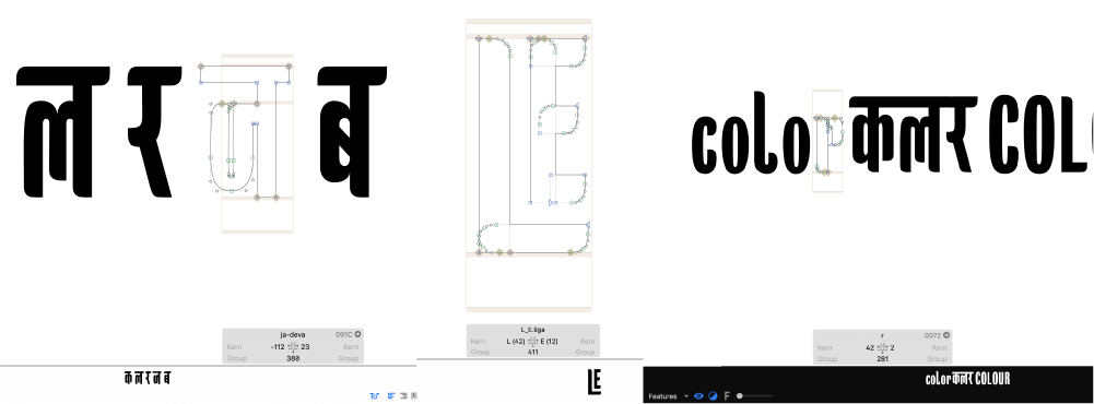
The shift from analog to digital was a bit rough for me. I was enjoying drawing letters on paper so much and knew that so much can be improved, that I was almost scared to shift to digital drawing. But, as I started working on Glyphs, I got to know it is only to improve the form of my letters. A couple days went in figuring out how to work simultaneously on 2 scripts, but it got better as I got the hang of it. I am still to find out many things about the font editor as I am still working on my font, but now that I am actually using it, it is quite comfortable. I have explored how a few open type features work and it is so fun to actually see working on screen what you imagined. I am having the most fun working on ligatures.
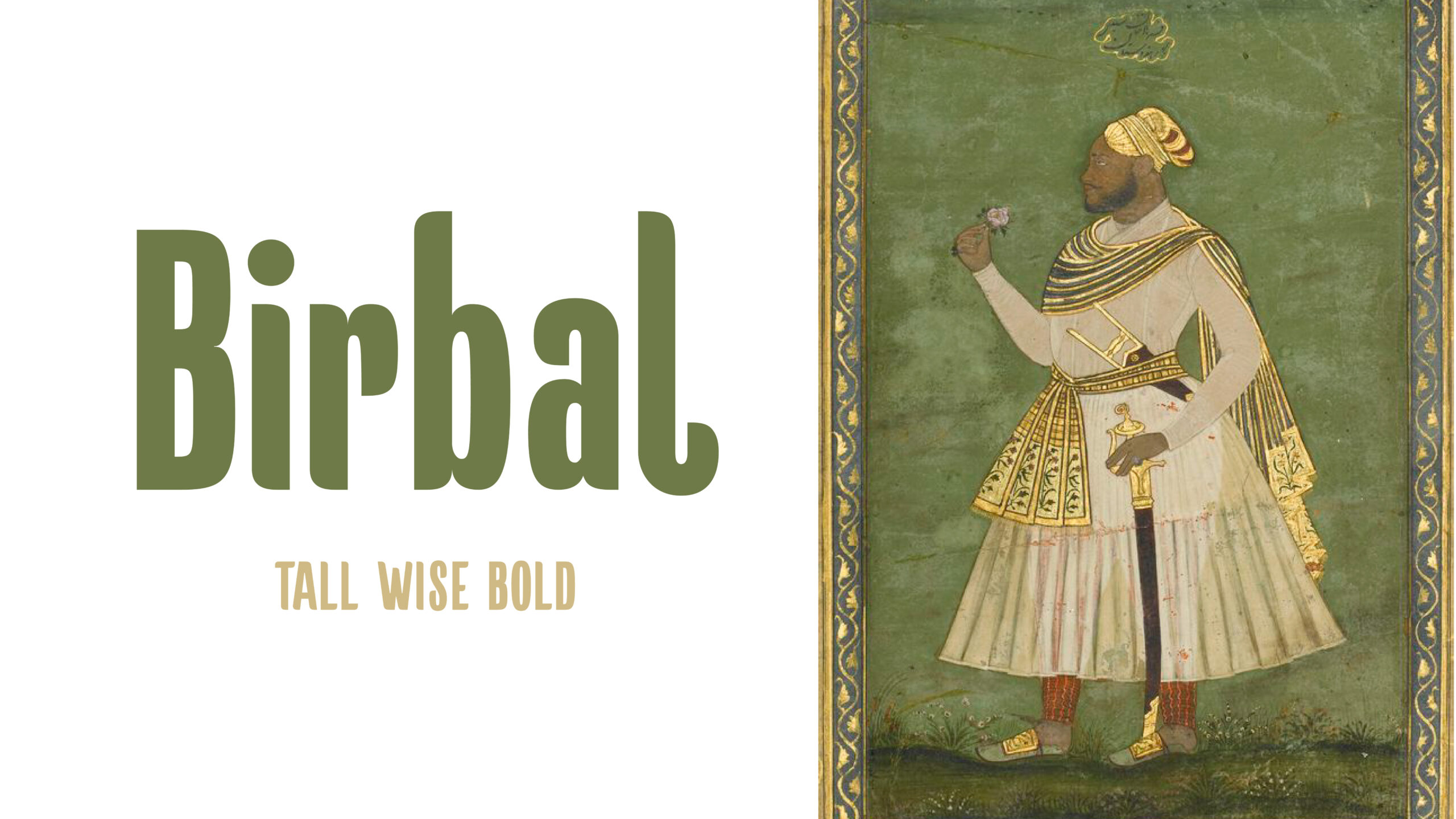
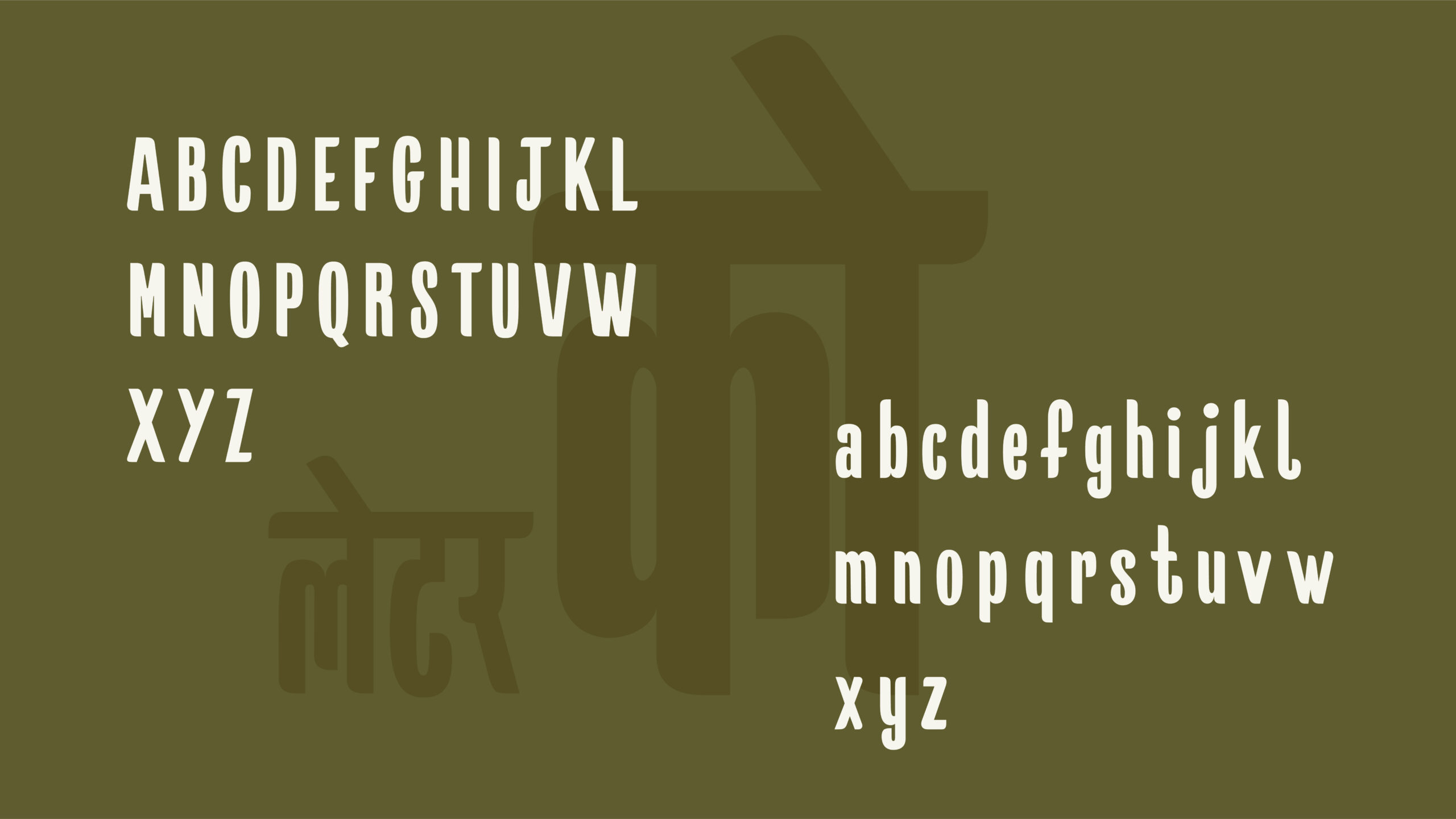
The name of my font is ‘Birbal’. Birbal was a hindu advisor in the court of emperor Akbar. Akbar and Birbal stories are famous across India where Birbal is known for his wise and witty nature. Hence the name, Birbal, tall | wise | bold. Birbal is going to be a display font that can be used for banners and posters, t-shirt graphics or even cool logo marks. I am currently working on 2 scripts, Latin and Devanagari.
I found out about Letter&Co. through youtube. Being a new mother it was quite challenging for me to think of doing such an intensive course. I was always looking for online courses on type design but never found myself getting excited about the ones I found. But, to find out that this course was going to be led by Martina was in itself an assurance that it is going to be worth all the effort and money of course.
I was very determined from the start to follow the course according to the given timeline as I wanted to make the most out of it. It was a bit challenging to keep up with the pace when it came to drawing the letters by hand, taking them to the software and learning the font editor tool, everything was new, but with the help of all instructors it became a bit easier. All the instructors were so open to any questions. I could contact them anytime through the online portal if I had a query. Most importantly, this course provides a huge collection of resources that I now have access to for lifetime.
The lessons are designed in a way that I can keep going back to them if I get stuck anywhere in my working process.I got to know so many fellow students with the same interests as mine. Everyone was very helpful and encouraging. And now we all plan an online global meet every month, isn’t that exciting? As I was working on 2 scripts, I was provided with some Devanagari type design resources too to help me progress with my work. Just to be able to talk to all the experienced instructors one on one, to be able to share my ideas with them felt very liberating.
Thanks to Martina and this course, I was able to take my first step in type design. It has given a structure to my thought process and a deep understanding on how letters work. Of course, there is so much more to learn, but it seems like doors are opened for me to step in. I had enrolled in with just one wish that I wanted to design my first font but I took away so much with me. It is really great to be a part of this community. Thank you.
©2019 Studio Martina Flor. All rights reserved.
©2019 Studio Martina Flor. All rights reserved.