

ADVENTURE BY ANNI KYLMÄLÄ
AWARDED WITH DISTINCTION • 2020 EDITION
My name is Anni Kylmälä. I’m a graphic designer from Finland. My interest towards type design gradually started already in design school almost ten years ago. There I eventually realized I had a passion for typography. I studied graphic and product design in Finland and in France. I’ve worked as a graphic designer at advertising agencies and as a freelancer for almost 6 years. Since design school I’ve always wanted to learn type design as well as lettering and calligraphy but thought that type design is perhaps just too detailed and demanding. There’s not much information online about type design so I was thrilled when I found out about Letter & Co.
I watch a lot of movies and sometimes take inspiration from them. Before I started sketching for the font I had just watched a western themed movie. I guess I had that in the back of my mind when I started sketching. My font project is a result of an exercise where we would alter and modify an already existing typeface and a certain word. So I started out with simply hand sketching. I then expanded that sketch into more characters. I really enjoyed the method of using tracing paper and just pen and paper.
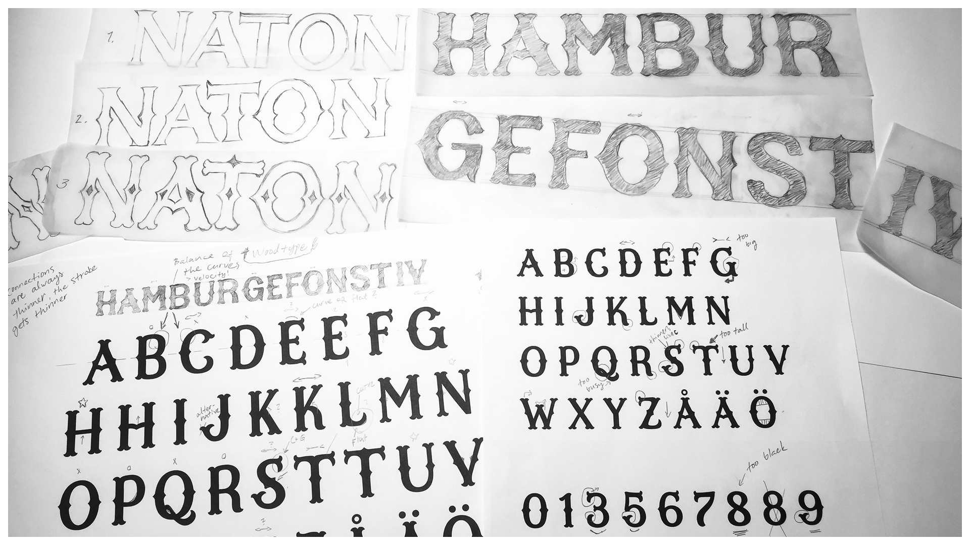
There’s no historical point of view to my project. It’s entirely based on my sketches, both hand drawn as well as digital sketches made with Illustrator. I decided I want to make this particular sketch as a font because I had most fun drawing it out of all the other exercises we had during the course and I thought it had a lot of personality to it.
My process was very straight forward from that point on due to hurried schedule. I started out with Adobe Illustrator with the word specimen “Hamburgefonstiv” using my sketch in the background. I then quickly moved onto to Glyphs.
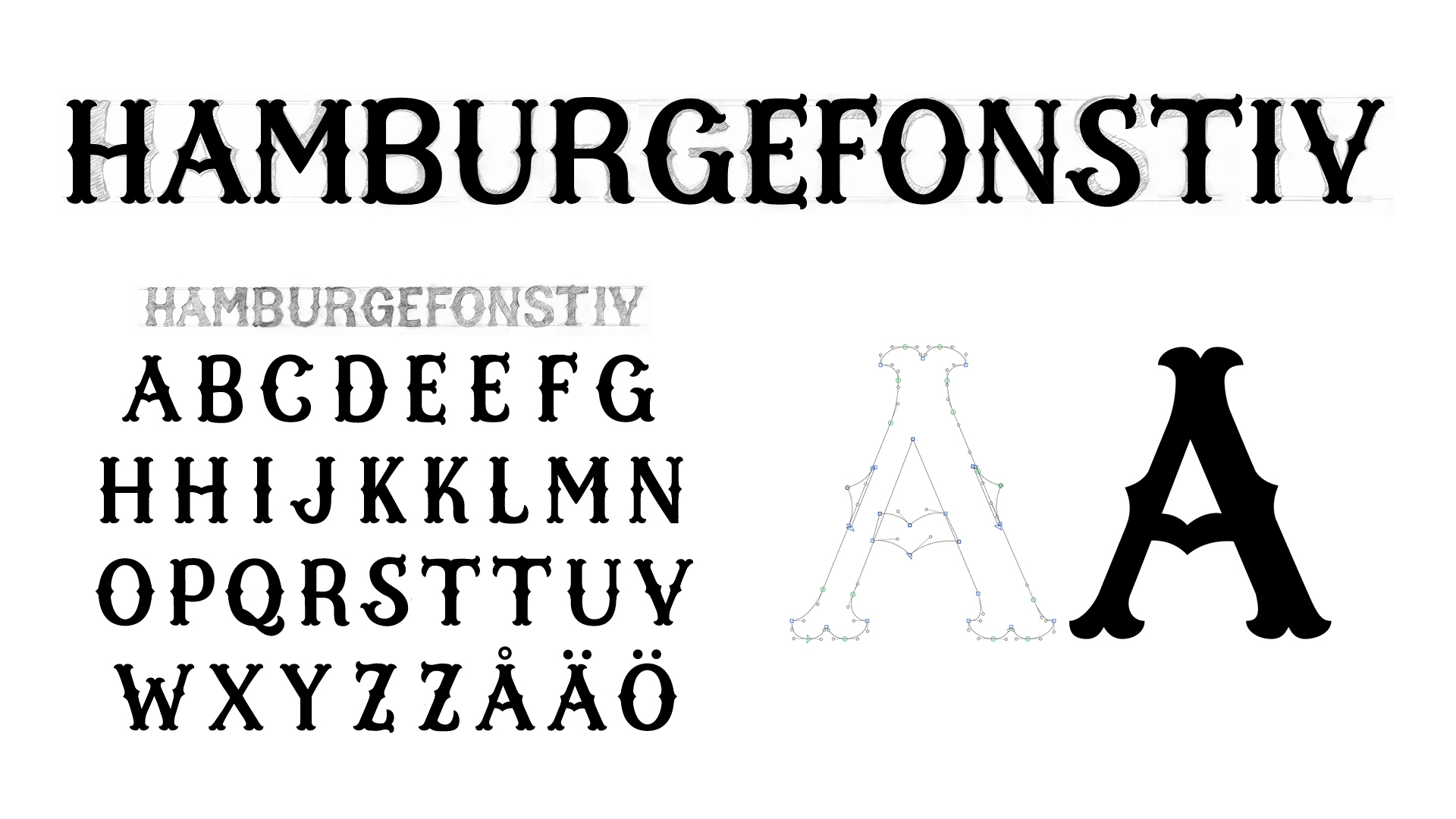
The digital process was where I made the decisions concerning the shape of the serifs, the width of the letters and for example I completely drew the numerals in digital environment. I found Glyphs to be fairly easy to work with from the beginning. I had a particularly tough time with the rounded shapes but Glyphs really made a difference when working with curves. Simple open type features were fairly easy to produce as well.
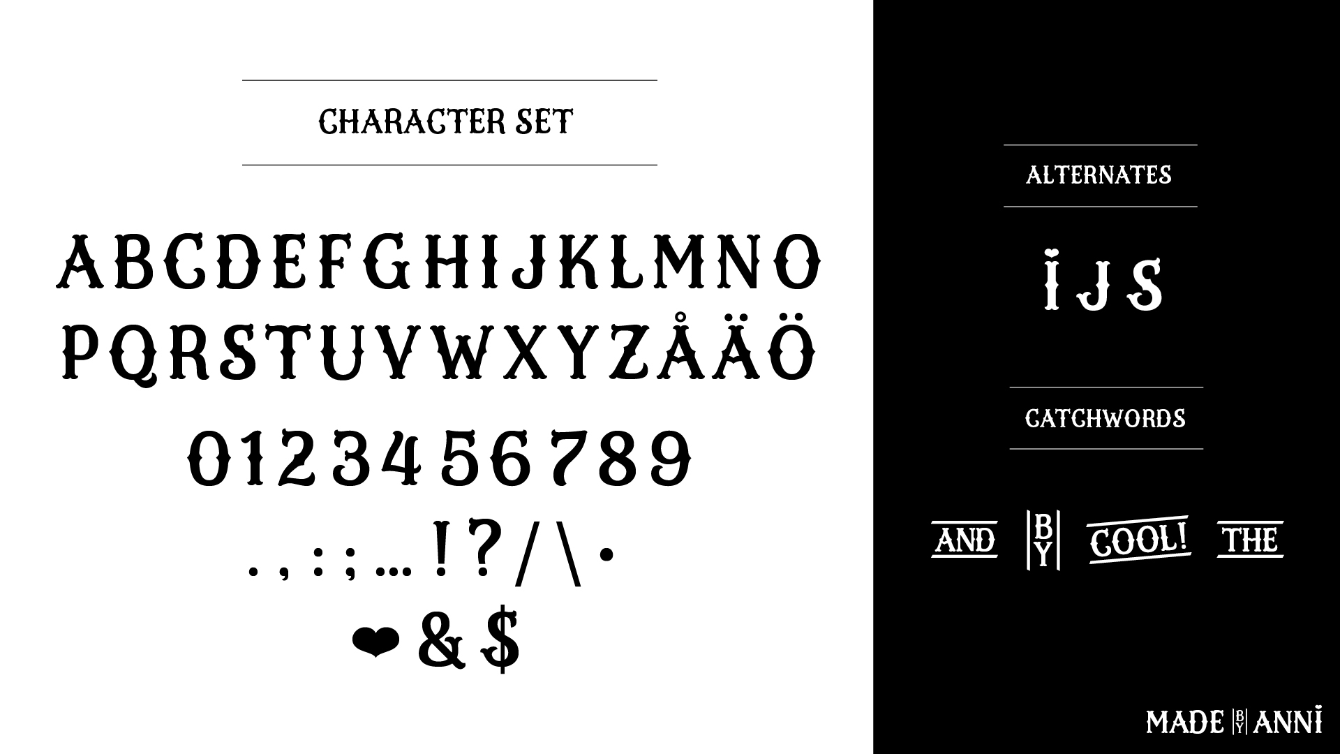
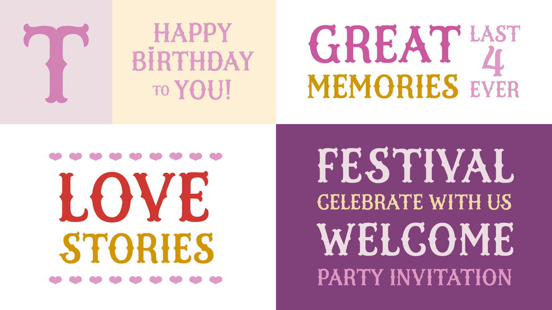
In my process I got to the point where I constructed the uppercase alphabet, numerals, some punctuations, other marks and symbols. I created some alternate characters as well as simple catchword. Perhaps if this font were to have a lowercase set in the future it would be slightly similar, sort of like small caps. I would also like to continue with the open type features.
From the specimen pictures you can find my character set presented with some alternate characters and catch words.
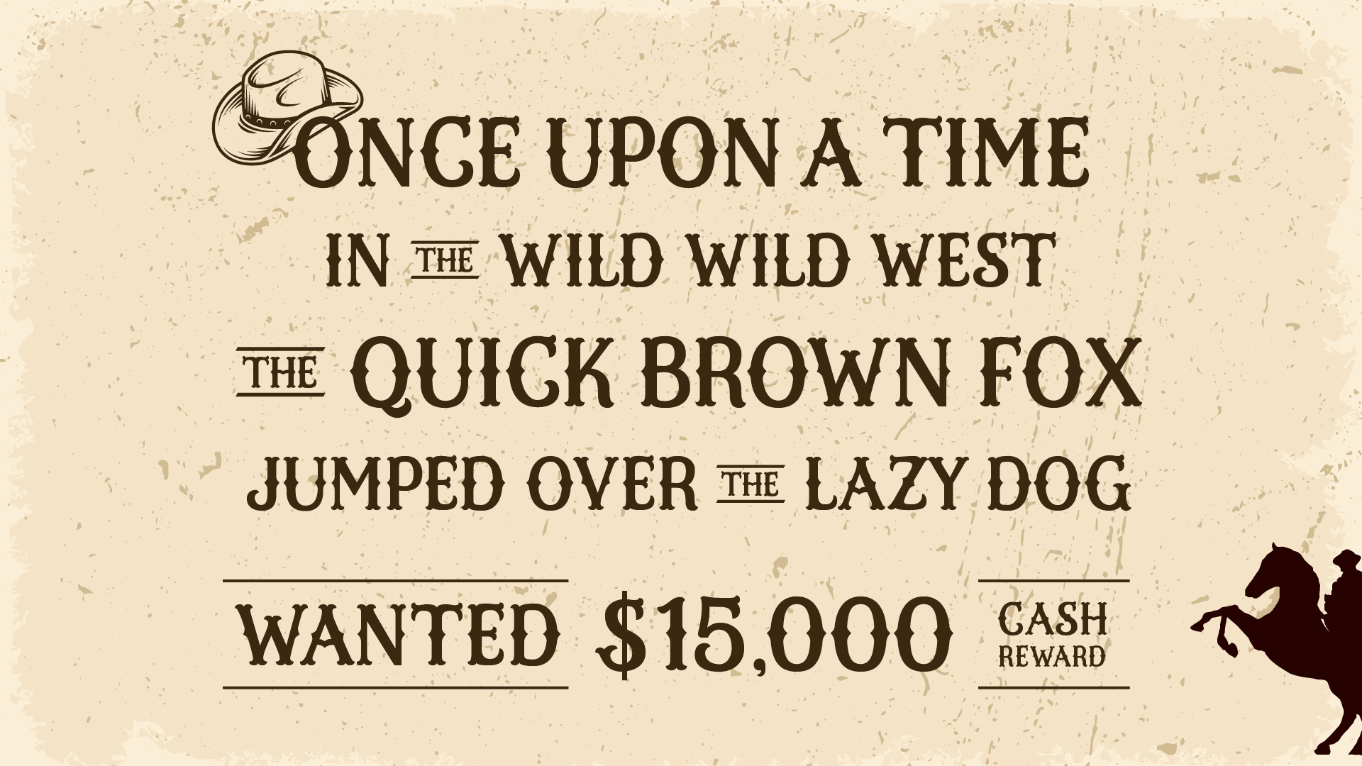
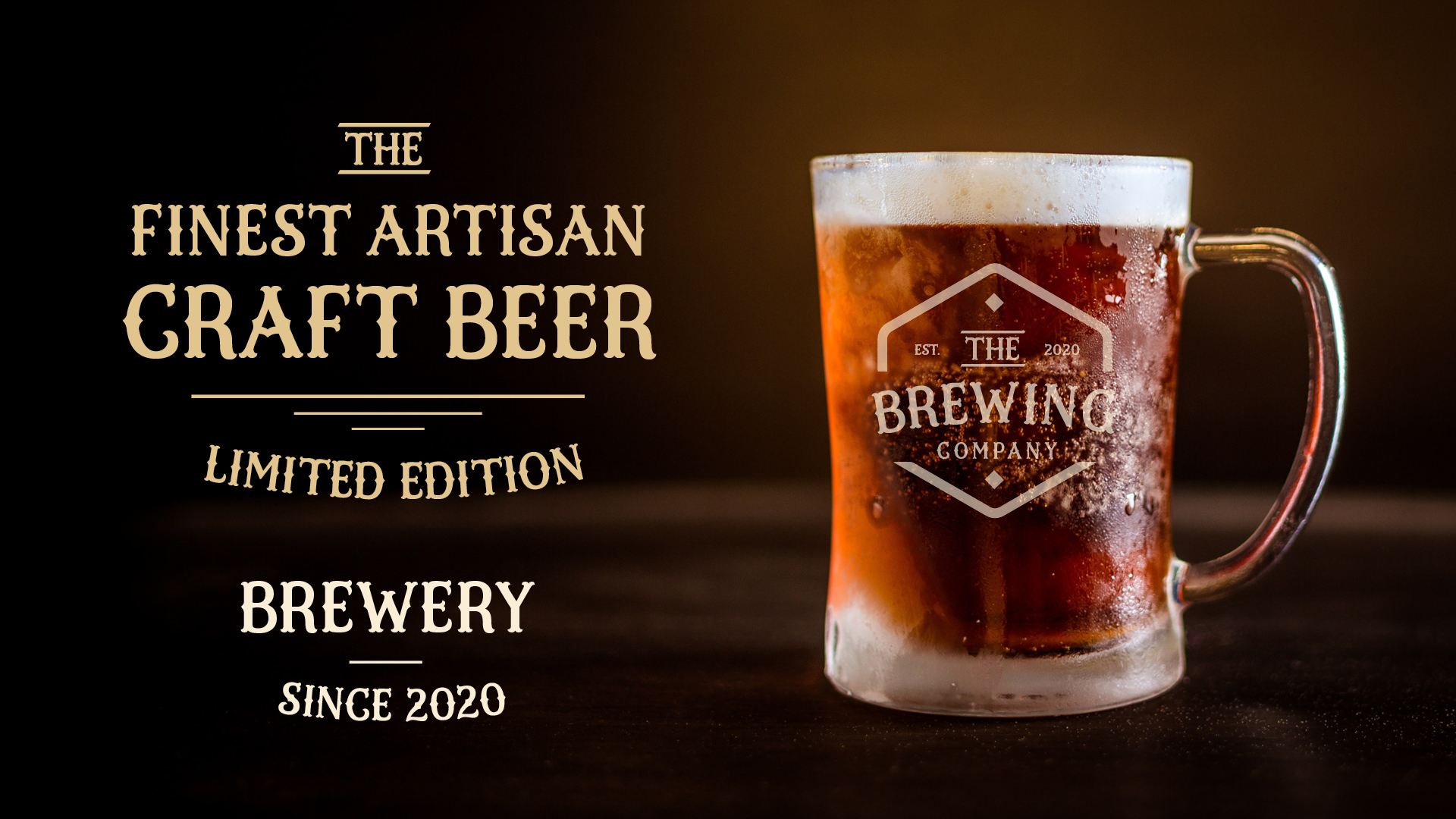
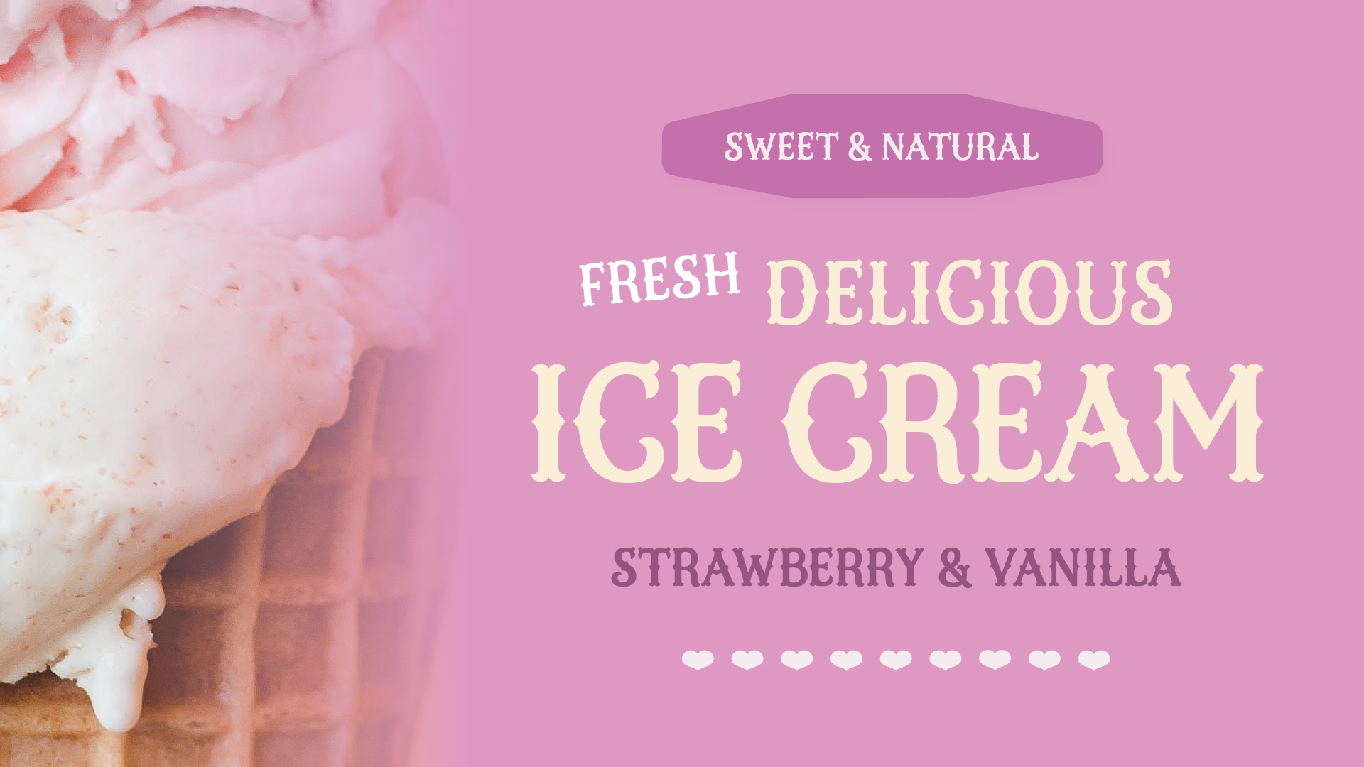
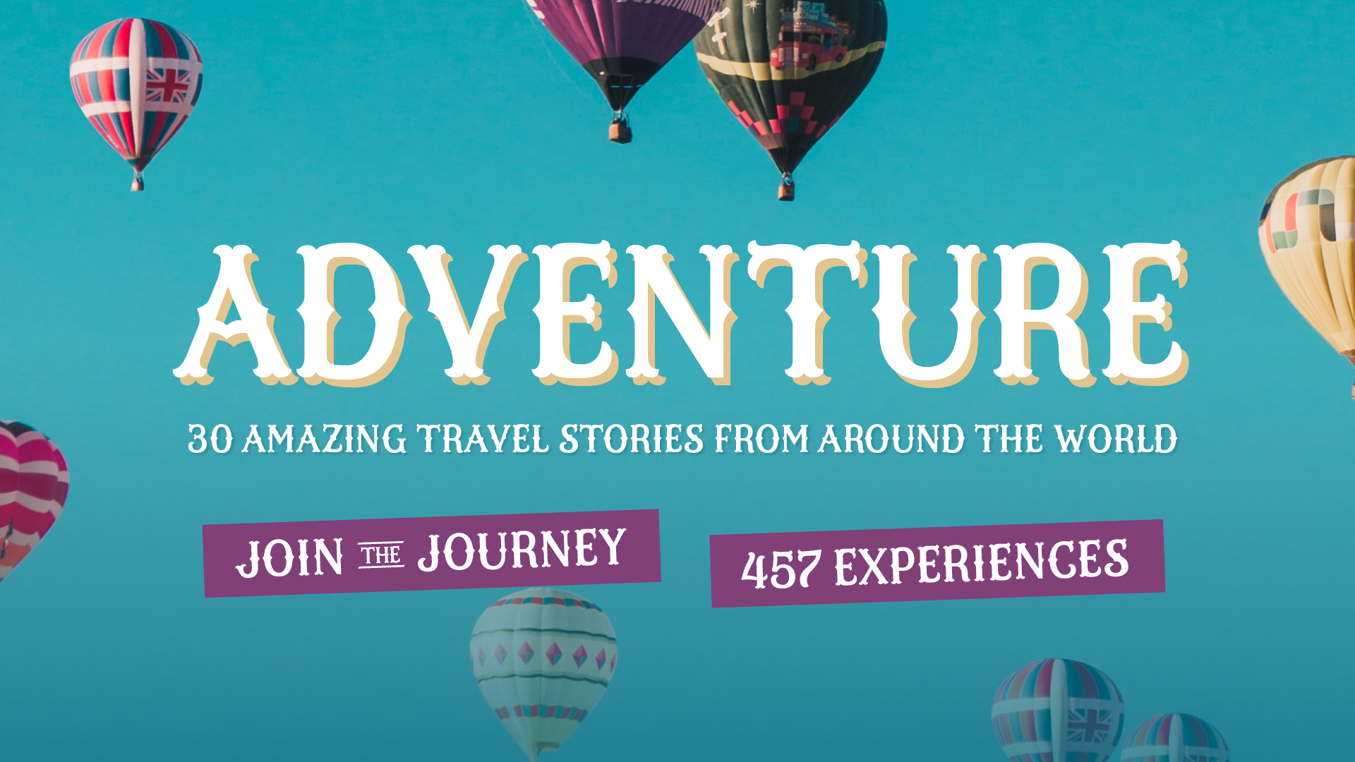
My (yet unnamed) font is a decorative, friendly typeface design that has a modern twist on vintage woodtype serif fonts. The font is designed to decorate publication covers, headlines, labels, posters or any other applications that need to stand out with their personality.
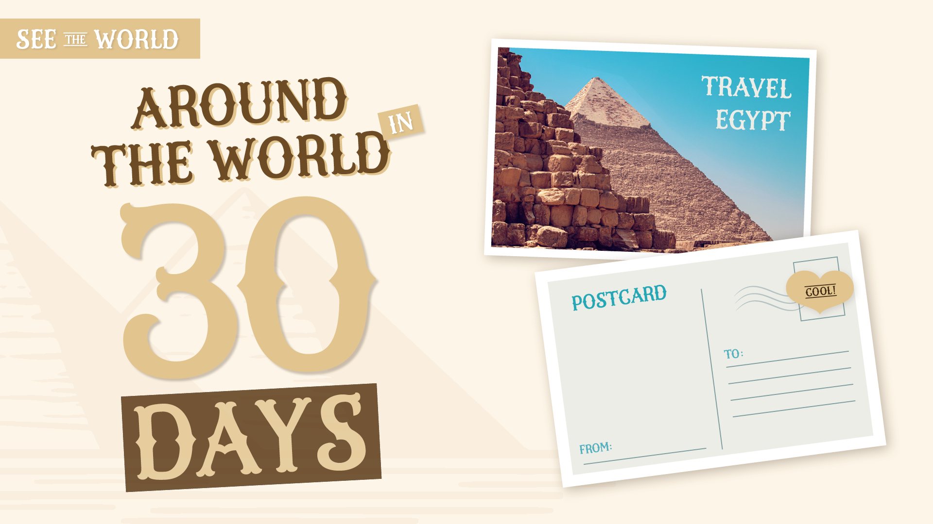
The specimen pictures present the font with different applications and context. The font could be used for example for western themed context, branding, book covers, greeting cards, invitations, happenings and events (picture 6 ) as well as travel related publications and headlines.
All photo credits in the specimen: unsplash.com
In my opinion Letter & Co. covered all the relevant points that a type design project requires. From the history of letters to inspiration within letter forms, fieldtrips, calligraphy as the starting point of letters, brainstorming techniques, how to find ideas for the alphabet, briefing, digital process using a font editor, open type features, marketing for type design and making visuals. The type critique sessions were especially helpful and motivating with great teachers. Thanks to all the instructors for the resources provided during this course.
I was also amazed to see all of my classmate’s creations and the hard work everyone put into their projects in such short period of time. The environment for learning was really friendly and inspiring. The program really helped me to put my skills in action in encouraging ways. I learned new techniques of drawing and briefing, introduced myself to a completely new font editing program and most of all learned new ways of looking at my own process of creating. I’m happy that I’m able to review the materials and context of the course all over again and wish to dig into calligraphy in more detail in the future. This experience will definitely help me in the future to create beautiful lettering in any type related projects. Thank you!
Currently I work as a freelancer. You can reach me at [email protected] and find me @anni_creates (new Instagram account so there’s not much there, yet!).
©2019 Studio Martina Flor. All rights reserved.
©2019 Studio Martina Flor. All rights reserved.