July 2, 2016

My lettering work

THE DECISION

I believe I’m one of these people with big career turn and moving to Berlin has a lot to do with that. I started to work exclusively as a letter designer more or less at the same time that I moved to the city. Working as a graphic designer and being an art director for 7 years I had of course been doing typography related stuff before. Still, it wasn’t until I moved here that I decided to stop doing any other graphic design work and pursued making a living exclusively from my lettering work.

My first step towards it was to clean up my website of all the things that I had done but I didn’t want to do anymore. My second step was to print new business cards. This was my way to say to the world that I was a letterer.

businesscards-martinaflor
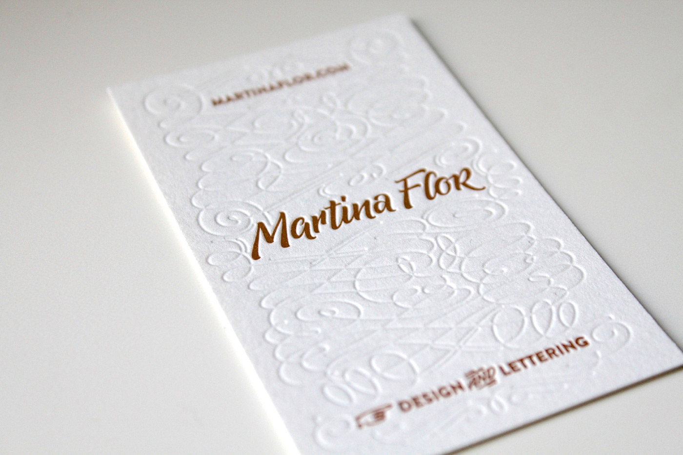
My first business cards as a letter designer

THE CONTEXT

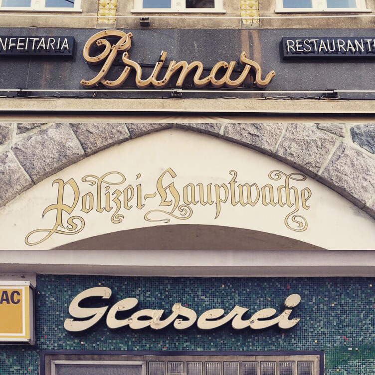
Berlin is one of the cities with more type designers per square kilometre in the world. Berlin breaths typography: there’s monthly meetings (called Typostammtisch) where the typographic community comes together to discuss typography related topics, there’s a few conferences with a focus on the mater and there’s a vibrant community of designers working in the field. You can even find a  museum of Letters (Buchstabenmuseum) that rescues abandoned vernacular signs from the streets from all around Germany.

kosmetik

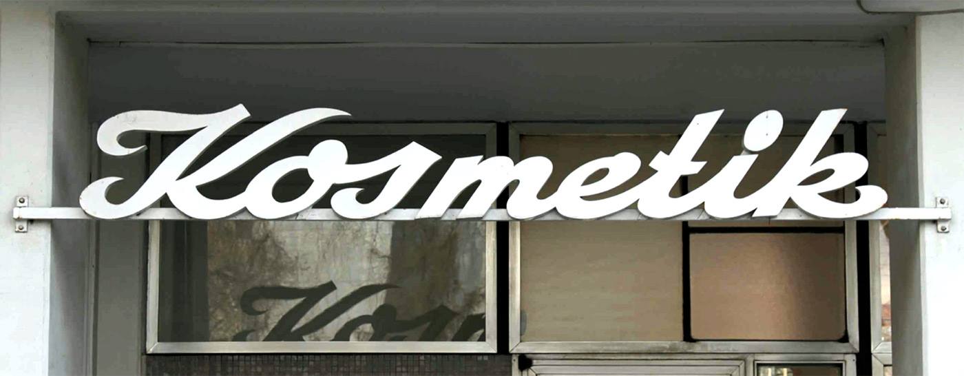
Vernacular signs are all over the place in Berlin

Traditionally Germany has a focus on formal typography. Topics as readability, legibility and clarity are essential. And these are all things that my work doesn’t necessarily pursue. My work is colourful and expressive, at times is even not readable. It's about conveying an idea and telling a story. For this I use letter shapes that combined with color and texture create a new visual text.

I was truly hesitant whether this typographic community would accept my approach to letter design. Topping all my expectations, this community welcomed my work and ultimately triggered it. Throughout these years living and working in Berlin my work became more colourful, expressful and playful than i's ever been.

THE WORK

When started working commercialy with lettering I quickly realised that I had to improve my workflow. On the first place, to be able to manage multiple projects at the same time. On the second place, to cope with tight deadlines of agencies and publishing houses. My work process is moulded through that and has become more effective with the time.

Throughout this years I have parallel run a few side projects. The biggest one that I started was Lettering vs Calligraphy, where together with calligrapher Giuseppe Salerno we organised an online battle that got a lot of attention from the audience and the media. That was one of the most exciting times of my life. Also, the way this project improved my work showed me for the first time the impact that this sort of endeavours may have in your bulk of work and the sort of commissions you get.

letteringvscalligraphy

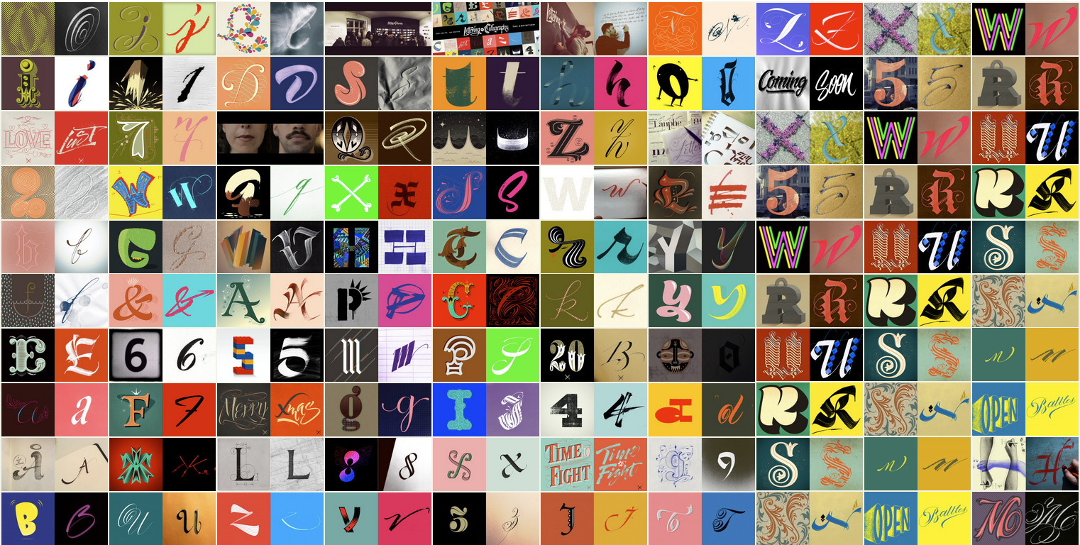
The variety of letters we created together with Giuseppe Salerno.

Some years after that I started Letter Collections where I was designing and sending postcards to friends, colleagues and complete strangers. As a result, I created a collection of 100 postcards where I experimented with several lettering styles that informed my work immensely

Side projects, commercial work and my teaching has been my main occupations during this years. Thanks to the growing attention towards my work, I have been regularly invited to speak at conferences.

THE TALKS

Speaking about my work and teaching has been one of the most nurturing things I have done so far in my career. It pushed me to organise my ideas, to question my methods and to identify what is important and what is not.

I have the luck to travel often to speak at design and type conferences, and it amazes me every time the fact that I share the stage with people I have admired since I was a young design student. Speaking about my work is just something I love to do and allows me to keep in mind the few things that are essential.

thegoldensecretsoflettering-slide
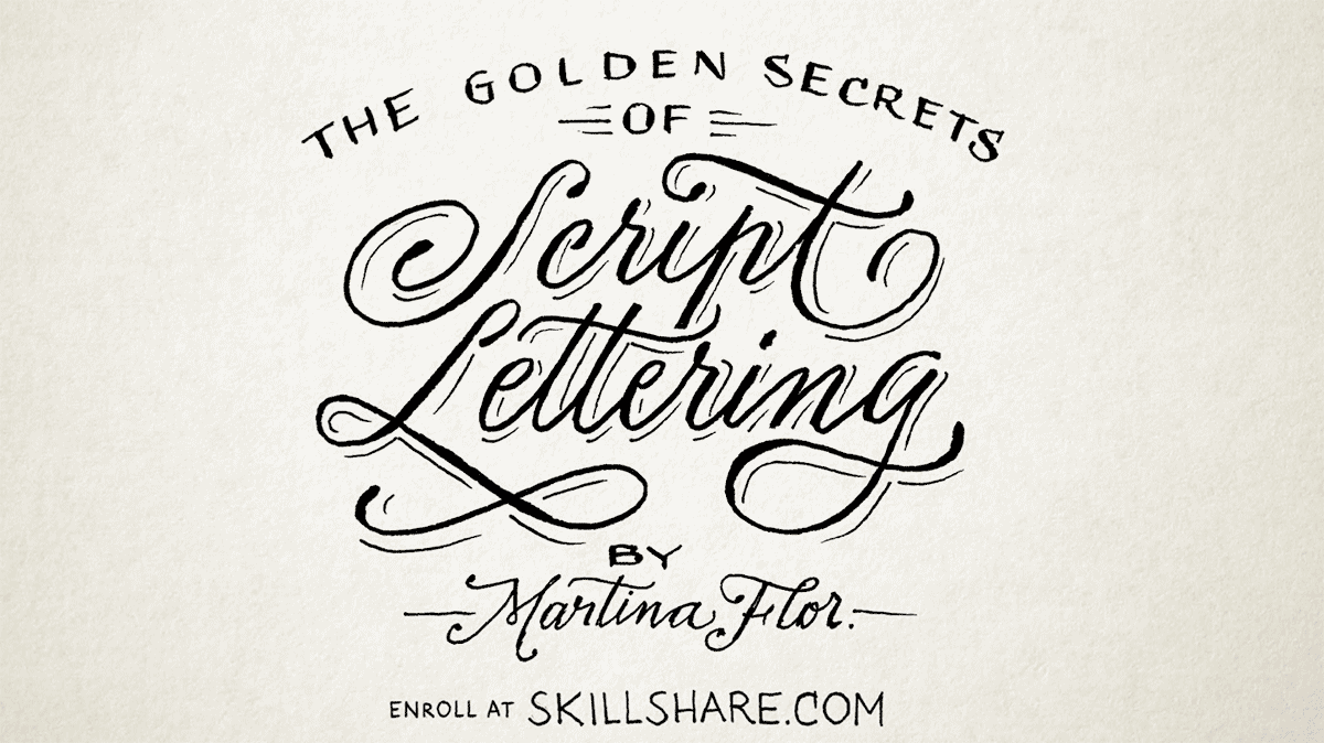
The title and the slides of my presentations about my experience at teaching lettering where made my hand. 

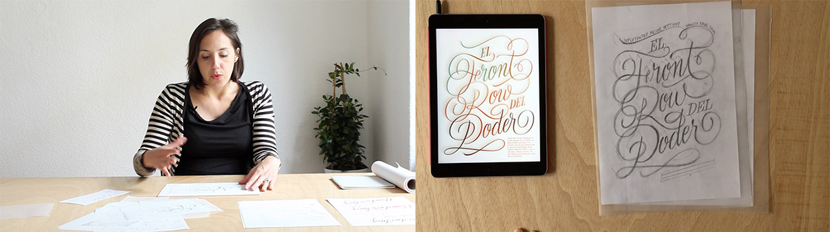
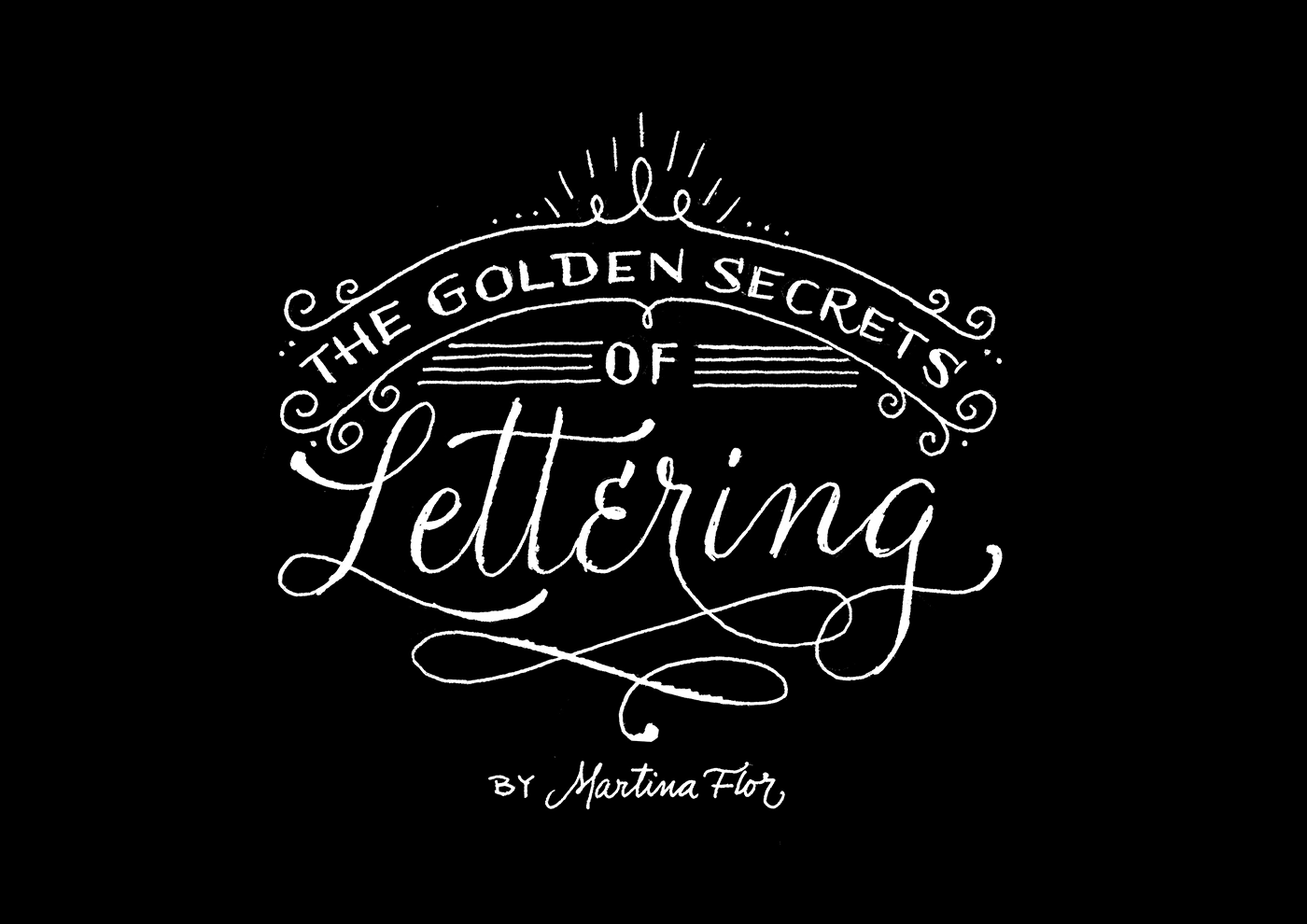
TypeCon 2014 was the conference where for the first time I presented a talk exclusively focused on my teaching. I gave a similar talk at AtypI 2014. Breaking down my teaching method into a few clear simple steps that would fit in a 20 minutes presentation made me realise that I had an own personal method, that it was also didactic and certainly effective to achieve personal results. These talks, called after my online clases The Golden Secrets of Lettering first planted the idea of making a book about it in my head. And so I did.


line

In my next post I'll be speaking about my the book Lust auf Lettering and its content. Click here to read it. 

Join thousands of readers in this community and upgrade your lettering skills! If you're as excited as I am, send this link to a friend, so they can subscribe too. 

July 2, 2016

My lettering workshops

THE START

The first lettering workshop I hosted was for free. I had just arrived to Berlin, fresh out of my type design studies in the Netherlands. No one really knew me in the city and I was positive that I could teach lettering, however I hadn't done it before and I wasn't sure if I was any good at it. My thought was basic and straight forward: if no one had to pay for it people would just sign up. That would give me more chances to have a room full and I would ultimately have the opportunity to try if I could do it.

I organized that workshop with a heart full of expectation. I planed every detail: how would I welcome the attendants, where would they seat, what would be the best for beverages and snacks and which goodies I would give away. I even organized an after workshop party, where the attendants could relax and fill in what I called The Wall of Letters, a wall-sized grid to fill with letters. After its completition it read "all the letters are equal".

The workshop exceded all my outlooks. The results were good, attendants were thankful and I felt that I had succeeded on trying to turn words something that I did intuitively. It was my first time at teaching letter design, but I felt that all the years of experience at teaching typography back in the years at Universidad de Buenos Aires translated into confidence and precision to convey concepts. That, jointly with my will to make it happen turned out to have a positive impact in my teaching.

goodtype-1st
Workshop organised in collaboration with Jakob Wolf

THE TEACHING METHOD

Over 5 years went through since that time. My first workshop lasted three days (three days!) and my workshops nowadays last 6 hours top. What has changed? My precision at sorting out the truly essential concepts that I want to give the people as take away. With the time I have also learned to identify profiles of students and how to help them improve their design process, so my efficacy at teaching translates into their success at working and getting the best out of the sessions within an economical process.

At these workshops I teach an effective technique to draw letters by hand very popular among letter designers: the improvement of a drawing by layers. Moreover, I convey a series of type design principles. Altogether these are the tools that they attendants could use for the continuation of their own practice. I also share insights on my experience at working commercially with lettering and I give tips on how to improve the workflow on a commission.


Demo of the sketching technique I use in my workshops

But perhaps the most relevant thing that I do with my teaching is to turn naive eyes into sharp, critical eyes at working with typography. And this is perhaps the most rewarding part of it, the feeling that attendants walk away with a degree of illumination. These students with my contribution will hopefully never look at letter shapes the same way again.

THE SERIES

I have taught over 35 workshops. Sometimes privately organised, at times in-house at agencies and publishing houses or universities.

I took my workshops to many cities. From the beginning I pursued the vision of turning them into an international series. And I did. I have hosted workshops in Barcelona, London, Buenos Aires, Turquey, Lugano, Dubai, Dessau and many other places in and outside Europe.

goodtypeseries

Picture with workshop attendants

The series of workshops became a living-the-dream experience that allowed me to travel to many countries as well as welcome more than 400 students eager to learn more about letter design. 

However, this scheme was not sustainable. The amount of work and money invested into organising a workshop in another city began to undermine the concept of "international".

ONLINE SKILL SHARING

I quickly found out that my wish to reach new audiences was not possible to realise through face-to-face workshops. This is when online platforms like Domestika (in spanish) and Skillshare (in english) turned out to be great outlets for my endeavour.

martinaflor-skillshareTeaching my online skillshare class

They are a different experience than a face-to-face workshop: its affordable nature and the fact that you can structure your own content turns each class into a unique way of sharing the manner in which you do things. It also provides tools to create a community that is now over 12.000 students.

These years of teaching have translated into a community that comes back to me from time to time for showing me the last lettering they did for a poster or the hand lettered invitations for their own wedding. It is jut get to see how I contributed to their knowledge in some way.

My teaching at letter design started as a side project and is nowadays a big part of my work. And this experience all in all has helped me to build self confidence in what I do and allowed me to reflect on how I do it.

line

In my next post I'll be speaking about my commercial work and how did it all started. Click here to read it. 

line

July 13, 2015

My new Skillshare Class

I'm really excited to release my new online class 'The Golden Secrets of Script Lettering' on Skillshare.  Although being an completely independent unit, this class is a good complement for my previous class 'The Golden Secrets of Lettering' and it’s tailored for designers, illustrators, and everyone who wants to improve their set of skills for creating lettering. 

One of the challenges of working with letter design is to come up with shapes that are personal and unique. My classes do not intend to give you models that you could copy, but giving you tools that you could use to boost your creativity at creating letter shapes. Your handwriting is one of those tools: no handwriting resembles another, therefore learning how to improve features on your own written words will help you achieve those personal shapes you’re aiming for.

skillshare-martinaflor-02

In this class we will be creating a lettering piece with our name departing from our own handwriting. This assignment will teach you how to make a lot of fundamental design decisions like how to improve defective letter shapes, spacing, proportions and make individual letters more sharp and unique. I’ll also give you some insights for doing flourishes.

skillshare-martinaflor-05

We’ll be going together through the entire task, from sketch to digitisation. And I’ll be showing you some of the sketches from commercial commissions and share some tips on how to improve your own creative process.

Watch the trailer and enroll in the class here.

skillshare-martinaflor-06


Look forward to see you all there!
My classes are available in two languages: English (at Skillshare) and Spanish (at Domestika.org).

March 27, 2015

Free spots for my Skillshare class

I'm giving away two free spots for my class 'The Golden Secrets of Lettering' on Skillshare.  To win, take a photo of lettering pieces found in your city or any other city and share it on Instagram or Twitter with the tag #goldensecretsoflettering. You've until Monday next week to submit your entry. Winners will be announced on Tuesday and will get a free spot to attend the online class. Good luck! 

thegoldensecretsoflettering

November 20, 2014

Teaching lettering in Spanish

martinaflor-teaching

In the last few days I've been shooting my upcoming online lettering course with Domestika team and it's been such a wonderful and fun experience!. We shot in my studio and went around the city to discover vernacular lettering. Additionally, we had the chance to shoot at Buchstabenmuseum, an unique place in Berlin. We believe this will be an unique and fantastic lettering course!

The classes will be in Spanish and will be available online starting December 9th, 2014.  I'm very excited to be able to reach students and professionals from spanish speaking countries and overseas, places where I can hardly take my workshops to. Surprisingly, it's pretty rare for me to teach in my native language and I look forward to meet them online and share my skills. ¡Nos vemos amigos!

PB181020

Sparrstraße 20,
13353 Berlin, Germany (by appointment only)
+49 (0) 30 33877574 

Sparrstraße 20,
13353 Berlin, Germany (by appointment only)
+49 (0) 30 33877574 

Sparrstraße 20,
13353 Berlin, Germany (by appointment only)
+49 (0) 30 33877574 

Subscribe to the Lettering Tips newsletter and other important updates!


Liability Disclamer 

©2019 Studio Martina Flor. All rights reserved.


 ©2019 Studio Martina Flor. All rights reserved.