August 24, 2020

Lettering Crit—Display Type Special.

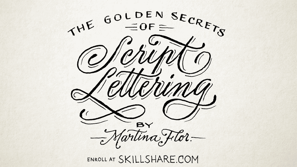
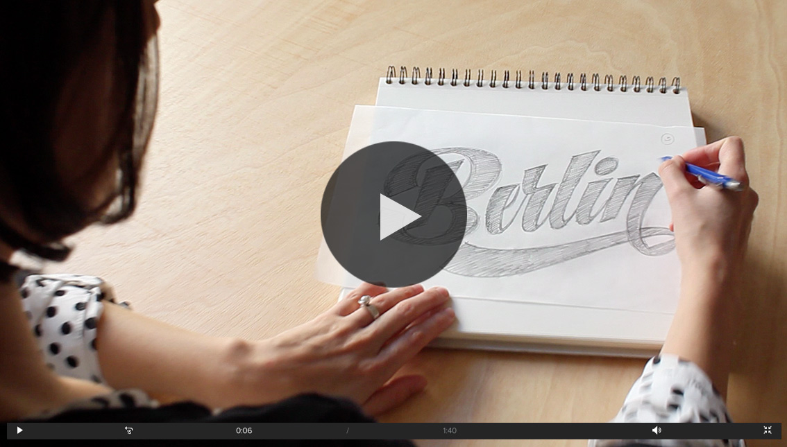
The Lettering Crit - Display Type Special was so much fun and there are so many takeaways to share with you. Everyone was truly engaged with giving feedback to the projects, and I'm sure that the authors of the selected projects Derek Munn, Prateek Bisht, Jamie Otelsberg, and Ana Michel got tons of information to continue working on their projects. If you missed it, here's a replay.

Here are the main takeaways of this session:

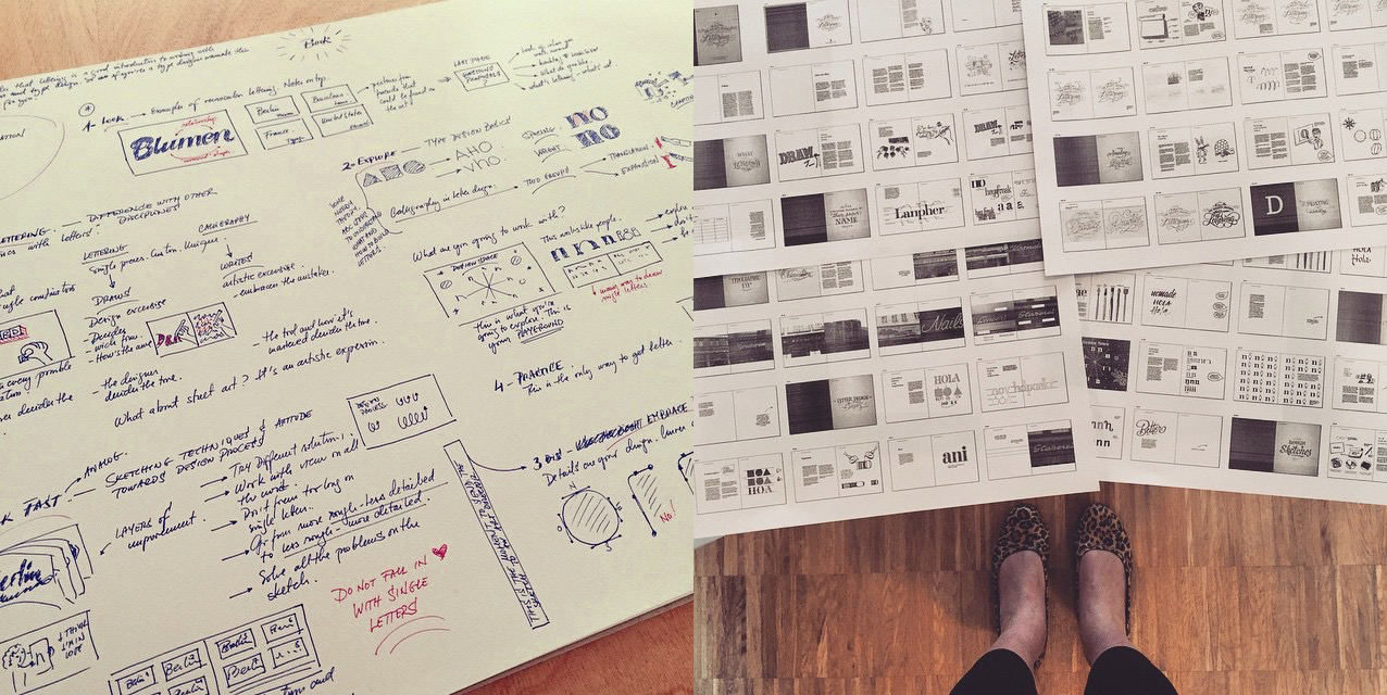
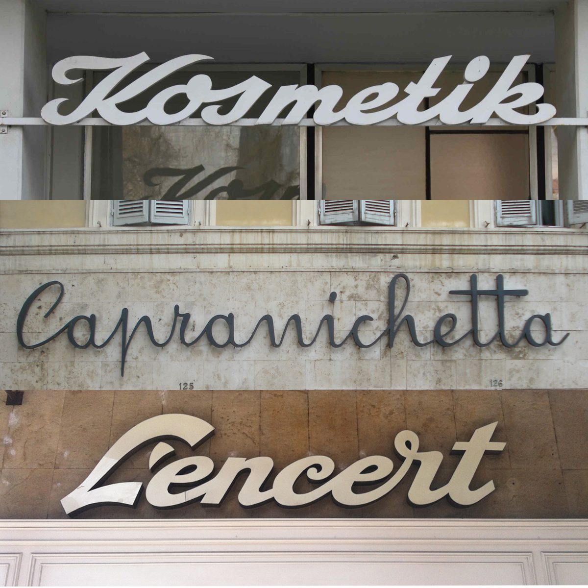
1. Finding inspiration in vernacular typography: old signs, old specimen books and graphic material can be a great starting point for a unique typeface (although not the only one). Beware, you'll probably have to redesign/reshape many letterforms to make them suitable to a contemporary eye. That's when your unique perspective plays an important role!

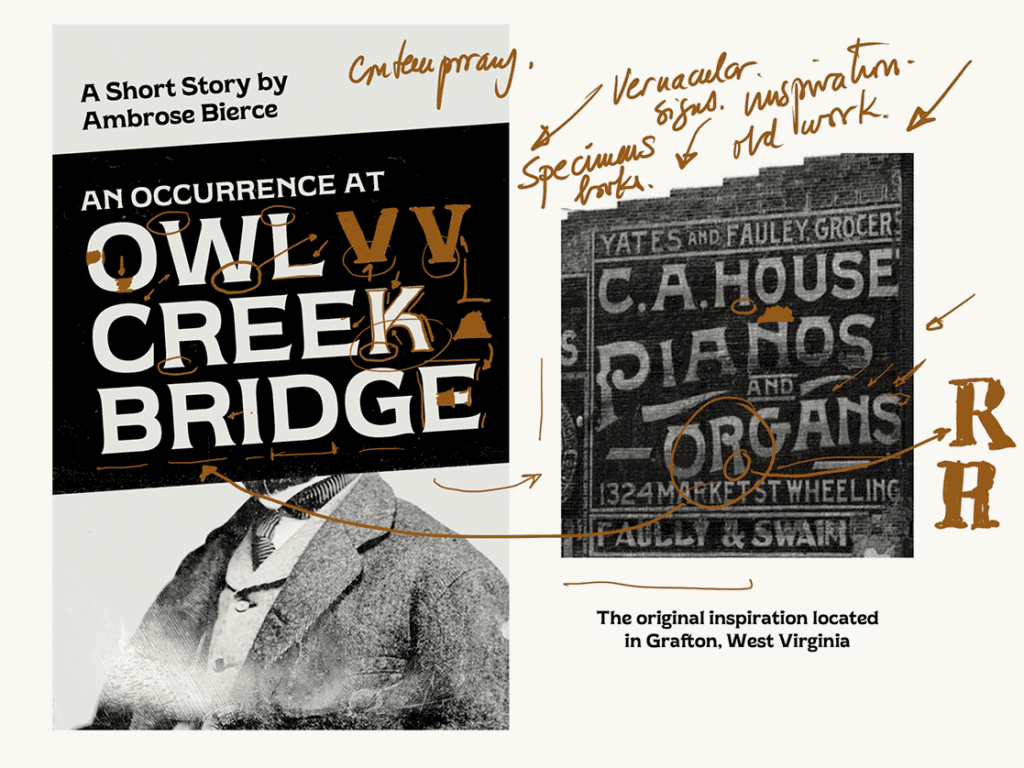
Derek's project is a good example of using and repurposing vernacular typography for a modern typeface.

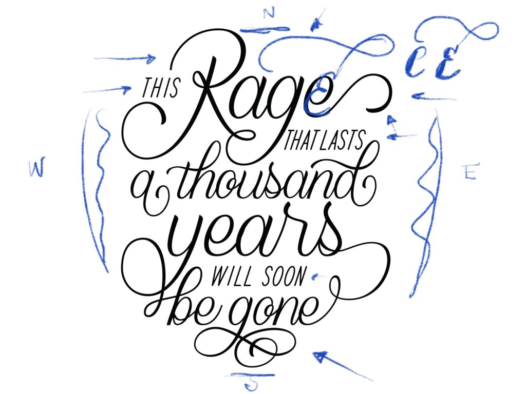
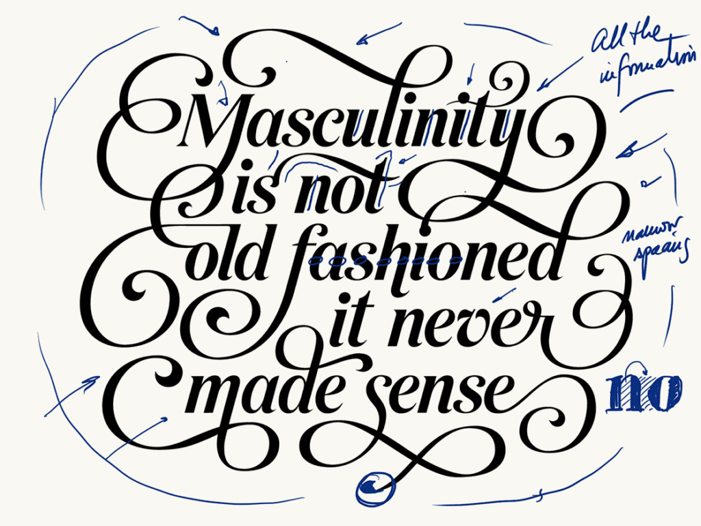
2. Use your calligraphy: calligraphy as the mother of all letterforms can help you easily stick to a style and achieve consistency within your alphabet. Why? Because the letters will be all essentially "written" by the same hand. 

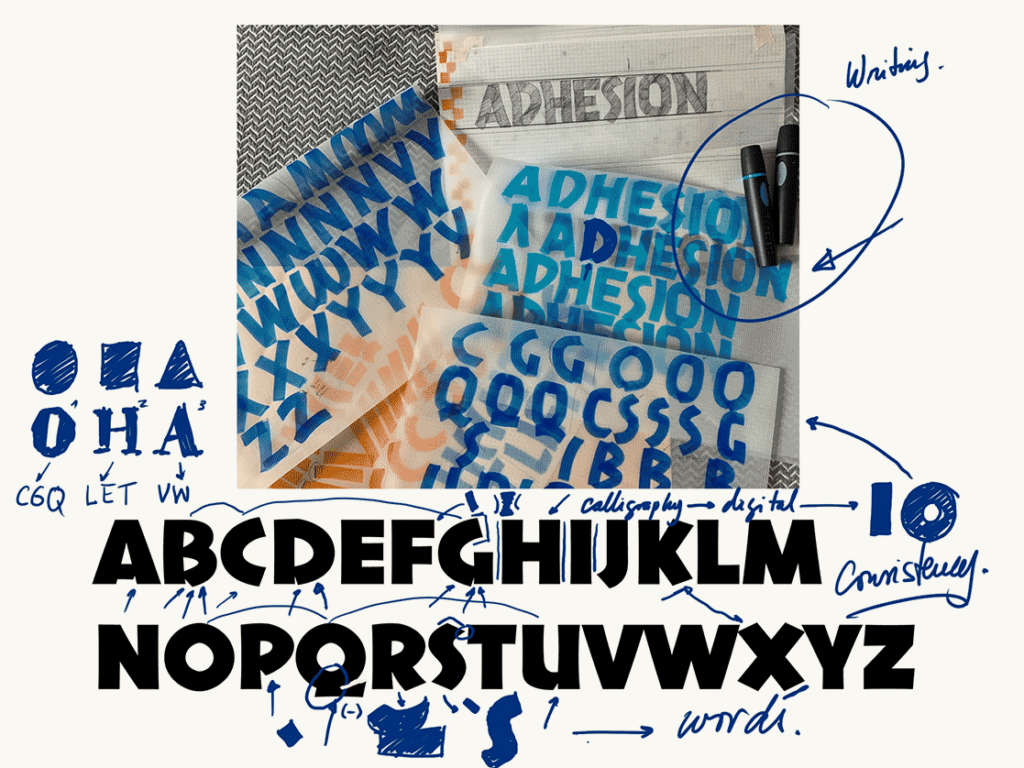
Jamie's project translates her calligraphy into an alphabet, and through that process she keeps consistency all along.

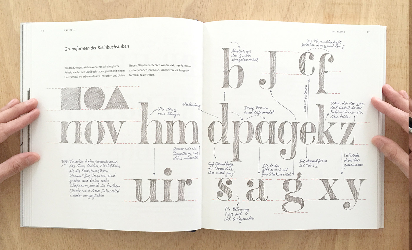
3. Expand your alphabet: find the mother shapes and use them to inform the shape of other letters. Your mother shapes are those that look like a rectangle, a circle or a triangle. For instance, your "O" is the mother shape for your C, Q, and gives you tons of information to draw your D or P. Can you see why? Of course! All these letters share a rounded shape.

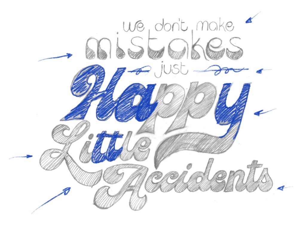
4. Consistency: make a couple of strong decisions and try to apply them consistently in all letter shapes. That decision could be making your letters high contrast, or inverting the contrast completely or using bananas to build your letterforms. Everything is possible as long as it's possible on all letters.

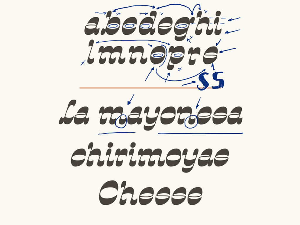
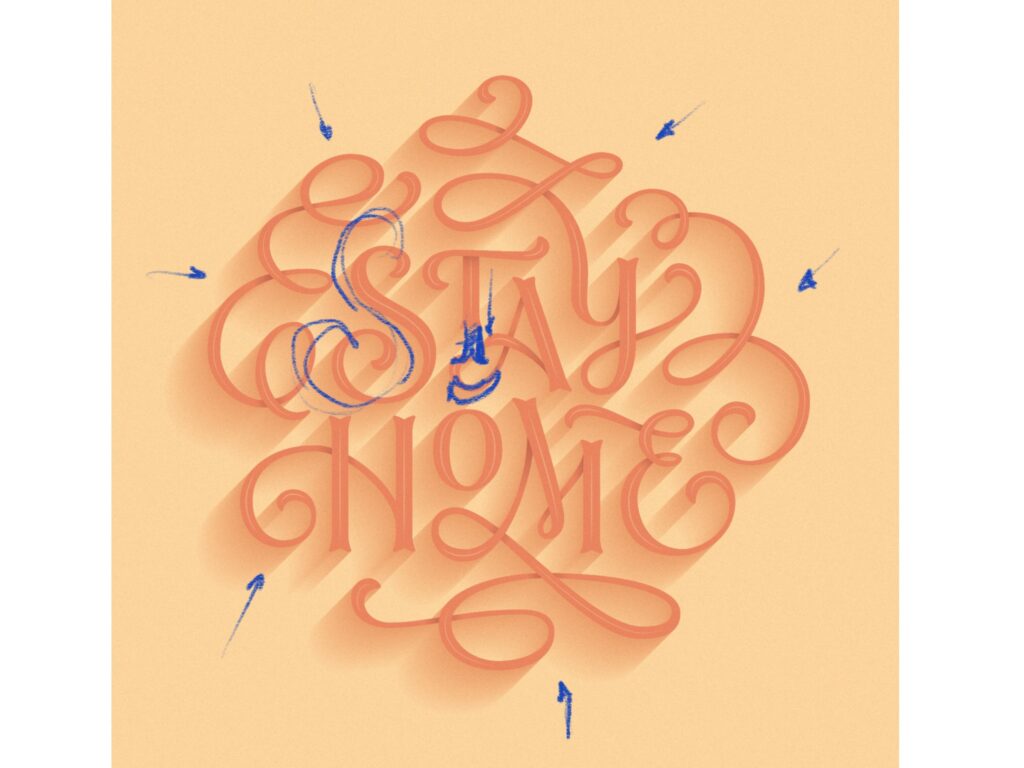
Ana's project stands through using one strong decision that applies to all letters. In this case, she's using inverted contrast for all shapes.

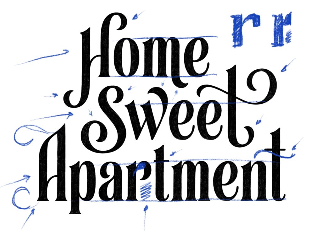
5. Design words: move onto setting words with your letters sooner than later. Remember that designing letters is not about the isolated shape itself, but about how well that interacts with all the rest.

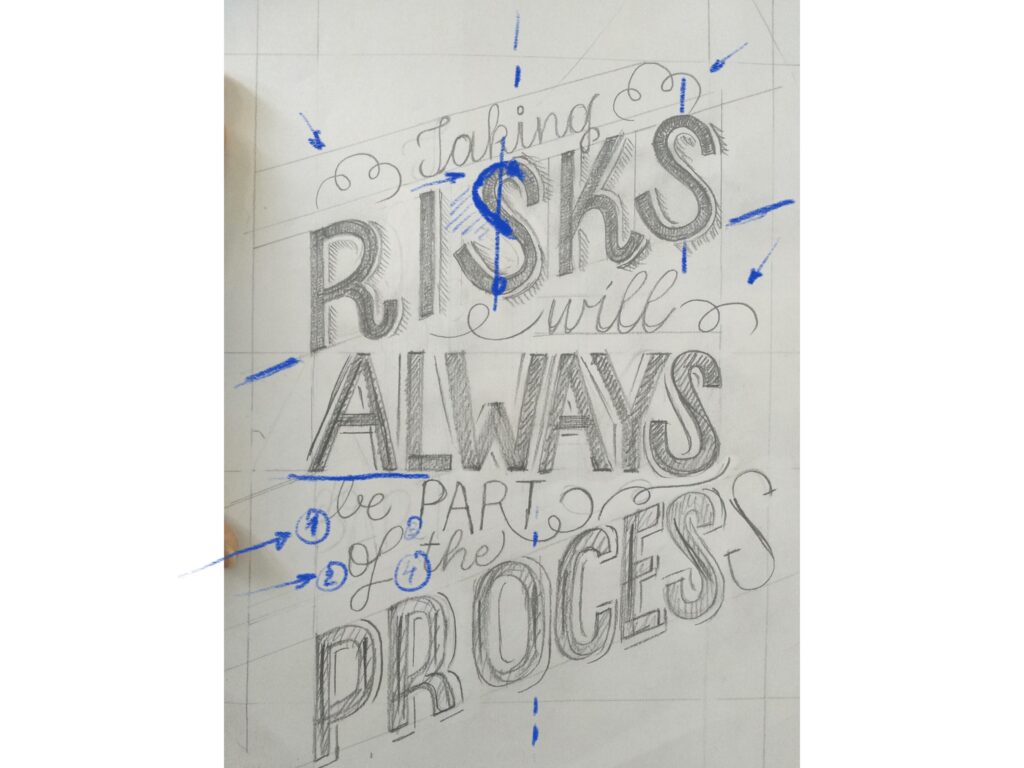
6. Mind the gap (spacing): designing letters is not only about the substance (the black part) but also about the space around them. Remember the rule of thumb for finding your ideal spacing—the space within the letters should be similar to the space between the letters.

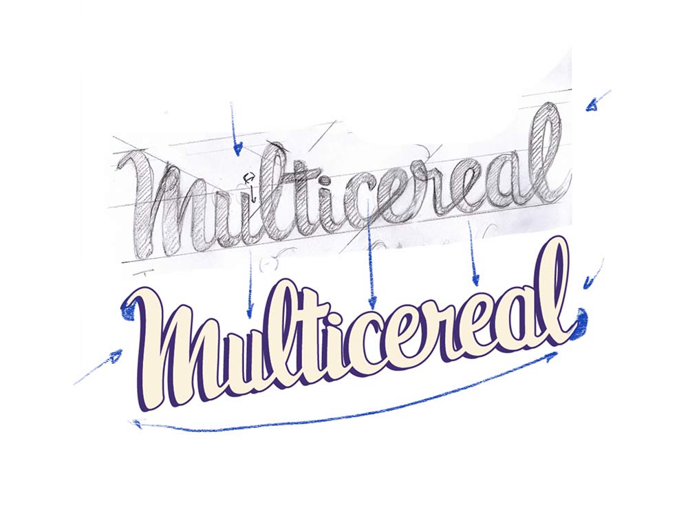
Prateek's project displays consistency through a consistent slant, contrast, and weight. Also, the spacing is considered as part of the design.

Give it up for Anna, Prateek, Jamie and Derek for their great work! 👏🏻👏🏻👏🏻👏🏻👏🏻 I'll be delivering more tips to create typefaces in the next few weeks, and on September 4 I'll be opening registration for Letter&Co. my latest course about display type design. Cannot wait! 

July 17, 2020

Lettering Crit. Take Aways.

The first Lettering Crit session was just over-the-top amazing. I enjoyed it so much that I just want to do this exclusively from now on! Just kidding #notkidding. If you missed it, here's a replay.

​This was a collective work. In the session, it was not only me giving comments and feedback on the work, but all attendees participated (that chat was on fire!). I have to say that it wasn't easy to select among hundreds of submissions and so many great pieces of work, but finally, the projects of Ailen Kenny, Caroline Esteves, Darshita Agarwal, Jenn Rothschild, Irene Clua, and Jenny Mercer were selected. They were the lucky ones to receive valuable feedback for their next iterations.

These are some of the main take-aways of the session, good lettering tips: 

1. Composition hints: To get your composition right use the North (N), South (S), West (W), East (E) principle. So if the north of your composition is very busy (with swashes or flourishes), find ways to compensate that in the south portion of your composition.

Beautiful script lettering by Ailen Kenny. We suggested a change of shape for letter e.

2. Decorative elements to the rescue: if you happen to have negative spaces (white spaces) within your composition, decorative elements may come handy. Use lines, swirls and flourishes to "cover" those up.

Extreme contrast for Caroline Esteves's work. Perhaps adding some decorative elements to cover up negative space?

3. Watch out with your S: Raise your hand if you ever struggled with an S. Well, I have! 🙋🏻‍♀️ When drawing an S, focus on the space around rather than in the shape itself. If there's too much space on any of the sides, you might need to adjust the slant or shape of that S.

Helping Darshita Agarwal with that S.

4. Use capital letters and design them all together: if possible, use as many capital letters as possible. Capital letters are normally more expressive and wild, and they will add tons of flavor to your piece. Also, when having multiple on your composition, design them all together, so that they share the same features and have the same complexity. 

Solid work by Jenn Rotschild. We suggested some flare for her capital letter A.

5. Confirm that is readable: especially when working on flourished compositions, there's the risk of compromising readability. Double-check with other readers if necessary. 

Irene Clua with a beautiful executed piece. It was mentioned that one of the flourishes mike read like a capital E.

6. Solve most of the problems in your sketch: before moving on to the digital drawing, solve all of the problems in your hand sketch. This will make digitization much easier!.

Jenny Mercer solved most of the problems in the hand sketch and continued improving her shapes as she moved on to the digital drawing.

I'll be hosting more sessions in the future, keep your eyes peeled! Have a great weekend. 

Martina.

July 17, 2020

Introducing FREE Lettering Crits

I'm uber-excited to introduce my first Lettering Crit, a new FREE live feedback session for lettering makers.

The Lettering Crit (short term for "critique") is a live event to provide feedback to selected work. Previously there will be a call for submissions. This is how it works in a nutshell:

Sessions will occur on YouTube, and everyone can attend. The fun thing is that you won't know if your work was selected upfront, you'll have to join the YouTube session to find out! During that session, attendees and I will comment on the pieces (it could be yours!) and provide tips and tricks to take it to the next level. Along the way, I'll be sharing valuable insights on lettering and letter design as well.

One important thing: these sessions are not made to crash anyone's work but to highlight the great bits and give feedback. One of the goals behind it is to discover new talent, that's why I'll be featuring the authors here in my newsletter and on my social networks.

See The Lettering Crit here.

Why feedback is important.

Having feedback from teachers and mentors was essential for me to improve my work with letters. Without them, it would have been really hard to spot the flaws in my work and make it better. Sometimes you need someone to point out at stuff and make you see it.​
​​
As important as understanding your flaws is having reaffirmation on what you're doing right, isn't it? I've always appreciated teachers and colleagues that were not only able to critique me but also give me a pat on the back. I want to be able to provide that to other letter makers out there, and this is why I'm hosting this Lettering Crit.

What do you think, are you in? I'm looking forward to seeing your work! Click here to join for free and submit your work.

July 2, 2016

The Book

THE FIRST STEPS

After holding talks about my teaching methodology at TypeCon 2014 and AtypI 2014, defining the structure of my book turned out pretty easy. I remember coming back from the AtypI Barcelona Conference, driving directly from the airport to the studio, sitting at my desk and putting down on an A3 paper all the ideas that I had in my head. This was the plan de route for the book. planderoute

Left: first mind map of the content of my book in November 2014. Right: First pages plan of the book before finding a publisher.

I wanted to make a book that would speak to a broad readership under my personal belief that everyone can learn to draw letters. I also wanted it to feel as if the reader was at one of my workshops, with clear visual explanations. As a result, the book is 50% handmade, including sketches done by me, handwritten notes and schematic illustrations that explain in a didactic way how to draw letter shapes.

Since I defined the first structure for the content, I worked on it on and off aside my studio work. The growing amount of commercial work I was doing didn’t allow me to work on it on a daily basis and it wasn't until TYPO Berlin 2015 that I set a deadline for it.

SIGNING WITH A PUBLISHER

I met Bertram Schmidt-Friedrichs, the head editor from Verlag Hermann Schmidt, at Typo Berlin 2015. We were spontaneously introduced to each other by book designer Tomas Marauzkas. In a 5 minutes conversation I pitched the book I was working on and I believe that I spoke about it with such an enthusiasm and conviction that, some days after, Bertram invited me to Mainz to speak about the project.

Since they have a wide expertise on typography and design books, Verlag Hermann Schmidt seemed the right match for what I had in hands. I was after a publisher that would understand the sort of project I was after.

It took us a two hour meeting to realise that we were on the same page with the direction of the book. One month later we were signing the contract that 9 months after will bring to life this book.

DOING THE BOOK

My son was born a month after signing that contract with Verlag Hermann Schmidt. As every first-time mom, I had no idea of what it means to welcome a baby in your life nor how that influences your daily routine, your family and your work. The first months my son was there where truly challenging, enjoyable and confusing. I didn’t really know how I could ever go from that position to back to work again. However, I was sure of one thing: I wanted to make this book happen.

Funnily, the conditions turned out to be relatively positive to work on it. Since during those months I was taking in very few commercial commissions from clients, I could concentrate almost exclusively on this project. mewithbaby

Me working at my home office with baby

I was creating the content, the illustrations as well as taking care of the layout for most of the time and, therefore, the making of process turned out to be really toilsome. Having an engaged, open minded and straight forward editor coordinating the steps as well as giving me valuable feedback was essential to finalise the book.

The book was written in english and translated to german. Since a big part of it is composed by handmade sketches and handwritten notes, the process was time consuming as well as implementing the corrections.

martinaflorshand

Physical proof of designers hard work

THE RESULT

The book is much more than I initially imagined, and it was shaped through an exciting creative process with my editor as a partner. It concentrates on the process of drawing letter shapes by hand, i.e., the art of hand lettering. However, the goal is not to make imperfect, quirky, handmade-looking type, but rather to create well-shaped, polished, exquisite digital lettering.

To that end, I show the basics of letter design as well as essential tips to master different lettering styles.photo01


I will guide you through the process of creating a lettering project, from start to finish, from analog to digital. Beginning your design by hand, you will learn about sketching methods and techniques to improve your drawings. photo02

Once you have finished sketching, you will jump into the digital environment and draw your letter shapes in vectors. You will finalize your piece by coloring it and adding texture. photo03
Last but not least, I will share some insights about the commercial work of hand lettering. I will describe the most common kinds of commissions and give advice on how to reach out for clients and how to showcase your work.photo04

Before you run to your favorite book store to get your copy, you should know that this book shows just one way of doing things: mine. It is informed by my personal experience of working in the commercial world, by all the teachers and colleagues I learned from, and by my involvement in teaching at universities and private workshops.

My aim with it is to share all I have learned through trial and error. Rather than showing pretty alphabets that you can copy and color, this book will provide you with concepts, tools, and techniques that will guide you in your own path to hand lettering. Be ready to learn about them and make them your own. After reading this book, you will see letters in a totally new way.

LustaufLettering-Martinaflor-order

You can order it online here or find it at your favourite book store.

line


Join thousands of readers in this community and upgrade your lettering skills! If you're as excited as I am, send this link to a friend, so they can subscribe too. 

July 2, 2016

My lettering workshops

THE START

The first lettering workshop I hosted was for free. I had just arrived to Berlin, fresh out of my type design studies in the Netherlands. No one really knew me in the city and I was positive that I could teach lettering, however I hadn't done it before and I wasn't sure if I was any good at it. My thought was basic and straight forward: if no one had to pay for it people would just sign up. That would give me more chances to have a room full and I would ultimately have the opportunity to try if I could do it.

I organized that workshop with a heart full of expectation. I planed every detail: how would I welcome the attendants, where would they seat, what would be the best for beverages and snacks and which goodies I would give away. I even organized an after workshop party, where the attendants could relax and fill in what I called The Wall of Letters, a wall-sized grid to fill with letters. After its completition it read "all the letters are equal".

The workshop exceded all my outlooks. The results were good, attendants were thankful and I felt that I had succeeded on trying to turn words something that I did intuitively. It was my first time at teaching letter design, but I felt that all the years of experience at teaching typography back in the years at Universidad de Buenos Aires translated into confidence and precision to convey concepts. That, jointly with my will to make it happen turned out to have a positive impact in my teaching.

goodtype-1st
Workshop organised in collaboration with Jakob Wolf

THE TEACHING METHOD

Over 5 years went through since that time. My first workshop lasted three days (three days!) and my workshops nowadays last 6 hours top. What has changed? My precision at sorting out the truly essential concepts that I want to give the people as take away. With the time I have also learned to identify profiles of students and how to help them improve their design process, so my efficacy at teaching translates into their success at working and getting the best out of the sessions within an economical process.

At these workshops I teach an effective technique to draw letters by hand very popular among letter designers: the improvement of a drawing by layers. Moreover, I convey a series of type design principles. Altogether these are the tools that they attendants could use for the continuation of their own practice. I also share insights on my experience at working commercially with lettering and I give tips on how to improve the workflow on a commission.


Demo of the sketching technique I use in my workshops

But perhaps the most relevant thing that I do with my teaching is to turn naive eyes into sharp, critical eyes at working with typography. And this is perhaps the most rewarding part of it, the feeling that attendants walk away with a degree of illumination. These students with my contribution will hopefully never look at letter shapes the same way again.

THE SERIES

I have taught over 35 workshops. Sometimes privately organised, at times in-house at agencies and publishing houses or universities.

I took my workshops to many cities. From the beginning I pursued the vision of turning them into an international series. And I did. I have hosted workshops in Barcelona, London, Buenos Aires, Turquey, Lugano, Dubai, Dessau and many other places in and outside Europe.

goodtypeseries

Picture with workshop attendants

The series of workshops became a living-the-dream experience that allowed me to travel to many countries as well as welcome more than 400 students eager to learn more about letter design. 

However, this scheme was not sustainable. The amount of work and money invested into organising a workshop in another city began to undermine the concept of "international".

ONLINE SKILL SHARING

I quickly found out that my wish to reach new audiences was not possible to realise through face-to-face workshops. This is when online platforms like Domestika (in spanish) and Skillshare (in english) turned out to be great outlets for my endeavour.

martinaflor-skillshareTeaching my online skillshare class

They are a different experience than a face-to-face workshop: its affordable nature and the fact that you can structure your own content turns each class into a unique way of sharing the manner in which you do things. It also provides tools to create a community that is now over 12.000 students.

These years of teaching have translated into a community that comes back to me from time to time for showing me the last lettering they did for a poster or the hand lettered invitations for their own wedding. It is jut get to see how I contributed to their knowledge in some way.

My teaching at letter design started as a side project and is nowadays a big part of my work. And this experience all in all has helped me to build self confidence in what I do and allowed me to reflect on how I do it.

line

In my next post I'll be speaking about my commercial work and how did it all started. Click here to read it. 

line

July 20, 2015

Free Spots for my new Skillshare Class

I'm giving away two free spots for my class 'The Golden Secrets of Script Lettering' on Skillshare. To win, take a photo of SCRIPT LETTERING pieces found in your city or any other city and share it on Instagram or Twitter with the tag #goldensecretsoflettering. You've until next Friday to submit your entry. Winners will be announced on Monday next week and will get a free spot to attend the online class. Good luck!

instagramwitdraw

July 13, 2015

My new Skillshare Class

I'm really excited to release my new online class 'The Golden Secrets of Script Lettering' on Skillshare.  Although being an completely independent unit, this class is a good complement for my previous class 'The Golden Secrets of Lettering' and it’s tailored for designers, illustrators, and everyone who wants to improve their set of skills for creating lettering. 

One of the challenges of working with letter design is to come up with shapes that are personal and unique. My classes do not intend to give you models that you could copy, but giving you tools that you could use to boost your creativity at creating letter shapes. Your handwriting is one of those tools: no handwriting resembles another, therefore learning how to improve features on your own written words will help you achieve those personal shapes you’re aiming for.

skillshare-martinaflor-02

In this class we will be creating a lettering piece with our name departing from our own handwriting. This assignment will teach you how to make a lot of fundamental design decisions like how to improve defective letter shapes, spacing, proportions and make individual letters more sharp and unique. I’ll also give you some insights for doing flourishes.

skillshare-martinaflor-05

We’ll be going together through the entire task, from sketch to digitisation. And I’ll be showing you some of the sketches from commercial commissions and share some tips on how to improve your own creative process.

Watch the trailer and enroll in the class here.

skillshare-martinaflor-06


Look forward to see you all there!
My classes are available in two languages: English (at Skillshare) and Spanish (at Domestika.org).

March 24, 2015

My new Skillshare Class

I'm really excited to release my new online class 'The Golden Secrets of Lettering' on Skillshare.  It's rewarding to be able to share my skills and reach students across the globe where I mostly find hard to go with my workshops.

The concept of this class is based on my Letter Collections  project where I design and send postcards around the globe and will share my making of process with you. Together, we will go through the assignment of creating a piece of lettering for the perfect postcard: from concept, to sketch to digitisation, including tips to add texture and color to your final work.

martinaflor-skillshare


In this class we will start by training our ‘typographic eye’ by looking at examples of typographic pieces that surround us. I'll show you some theoretical principles to understand the structure of letter shapes and I'll share with you the technique I use to sketch and achieve more extreme, personal and interesting results.

skillshareclass-martinaflor

This class is suitable for beginners as well as for those with previous experience who want to go a step forward into the art of lettering and expand their set of creative skills. You'll walk away from this class with a sharper eye when working with typography and essential and practical tools to draw lettering and to guide your own improvement afterwards. After this class, you will see typography in a completely different way.

Watch the trailer and enroll in the class here.

skillshare-martinaflor

This makes my online classes available in two languages: English (at Skillshare) and Spanish (at Domestika.org). What's next? A class in german language perhaps?

January 22, 2014

Good Type has a new Site!

I’m proud to announce GoodType.co, the brand new website for my series of workshops on lettering design.

Read more

Sparrstraße 20,
13353 Berlin, Germany (by appointment only)
+49 (0) 30 33877574 

Sparrstraße 20,
13353 Berlin, Germany (by appointment only)
+49 (0) 30 33877574 

Sparrstraße 20,
13353 Berlin, Germany (by appointment only)
+49 (0) 30 33877574 

Subscribe to the Lettering Tips newsletter and other important updates!


Liability Disclamer 

©2019 Studio Martina Flor. All rights reserved.


 ©2019 Studio Martina Flor. All rights reserved.