
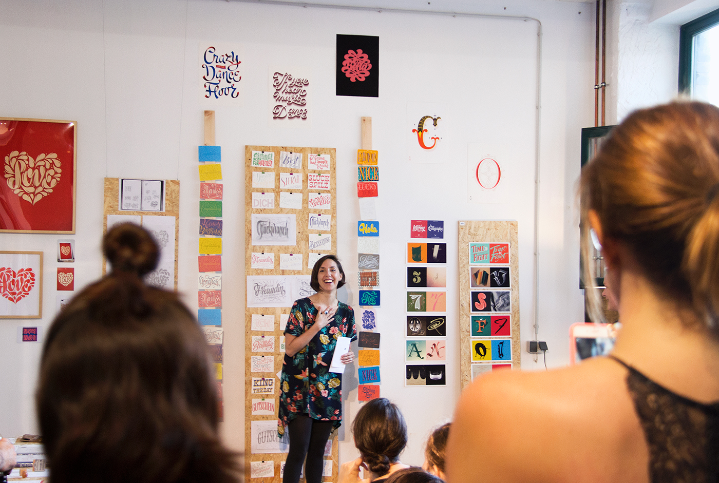
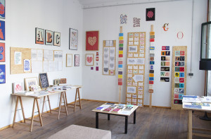
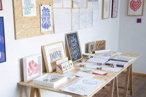
On Sunday, August 30th, I opened the doors of my studio for the first time. Old and new artwork were exhibited, including personal projects, commercial work, my book, and products. It was really interesting for me to put together a big part of my bulk of work throughout these years and to realize the progression of my art.
The doors were opened for two hours and I dedicated 35 minutes to make an introduction to what was exhibited. I started by presenting Lettering vs Calligraphy, the project that I consider helped kicking off my career as a lettering artist, mainly because of all the practice it involved and the self-confidence that I gained with it.
This was followed by another of my self-initiated projects, Letter Collections, a series of 100 hand lettered postcards that I sent to friends, strangers, and people I admired. Launched later in my career, this project contributed to inject new work in my portfolio and expand the client work that I was creating.
I also shared insights on my process by explaining all the steps, from the first thumbnail sketches, the refinement of the hand sketch, the digitisation and the final steps of adding color and texture. This is the work process that I use for my commercial work as well as for my teaching, which is nowadays a big part of my work.
I dedicated some minutes to explain my experience at teaching, from the anecdote of the first workshop I taught for free to teaching internationally and setting up my own online courses. I commented about my book "The Golden Secrets of Lettering" and showed the initial inspiration for it: a sketch book with my notes during my studies in type design in The Hague.
I usually say that lettering is about story telling with letters and it's about communicating an idea, creating an atmosphere and speaking to an audience. To exemplify this I showed book covers I created in the last years and explained how one image can help communicate the overall idea of the atmosphere of a book. Similarly, magazine covers are a window to the main topic of an issue. By showing the design of a magazine header for 'Der Spiegel' magazine, I exemplified the custom nature of lettering and it influences a layout.
My promotional material was also exhibited and I explained the purpose behind each one of them and the ultimate goal: making a small piece of work that you can take home.
Lastly and following the topic of creating things for people to keep, I spoke about my products, focusing on the collection of brooches, a 3D dimension for my designs. I gave insights on the difference between creating 2D artwork and taking it to something with volume.
The exhibition was set up mostly by my team; Josefina and Marc. These experience showed me how much more can be achieved if you team up with the right people.
Thank you to all that came and chatted with me. And to those that couldn't make it –there will be a next time
Join thousands of readers in this community and upgrade your lettering skills! If you're as excited as I am, send this link to a friend, so they can subscribe too.